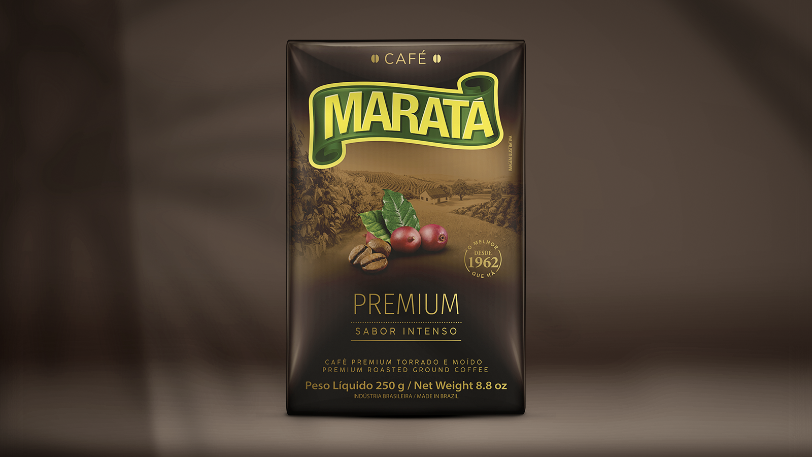
Maratá is one of the main brands in Northeast and Northern Brazil. The new design puts the products on a different level compared to previous packaging, conveying a sense of high-quality products.
The new design gave a new configuration to the illustration of the farm that in previous packaging occupied a large area, diminishing the value of other information. In the new format, it takes on a poetic air of remembrance of the origin of coffee. We kept the yellow background color as an element of recognition of the Traditional Coffee, the flagship of the brand.
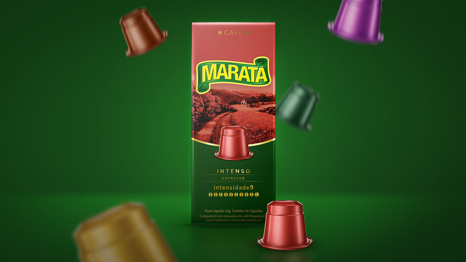
The great value of this line is that from a striking visual structure, it manages to balance a strong visual identity and at the same time attribute different qualities and positioning for each subline (traditional, premium, capsules, etc.), thus facilitating differentiation by the consumer.
The image of the farm conveys a bucolic atmosphere that refers to a space of quality and natural, where the product comes from. Reinforced even more by the fact that the farm really exists: Fazenda Maratá.
The packaging is very clear in the differentiation between the different sublines, bringing to the surface the specific benefits of each one. On the other hand, the strong visual unity between them ends up creating a Maratá wall in the point of sale.
The line maintained the chromatic standard of the previous packaging, important for brand recognition in several categories in the region. The reorganization of the information didactically facilitates identification. The new format of the illustration, the typographical style, the colors of the premium products, all this elevated the perception of value of the various products.