Inspired by London charm, Parisian coolness, and the vibrant eccentricity of Seoul, beyondflair was born. As a brand that was created by women, for women, beyondflair highlighted its mission from the get-go: helping women feel confident and beautiful in their own skin. To appeal to its audience, beyondflair invites xolve to help them launch a simple yet powerful brand by reimagining its brand identity and employing it across a number of applications.
Our goal is to push beyondflair away from fast-fashion and towards a more refined position, while maintaining its feature of accessibility. The experience created by our design team functions to communicate that beyondflair is a lifestyle rather than just clothes. Confidence and elegance are an aura that beyondflair believes every woman can access with their products.
The mission: “The house of beyondflair was constructed based on a fundamental mission to make women feel confident and beautiful in their own skins. We intend to celebrate their individualities by sharing our individual aesthetic points of view on fashion and lifestyle.”
The creative flow: “The design process begins with us thinking about what pieces are missing in our wardrobes and what we want to wear every day. At beyondflair, we source the most beautiful fabrics possible to offer products that carry genuinity, quality, and affection for beauty.”
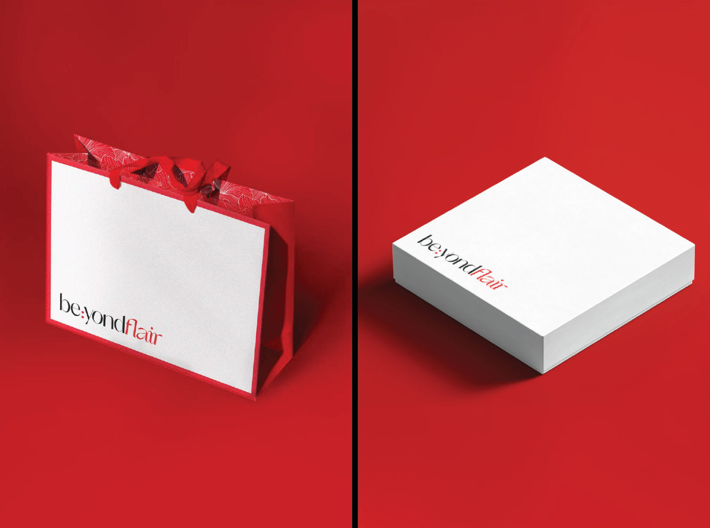
The color palette is the classic combination of red, black, and white. The red demonstrates striking femininity, alongside the black and white which conveys modern simplicity. The three colors together invoke a strong sense of passion and timeless beauty.
The two syllables of “beyond” are divided by a colon, which forms the focal point of the wordmark. Its purpose is to emphasize beyondflair’s belief that a woman should not have to limit herself to any one definition or identity, and that she can essentially “be:” whatever she desires.
The custom wordmark with the ‘fl’ ligature and the continuous flow joining ‘air’ creates a feeling of sophistication and effortlessness that are key elements of beyondflair’s identity. The primary font used across applications is Orelo, in order to align with the brand’s minimalist style while adding a soft and graceful accent.
The team incorporated the logo into the application design by pairing it with a flower graphic. The illustration integrates fine lines with smooth, wavy contours to create an image of blossoming flowers. The design is expressive and vibrant without overshadowing the logo or straying from the minimalist theme.
For the final touch, the animated logo was designed to depict the brand “blossoming” from a shape that can be interpreted as a flame or a flower, consolidating beyondflair’s bold spirit of elegance and femininity.
Opened the door in 2021, beyondflair begins its aesthetic journey as they accompany customers to create the narratives in daily life. They now own a concept store at Level 8, 34 Phan Chu Trinh Street, Hoan Kiem District, Ha Noi. “Self-discovery, knowledge sharing, and empowerment”, as they put in, are what beyondflair represents.