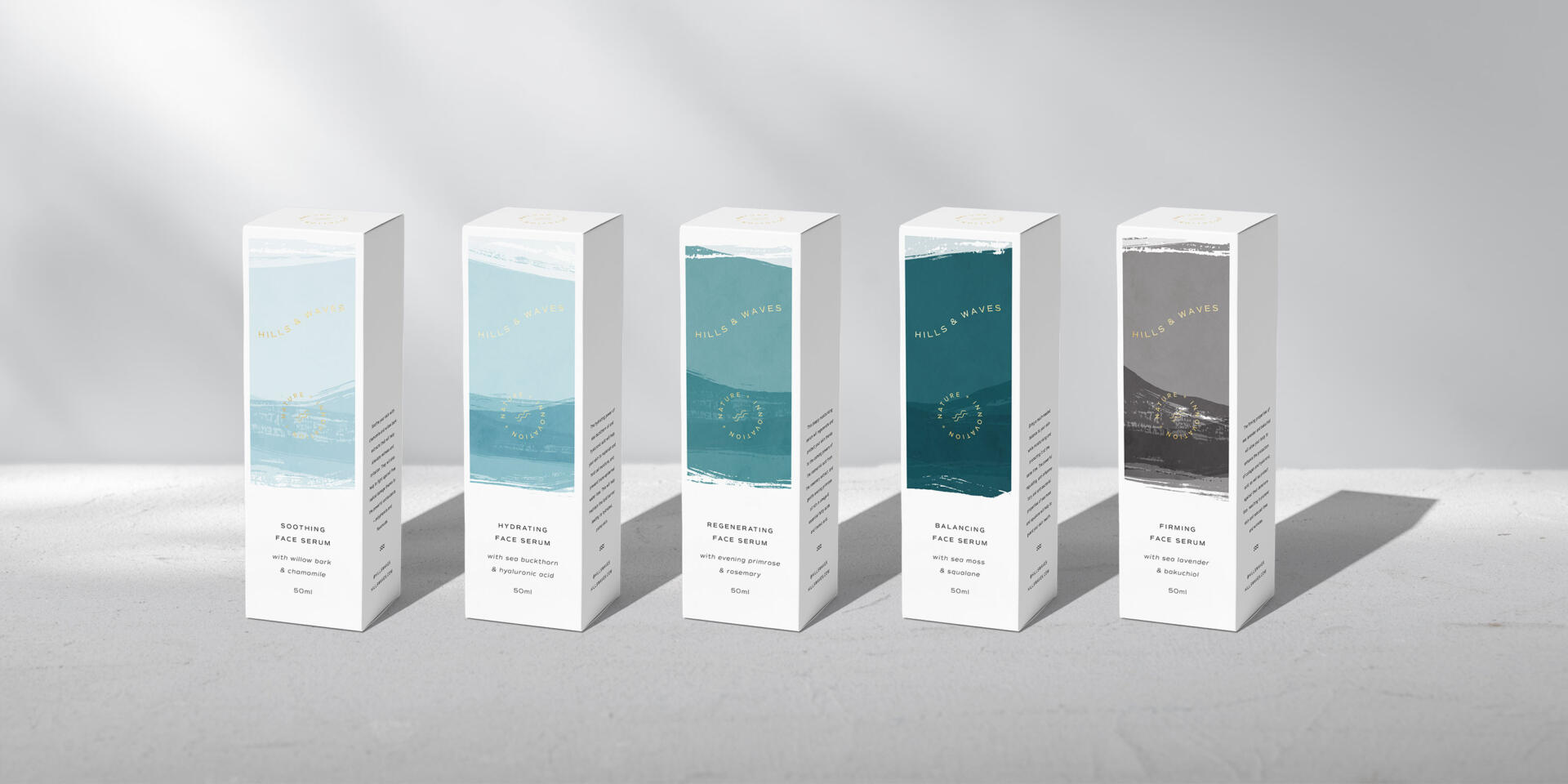
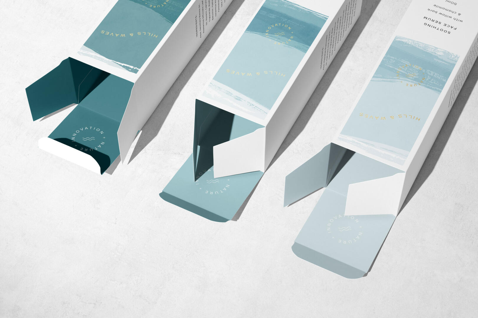
Minimalist branding and packaging for a skincare brand inspired by the sea
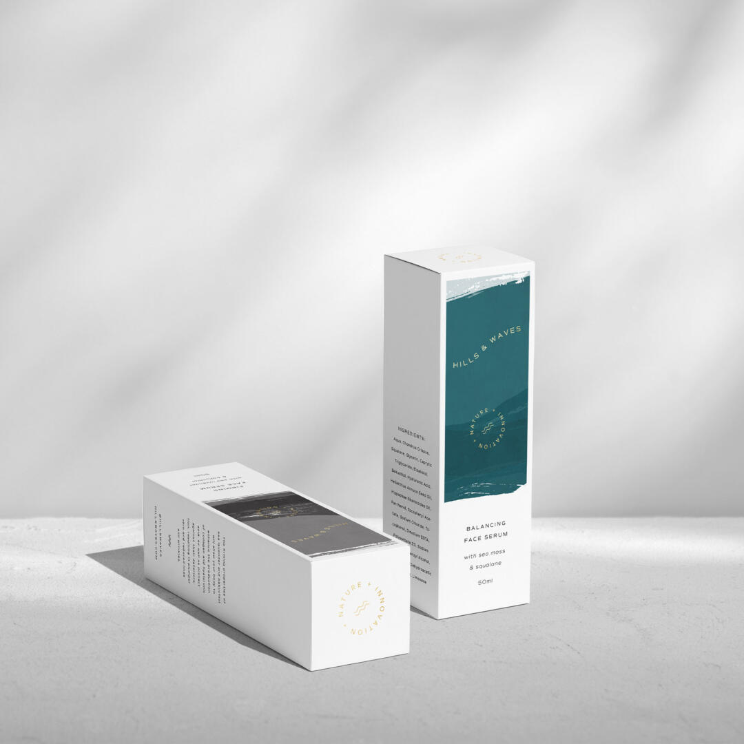
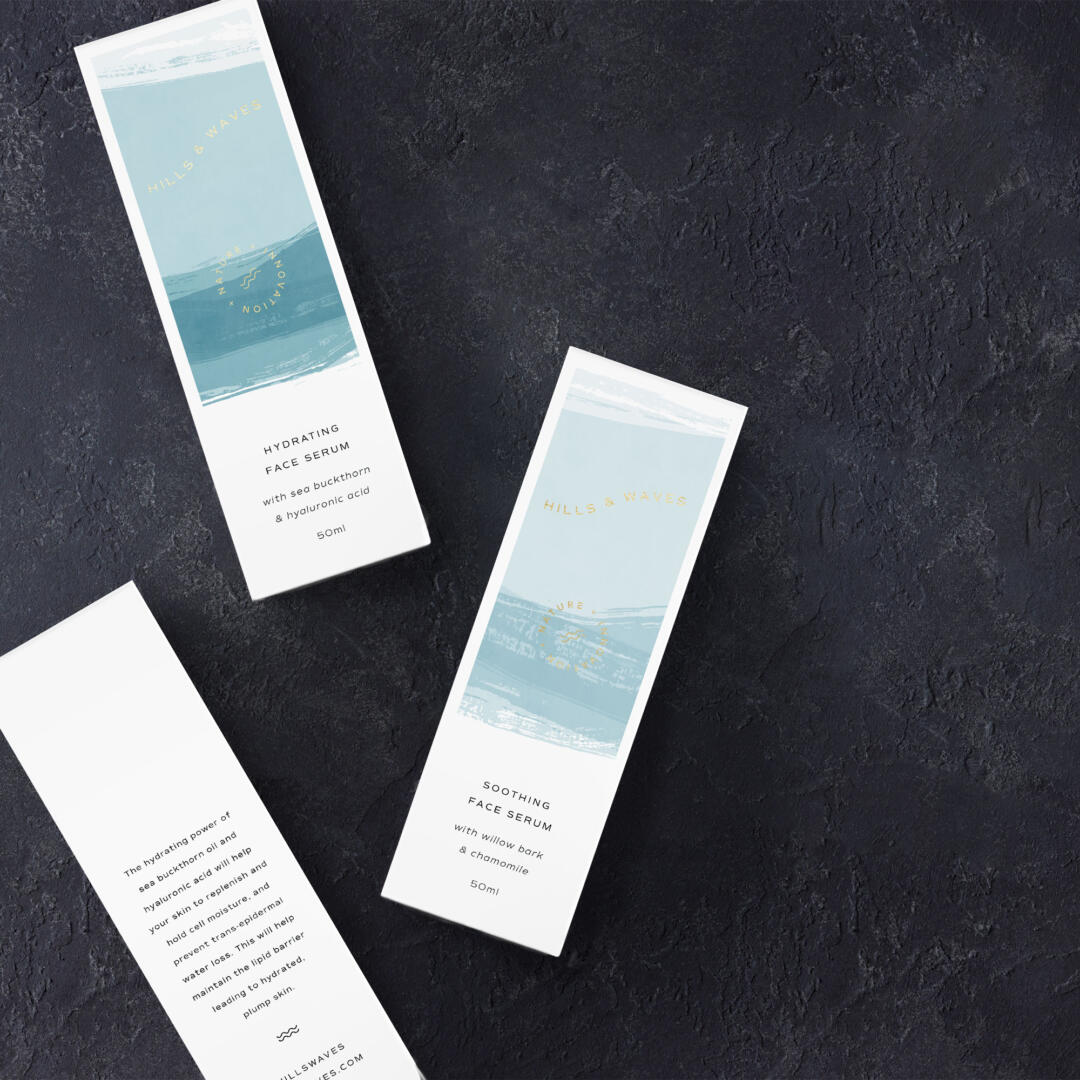
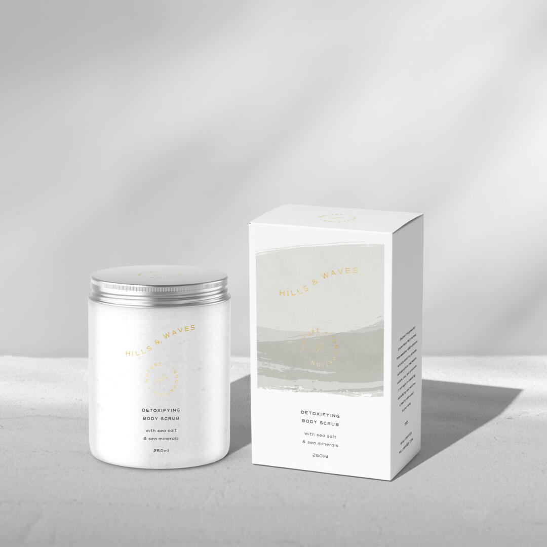
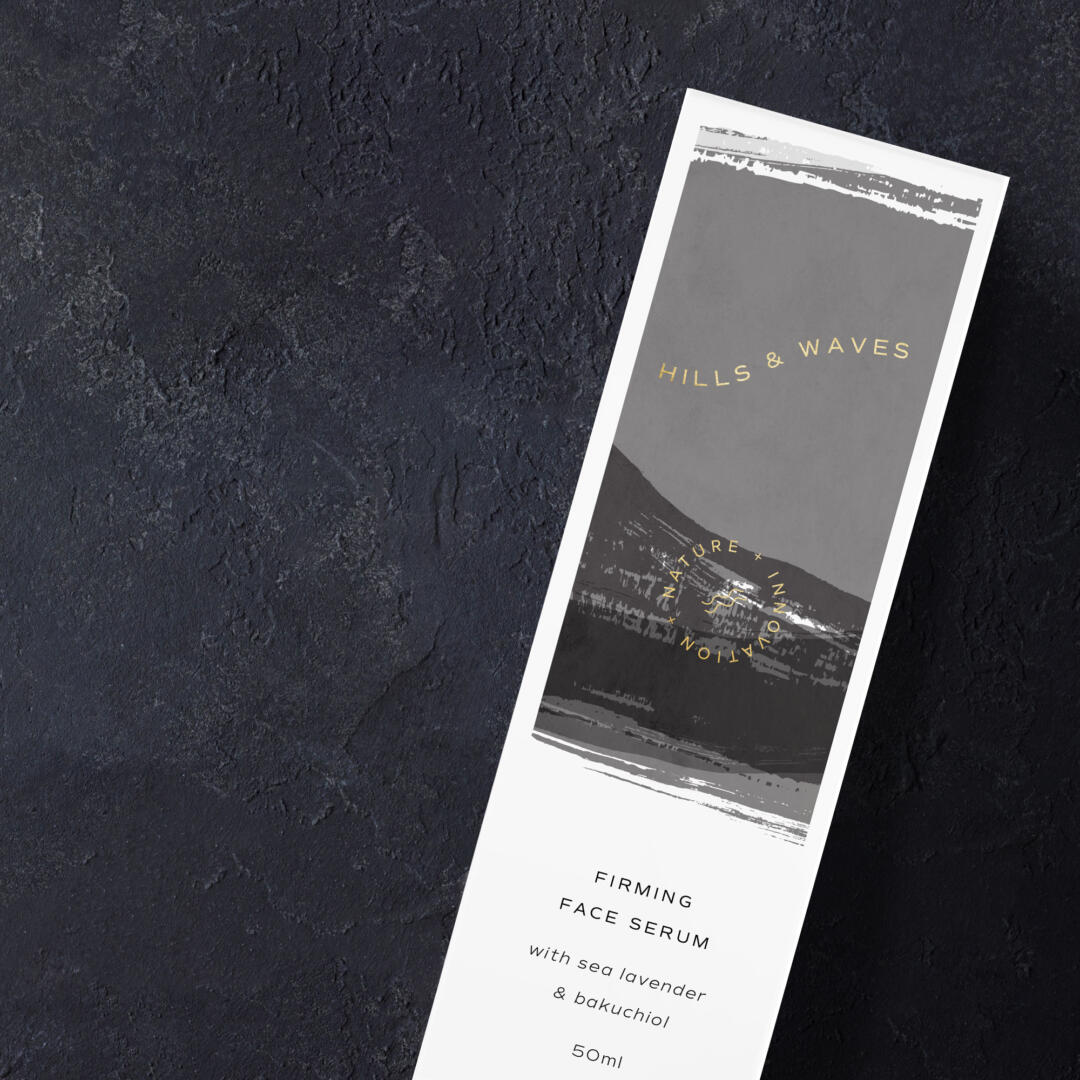
Hills & Waves is a sustainable skincare brand from the UK, that takes inspiration from the natural environment of British sea shores. They use the wealth of skin-friendly ingredients and minerals from the sea combined with innovative techniques to create effective natural skincare products such as serums and salt scrubs. All their products are formulated around powerful active ingredients of the highest quality, such as sea moss, sea minerals, sea lavender or sea buckthorn, sourced from the shores and their surroundings to nourish and regenerate the skin. This all-natural, environmentally-focused idea in the heart of the entire brand concept, gave rise to the creative direction for this project, and all ideas for the brand identity and packaging concepts focused on rocky coasts and rough waters of the UK.
The new identity for this brand needed to reflect the passion for local ingredients, innovative formulas and clean, environmentally-friendly solutions. In order to achieve that, the look and feel of the new brand identity was kept in a chic, minimalist style with a little touch of whimsy added in the wavy lines of the logo. To reflect the modern, innovative character of the brand, an elegant, minimalist font, and gold foil embellishments were used, emphasising the premium quality of the products. Illustrations featured on the packaging designs are custom abstract landscape paintings inspired by the windy shores of the UK, with their cool bluish-green colours and rough textures. These dynamic abstract paintings, with their raw look and lots of organic textures, provide a strong contrast to the otherwise clean and minimalist feel of the packaging, becoming a great metaphor of the simple and natural, yet powerful products.