APK Stoilenskaya Niva is a company producing flour and bakery products. Over its twenty-year history, it has become the industry leader. The holding already has more than 15 bakeries, 3 flour mills, a pasta factory, 500 thousand tons of bread per day, more than 450 thousand tons of flour and 250 thousand tons of feed per year are produced. The company has a large product portfolio – more than 3,000 items.
Task
The previous logo of the large agro-industrial company Stoilenskaya Niva was applied to all packaging / labeling of products manufactured by enterprises, but showed very low recognition and loyalty among consumers.
In 2020, a new name for the corporate brand, Slavna, was developed, and a trademark was registered. The company decided to create a new brand architecture, where Slavna will act as a corporate and consumer brand, uniting several local brands under a single federal one.
The company commissioned us to develop:
corporate identification of the Slavna federal brand;company strategy, brand essence and mission;brand portfolio for all product categories.
Solution
Regional brands are very strong in their territories, have great recognition and success with consumers. It was important for us to develop a strategy for a smooth transition to the national Slavna brand, which would cover such product categories as flour, pasta and cereals, bakery and confectionery products, as well as a separate b2b line of compound feed for animals and birds.
The brand should have a single ideology, which is based on certain positioning territories. In our case, there are three such territories.
- The territory of “Belonging”, since we are talking about the Russian national brand.
- Territory of “Comfort” – when you know what you are buying! When you trust what you buy!
- Territory of “Control” – a quality product is controlled at all stages of production.
Confidence in the origin, pride in a classy Russian product, time-tested quality – these are the benefits that we must convey to the consumer.
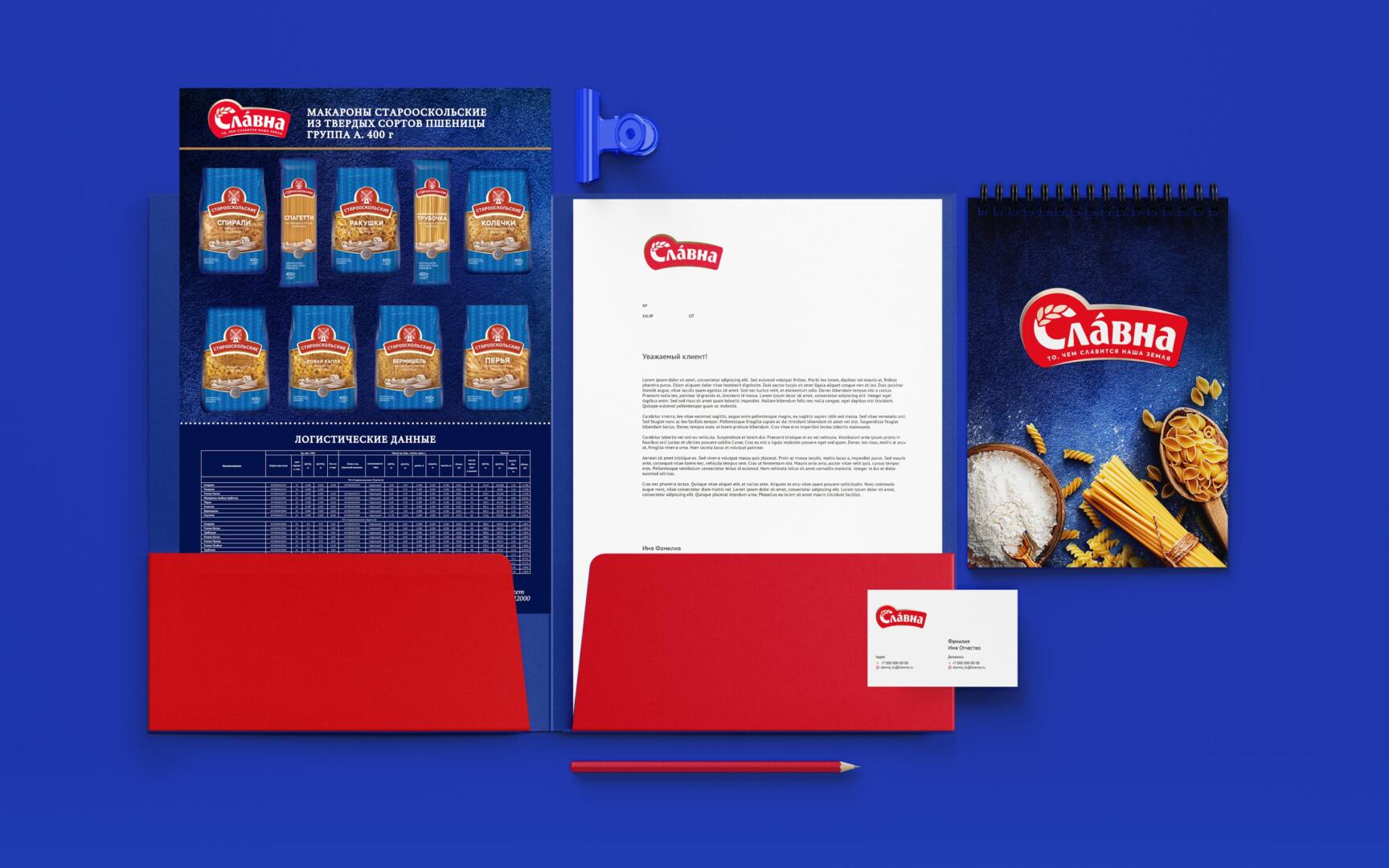
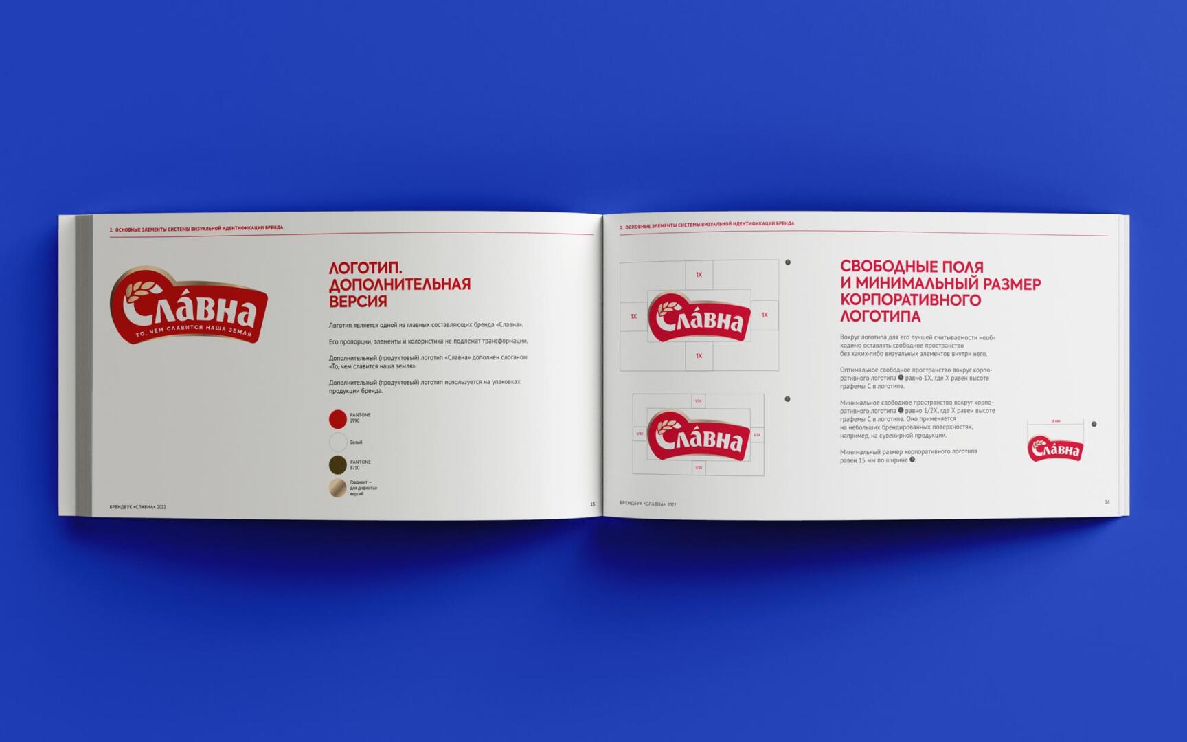
An important part of positioning is belonging to the Russian land and traditions. The red color was deliberately chosen to highlight the beauty of our homeland. The inscription “Slavna” has a capital letter “S” in the form of an spikelet, bearing a certain meaning, since our category is grain products. The logo is deployed in an arc, which speaks of breadth and good nature, while it has a closed base so that it can be used on any backgrounds in a single color.
The Getbrand team developed a corporate identity with this logo, described recommendations for the correct use of the identity in workflow and points of contact.
The Slavna brand is a new federal brand that is successfully sold not only in the Russian Federation, but is also popular in the export direction.