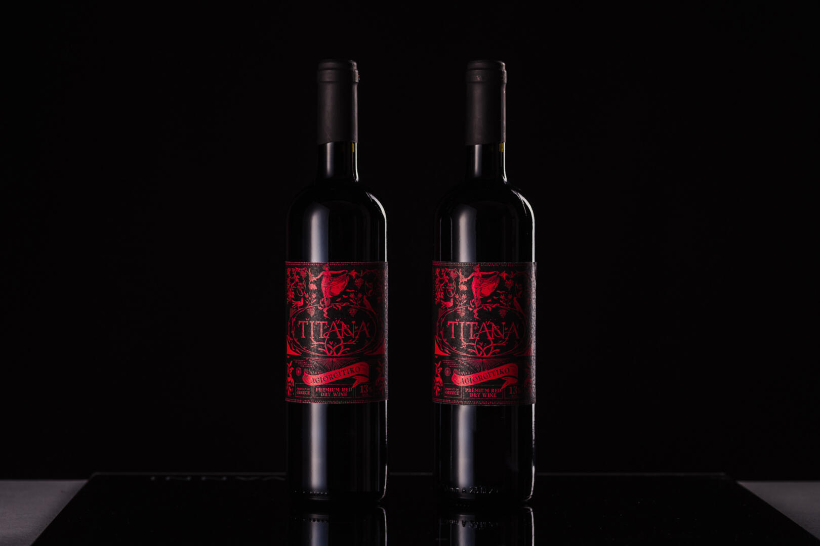
We were asked to design the labels for the “Titana” wine range, in 5 different varieties.
The concept for the first series of wines “Titana”, is an iconographic label, highly inspired by the Greek element and mythology, based on the name of the product.
Our concept here, Titanomachia: The mythological war between Titans and Olympian gods that lasted for 10 years. So here our myth changes and takes on a different and opposite dimension. The war between them turns into a feast – a long feast full of wine, drink and food. A Greek feast, and a hymn to tradition, happiness and well-being. The depicted gods engage in our imagery in a creative and distinctive way, feasting, conversing and having fun.
Our label is complemented by original and equally creative typography, to give the traditional design a modern and highly impressive dimension.
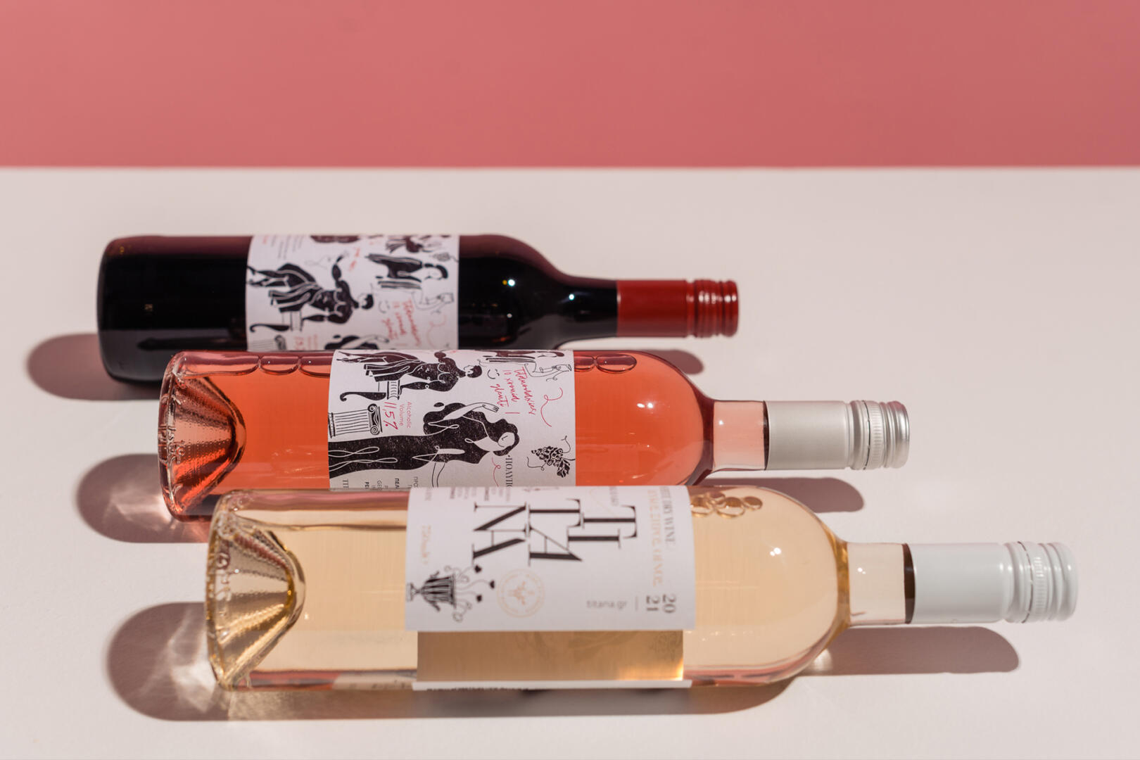
The concept for the second series of “Titana” wines, is an entirely pictorial label, with elements and colors that indicate the Greek element and origin of the wine.
The concept here is inspired by the titan gods, and more specifically the female titans, a direct reference to his name. On the designed label, the depicted “Titan” is the Titaness Tethys, daughter of Uranus and Gaia and mother of thousands of river deities. Surrounded by vines and their branches, she holds in her hand an ancient jug of wine and with it, fills the “world”, the circular element that encloses the name of the wine. As a continuation of the latter, it is joined by wooden branches (references to the titan logo) and joins the rest of our visual. The purpose of the visual ensemble is for the illustrations to be recreated per bottle for differentiation, and to depict a different goddess per time and wine.