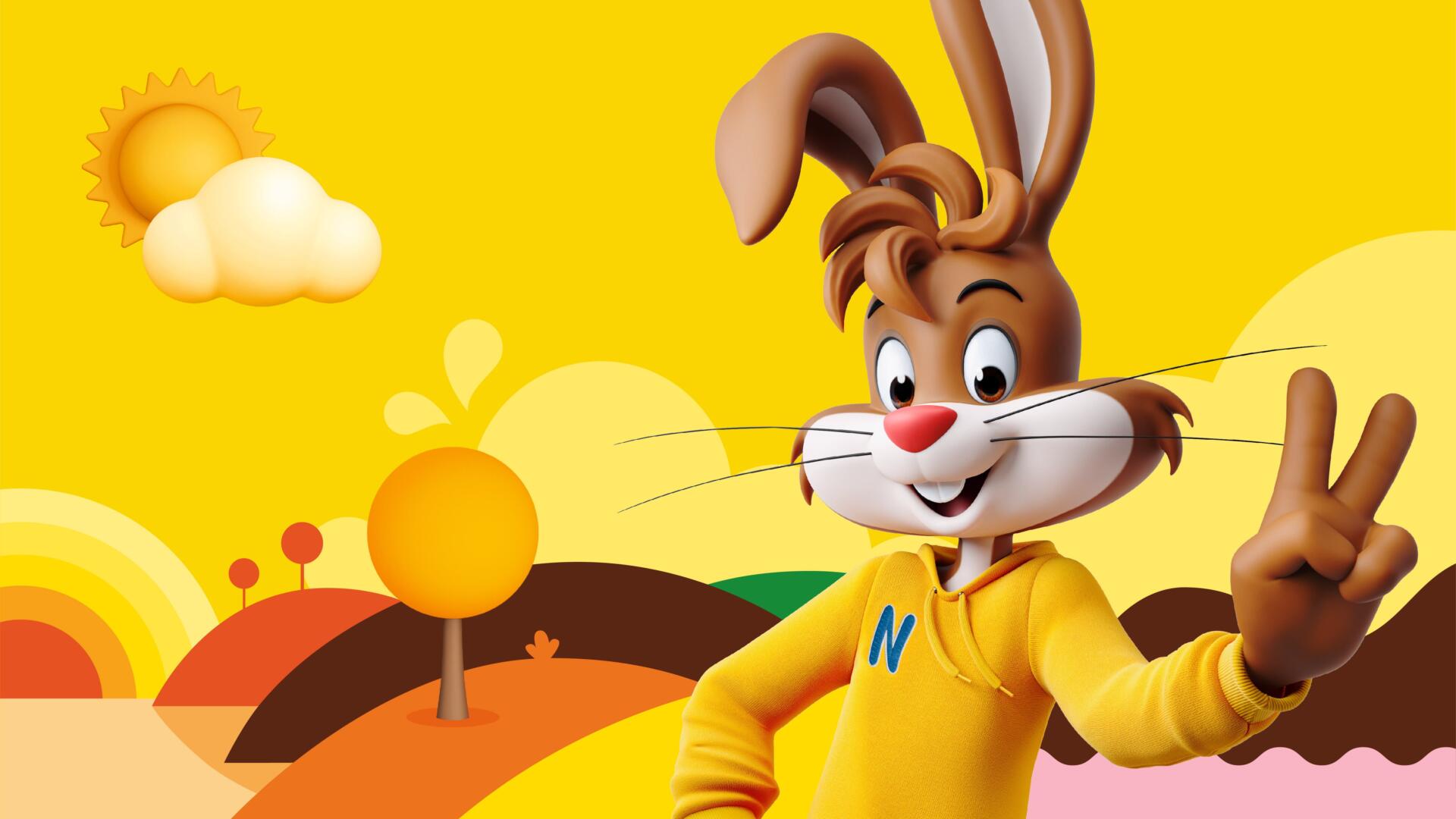
A reimagining of NESQUIK’s iconic rabbit mascot, Quicky, sits at the heart of a strategic pivot towards the new NESQUIK world.
NESQUIK has partnered with global brand-led business transformation company FutureBrand to deliver a modern brand identity which will boost brand relevancy and enable growth into new audience segments. At the heart of the work sits NESQUIK’s much-loved iconic mascot, Quicky, who has been reimagined for a digital future. With a focus on purpose and relevance, FutureBrand has created a brand world which will prime NESQUIK for future product innovation and communication, whilst retaining existing audiences.
For decades NESQUIK has been a beloved family favourite, with Quicky acting as an icon of fun for generations of parents and children alike. However, as consumer priorities have shifted, NESQUIK saw an opportunity to reposition Quicky’s purpose and role. The brief for FutureBrand was clear: re-energise NESQUIK in line with a new family landscape and evolving roles in the family, positioning Quicky as an ally to parents with an active voice in important topics such as nutritious diet, active lifestyle, sustainable habits and positive thinking.
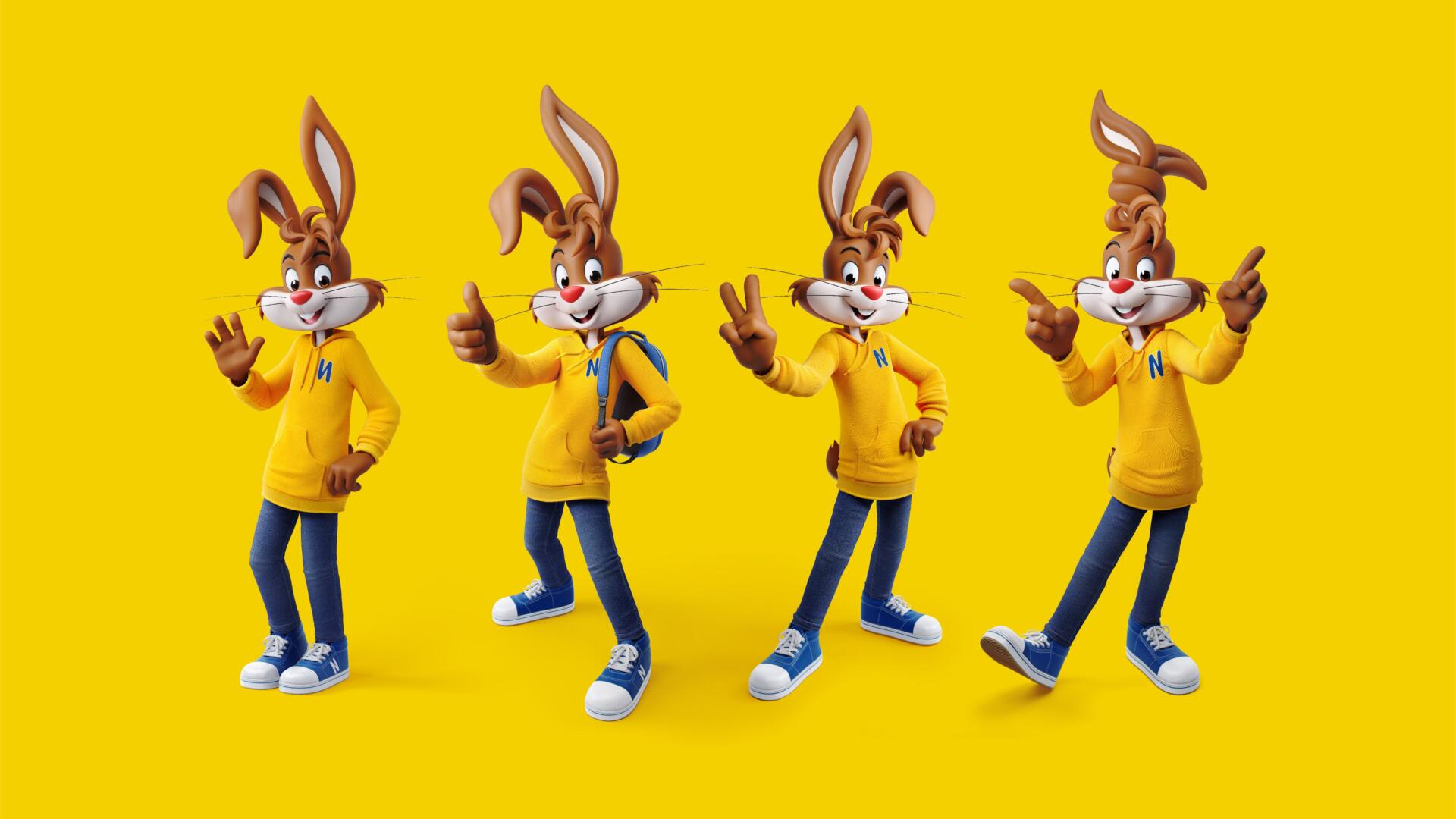
At the heart of the work is Quicky, the much-loved rabbit with whom generations have grown up. FutureBrand looked to the phygital world that the next generation play in for inspiration, drawing on cues from computer animation films and the gaming industry to bring contemporary relevance and real longevity. This digital-first and motion-led Quicky still feels as familiar as ever and retains his buoyant sense of fun. Immense detail went into his development, ensuring he was a dynamic mascot through his outfits, postures and appearance.
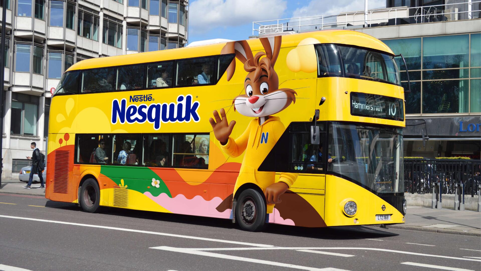
To support Quicky’s roll-out, FutureBrand also created a new brand expression and a wider brand world in which he exists, speaking to the wide age range of audiences who engage with the brand. These work together to create a cohesive brand experience, enriching ‘Quicky’s World’ at every turn. Going beyond just on-pack assets to focus on social media also enables NESQUIK to move towards being a truly digital-first brand that can speak more authentically to the growing teen market.
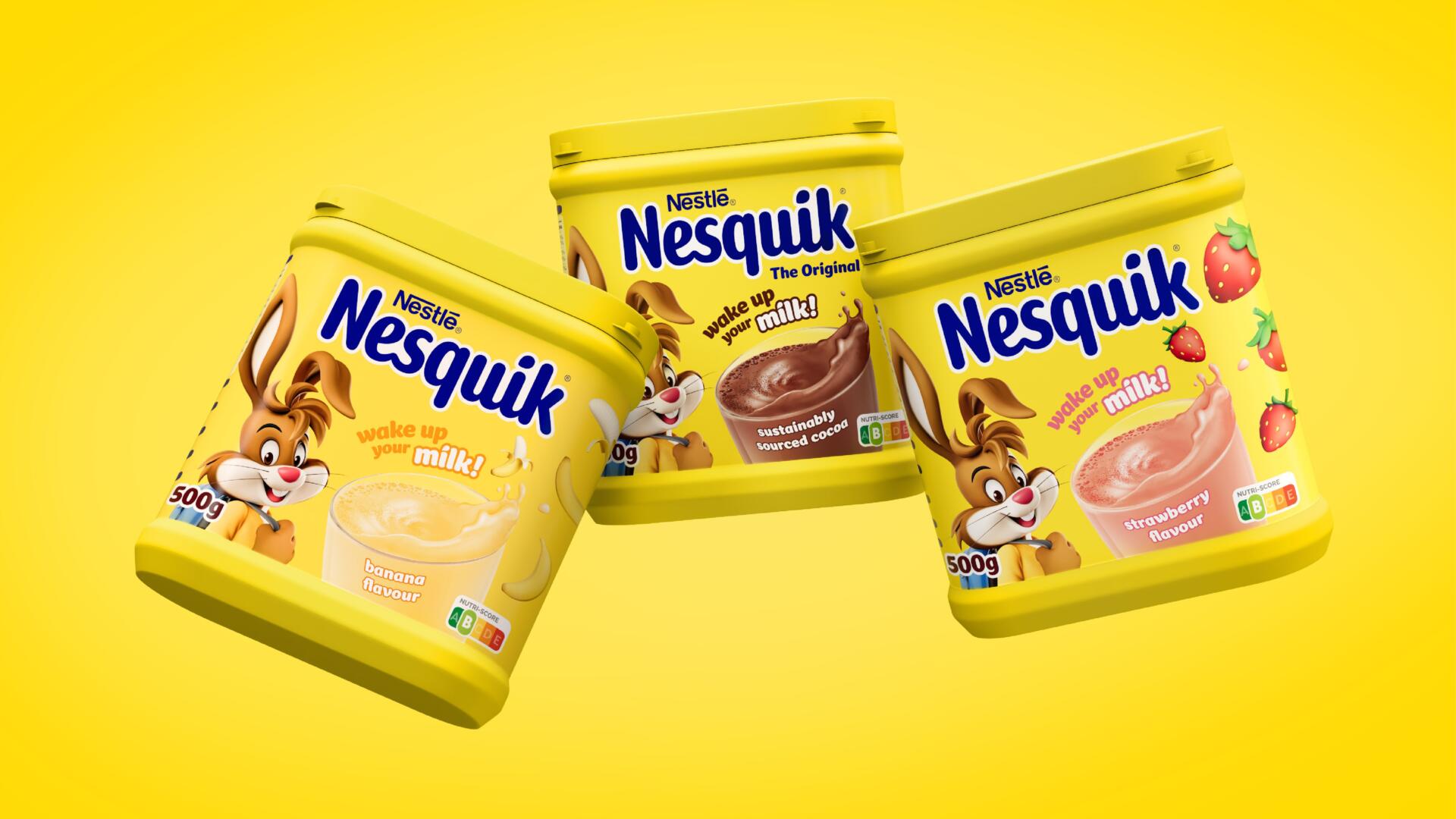
FutureBrand also created a bespoke typeface called NESQUIK Sans, with the aesthetic reflecting the brand’s playful and fun personality. This personality was the inspiration for the new logo too, with the animated milk splash bringing it to life in a digital-first world. The new packaging for NESQUIK is bold, immediate and has a real presence on the shelf, with a simplified packaging design system ensuring easy consumer navigation and allowing NESQUIK the opportunity to amplify its iconicity once again.
Stephen McGilvray, Executive Creative Director, FutureBrand commented: “Having grown up with Quicky ourselves, the challenge to re-position him to maximise his impact across the whole NESQUIK portfolio was both daunting and exciting. We knew we needed to make Quicky a true icon for the brand once more, and by evolving his character we’ve opened the door for him to engage with new audiences and flex to new product lines. Creating ‘Quicky’s World’ and taking him into fresh new territory has been so rewarding and we can’t wait to see him brought to life across pack and online.”