Design for tea with functional additions of organic herbs and fruits
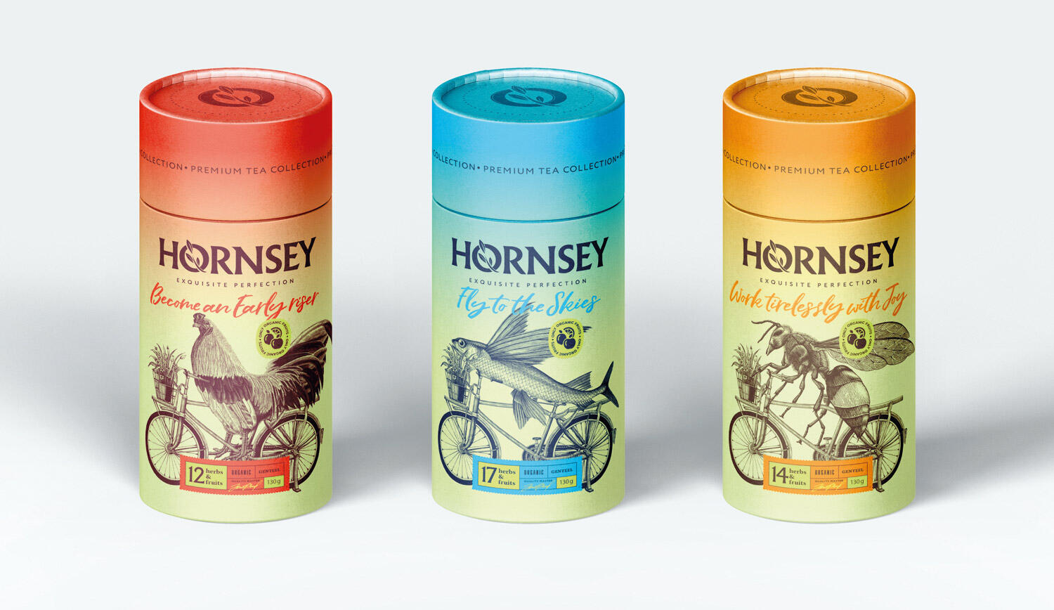
«Hornsey» is a premium line of teas with functional additives of organic herbs and fruits that help maintain vigor, improve performance and improve the physical and emotional state of a person. When developing the packaging design, the main components were vivid images compiled in a number of illustrations. In the entire line of teas, the image of a bicycle is a metaphorical expression of the accelerated pace of life with rapidly changing goals, objectives and impressions, which is so familiar to residents of large cities.
Cheer tea packaging design includes an illustration of a rooster in coral red. This bird symbolizes high vigor and productivity in humans, which is inherent in it even at a very early rise. The design of the tea packaging, contributing to the preservation of lightness and energy throughout the day, is made in blue tones, and the image of a flying fish is its central element. For tea intended to replenish lost strength, the packaging design includes an original illustration with the image of a wasp, highlighted in orange.
All types of products are supplied with original associative phrases expressing their properties. In the visual concept of packaging, backgrounds with gradient color transitions give modernity and relevance to the design. The necessary elements of tradition for tea packaging have found their expression in the engraving style of illustrations and in the design of the lower block of information.
The brand’s logo is made using a font that embodies a modern rethinking of historic British typography. It is complemented by a stylized branch with leaves, symbolizing the organic origin of the ingredients that make up the entire «Hornsey» premium range of teas.