Mugo Soda Packaging design by Tanya Dunaeva
Mugo is a new brand on the market of soft carbonated drinks
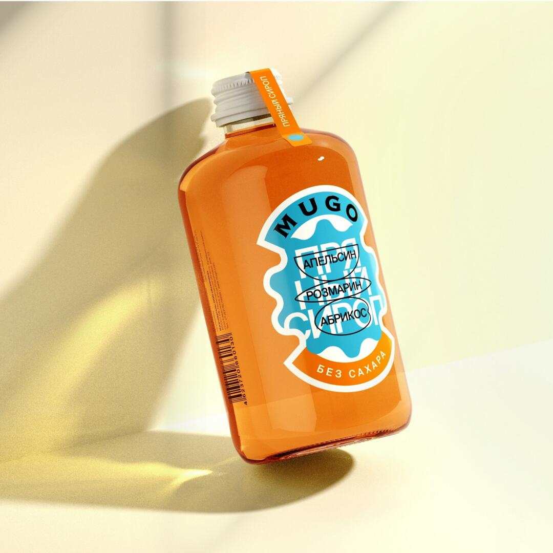
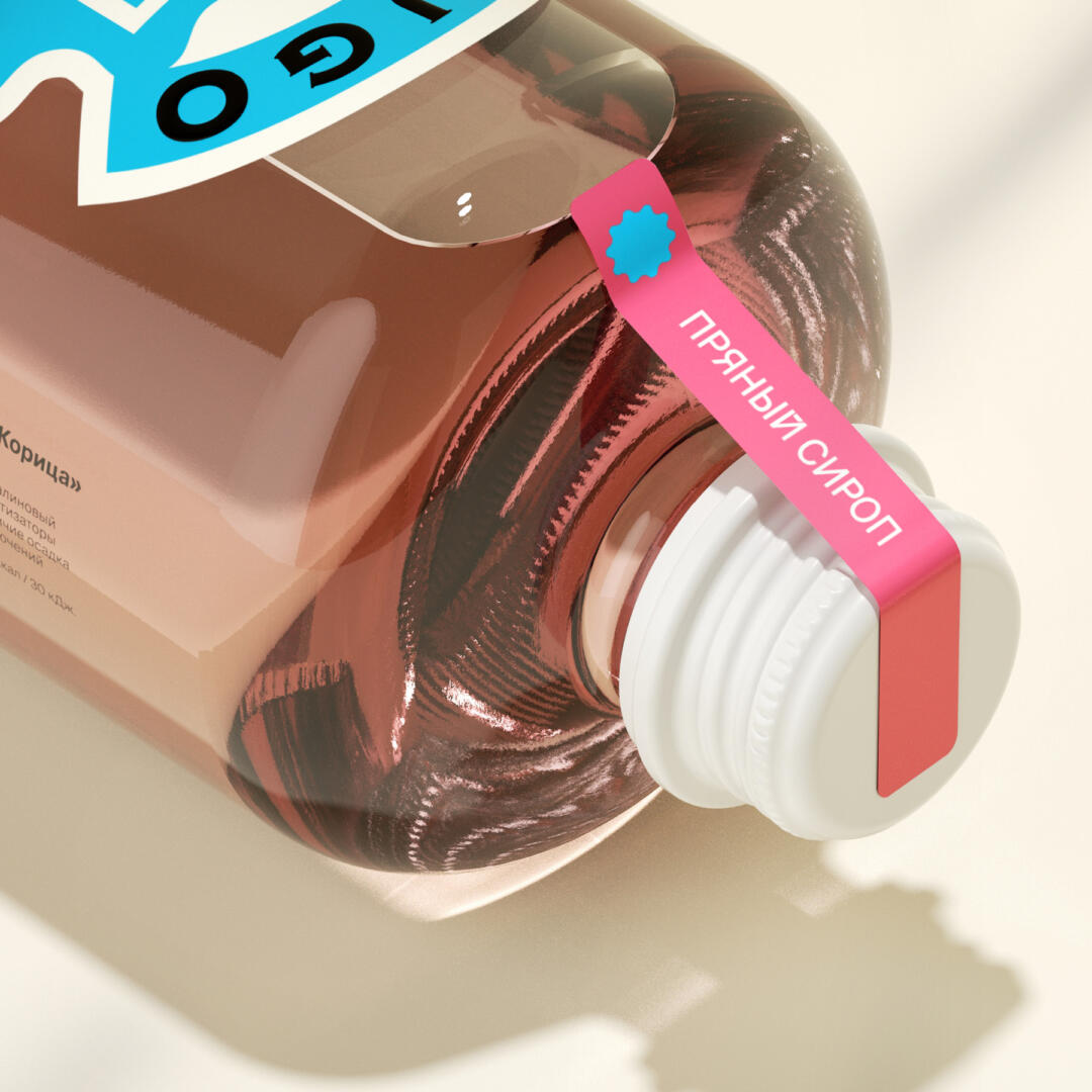
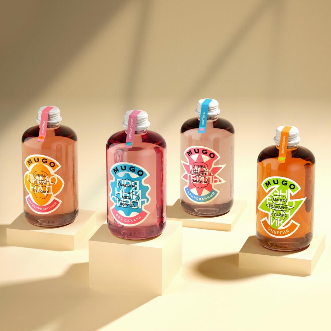
The label line consists of four types of drinks: Mocktails – carbonated soft drinks with exquisite taste compositions. Lemonades are a combination of various juices with mineral water and vitamins. Spicy syrups are natural syrups with original flavours based on spices. Energy-tonics is the perfect combination of vitamins and minerals in invigorating drinks.
The concept of the Mugo brand is soft carbonated drinks with complex flavours based on the recipes of the best bartenders. Experiments and taste discoveries in the field of original author cocktails.
The task is to form the visual language of the Mugo brand in accordance with the original product line.
The solution to this problem is based on the design of the classic label of traditional expensive alcoholic beverages, but in order to emphasize the originality and novelty of the product, with a sufficiently strong rethinking of the classics.
After analysing the scheme of the classic label and identifying the main most frequently repeated elements, it was decided to simplify these elements as much as possible to the point where a little more and the similarity will no longer be read. Thanks to this solution, a construction scheme was obtained that can be easily scaled to the entire line. The typographic solution turned out to be multi-layered and contrasting. The classic logo is made by antiqua, which gives a reference to the classical tradition and at the same time creates a strong contrast with the rest of the typographic solution, for which a strict grotesque was chosen, allowing the use of a multi-layered structure, where the first layer is responsible for the name of the product, and the second layer inside the original icons is for taste identification.