Browar Brewery is a small family-owned business that produces limited batches of high-quality craft beer using unique homemade recipes. The main goal of this brand is to satisfy the needs of true beer connoisseurs who seek exclusive and distinctive flavors.
The first batch of beer has a short shelf life, and the main task was to create an artistic system and packaging for this collection. The design requirements were simple: emotional impact, uniqueness, and an emphasis on the short shelf life, indicating the freshness of the product.
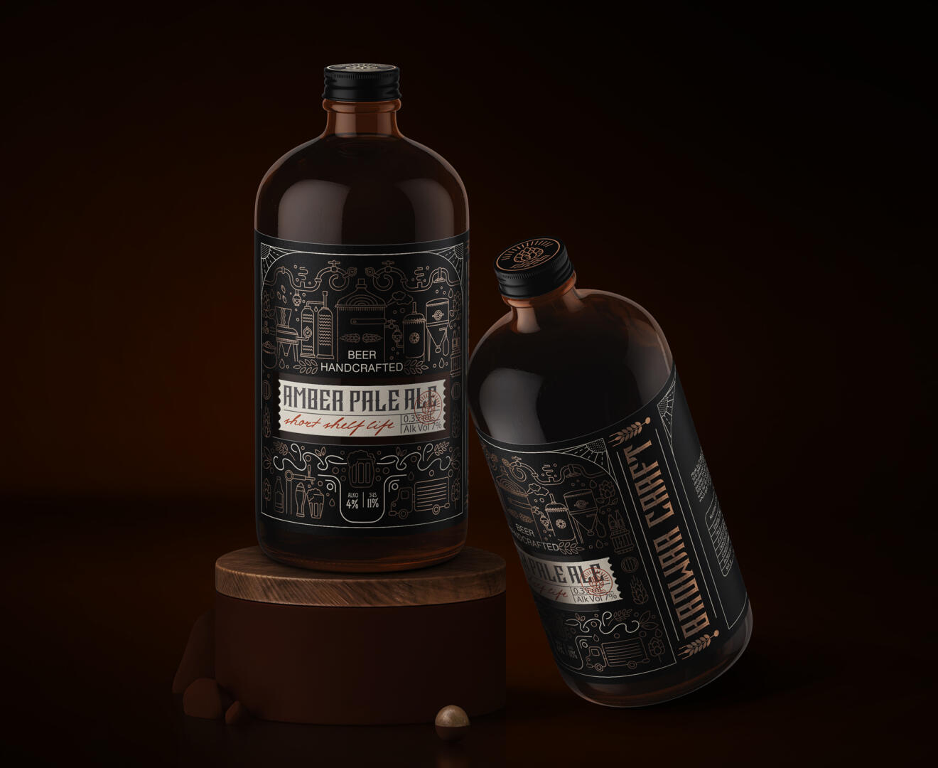
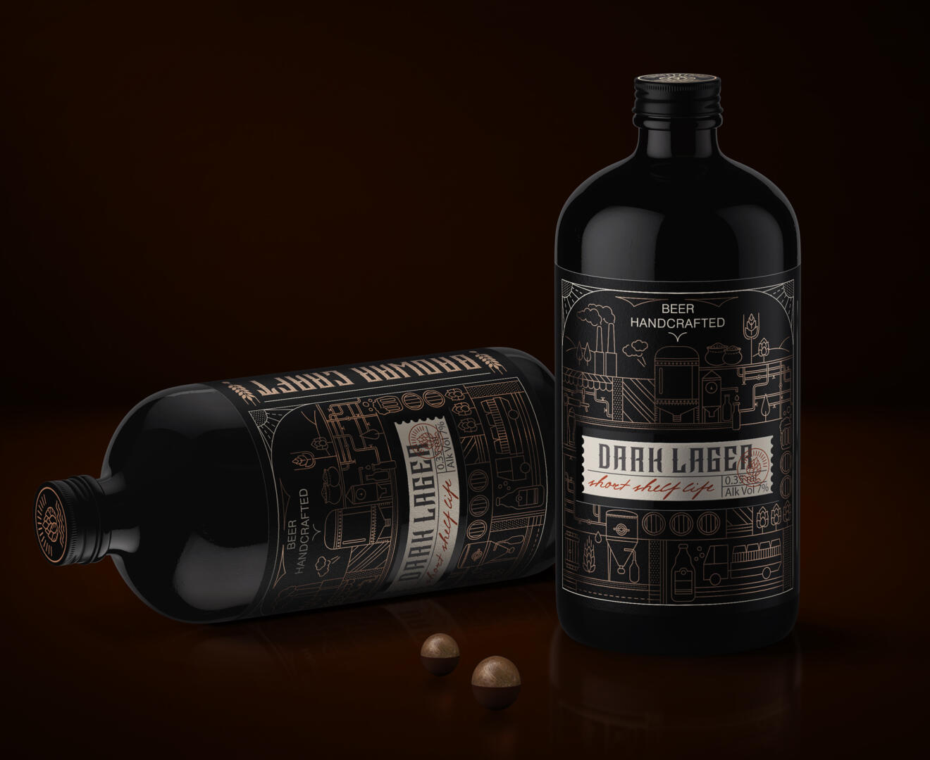
Only specialized craft beer stores and pubs were selected as sales points. The design solution was based on illustrations of the brewing process with an emphasis on the quick delivery of freshly brewed beer. The overall design style emphasizes the craft character of the product.
One of the key design decisions is the non-standard bottle shape, high-quality printing, and the use of craft paper for the label, emphasizing the uniqueness and exclusivity of the product.
Initial illustrations were done by hand, taking into account all the client’s wishes and placing the main accents, and later, digital illustrations were created and texts were placed according to the brand’s needs. The design of the illustrations was simplified to ensure ease of perception of the product by the audience.
The idea of a restrained color palette was largely associated with the fact that competing brands’ designs have many bright colors. Therefore, a restrained color palette was chosen to better highlight the design and showcase the packaging illustration, which evokes an associative range related to brewing.