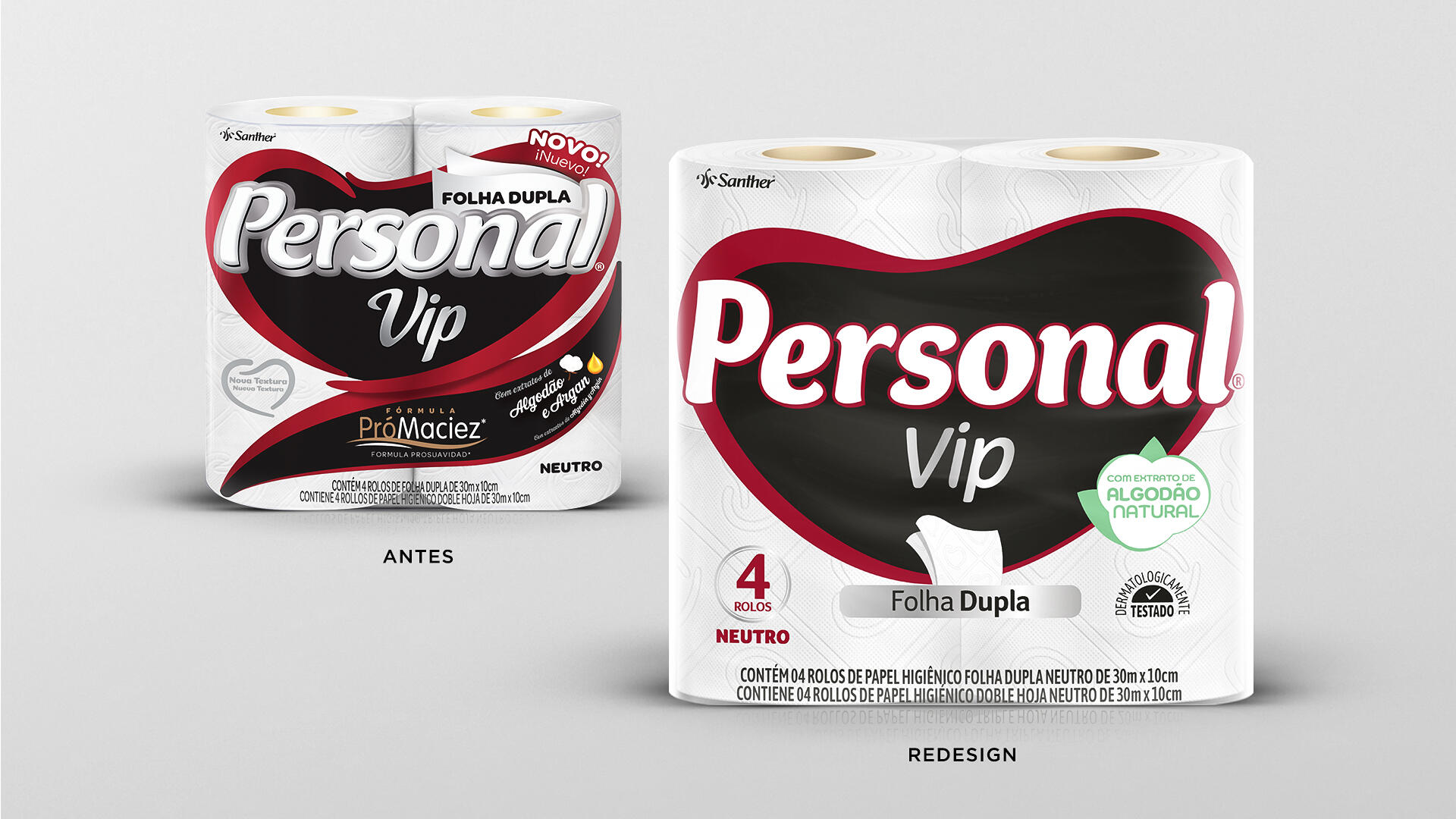
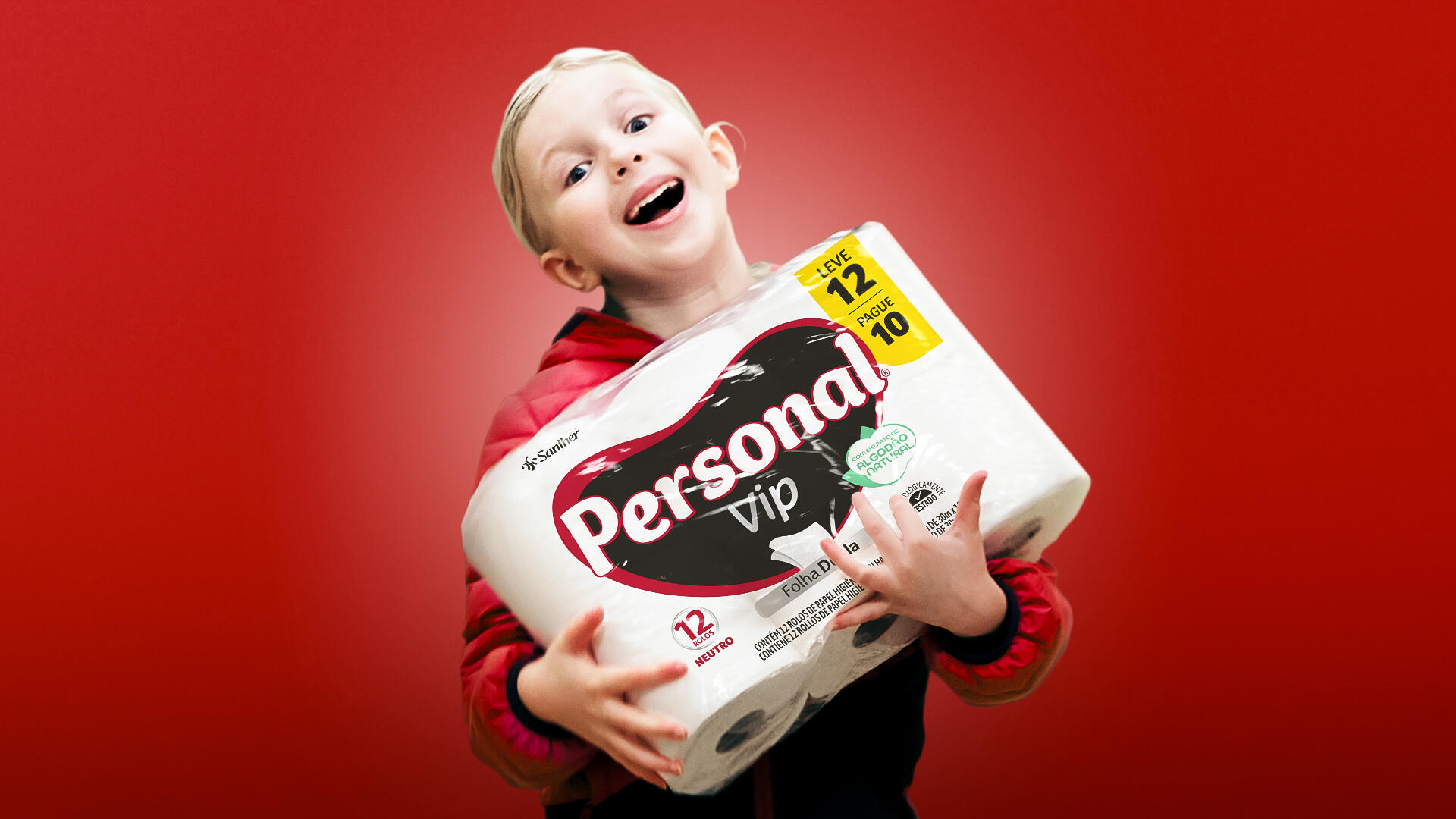
The challenge was to create a new visual while preserving the main brand recognition icon: the heart. We sought a cleaner design compared to the previous one, which was loaded with elements that made it difficult for consumers to absorb the different product-related information.
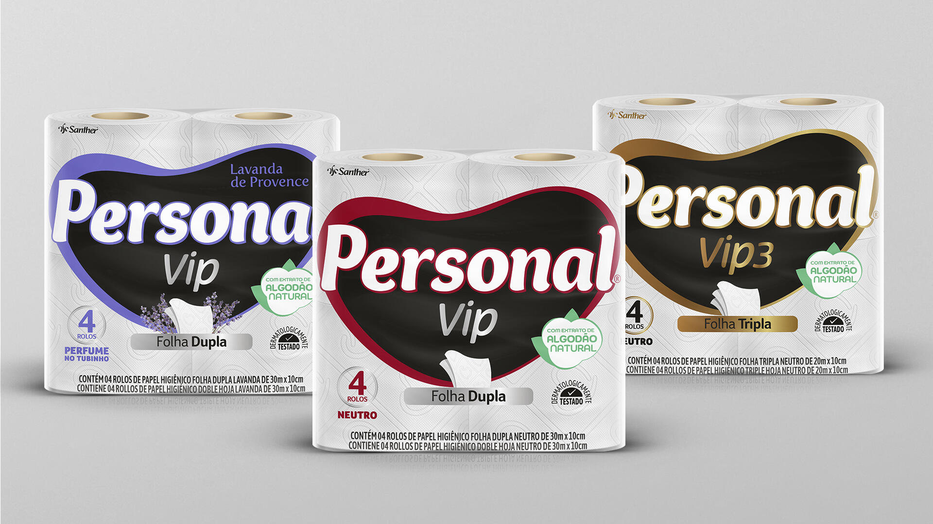
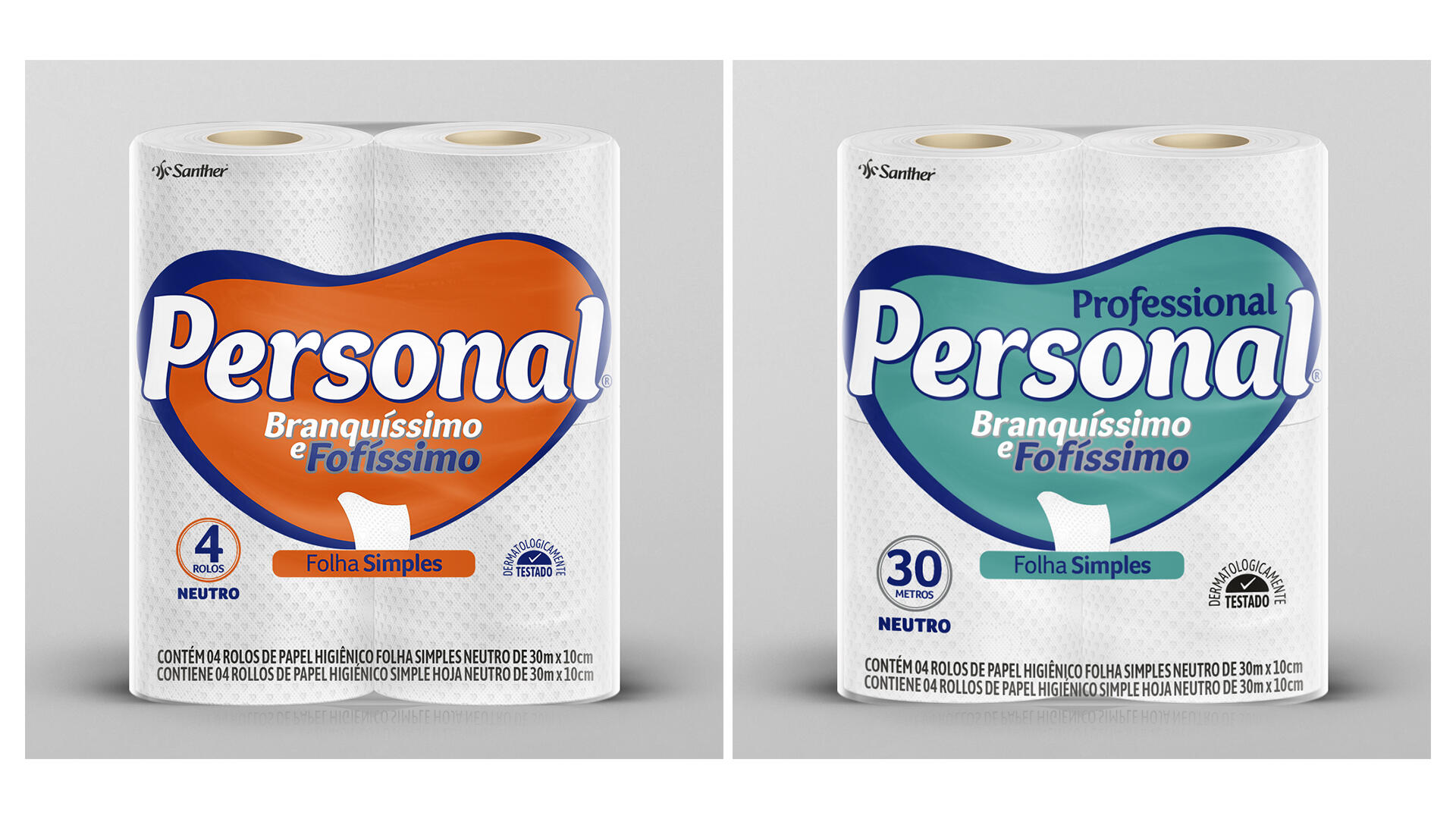
Criteria for choosing your product: type (single, double, or triple ply), brand, number of rolls, footage, version (neutral, scented, and/or decorated). Therefore, in our layout, we created a very clear and direct distribution of information to facilitate consumer choice.
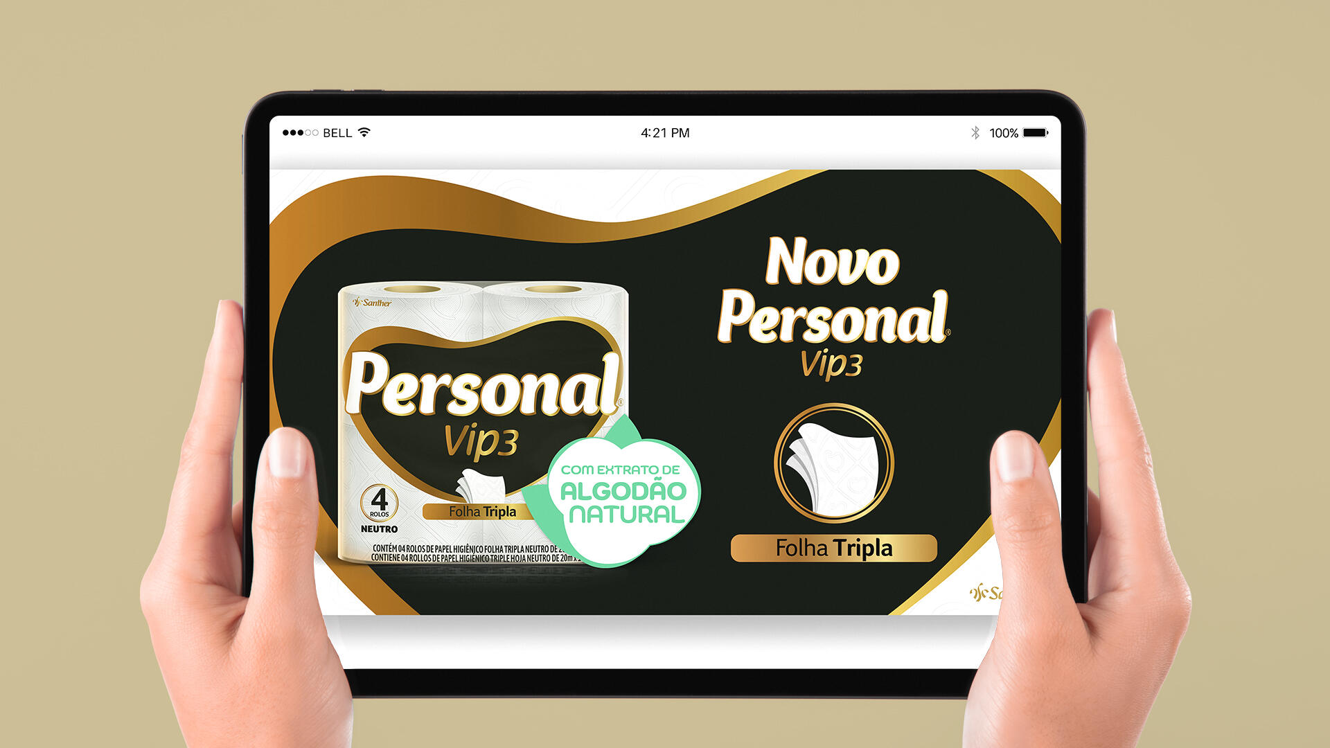
Personal is a brand of great importance in the market. Thus, by making the logo more prominent, we not only maintained the relationship with the current audience but also aimed to engage a new one. At the same time, we gave great emphasis to the claim “natural cotton extract” as a differential.
There are many toilet paper brands, many of them with excessive information and visually polluted. Therefore, we adopted a very clean visual language where all the information is hierarchically distributed in a very clear and didactic way, contrasting with competitors.
The new packaging has the necessary attributes to stand out and achieve leadership: it has a connection with the previous one, has a strong image on the shelf with the heart as a great recognition icon, contemporary and clean language, prominent logo, and clear information.