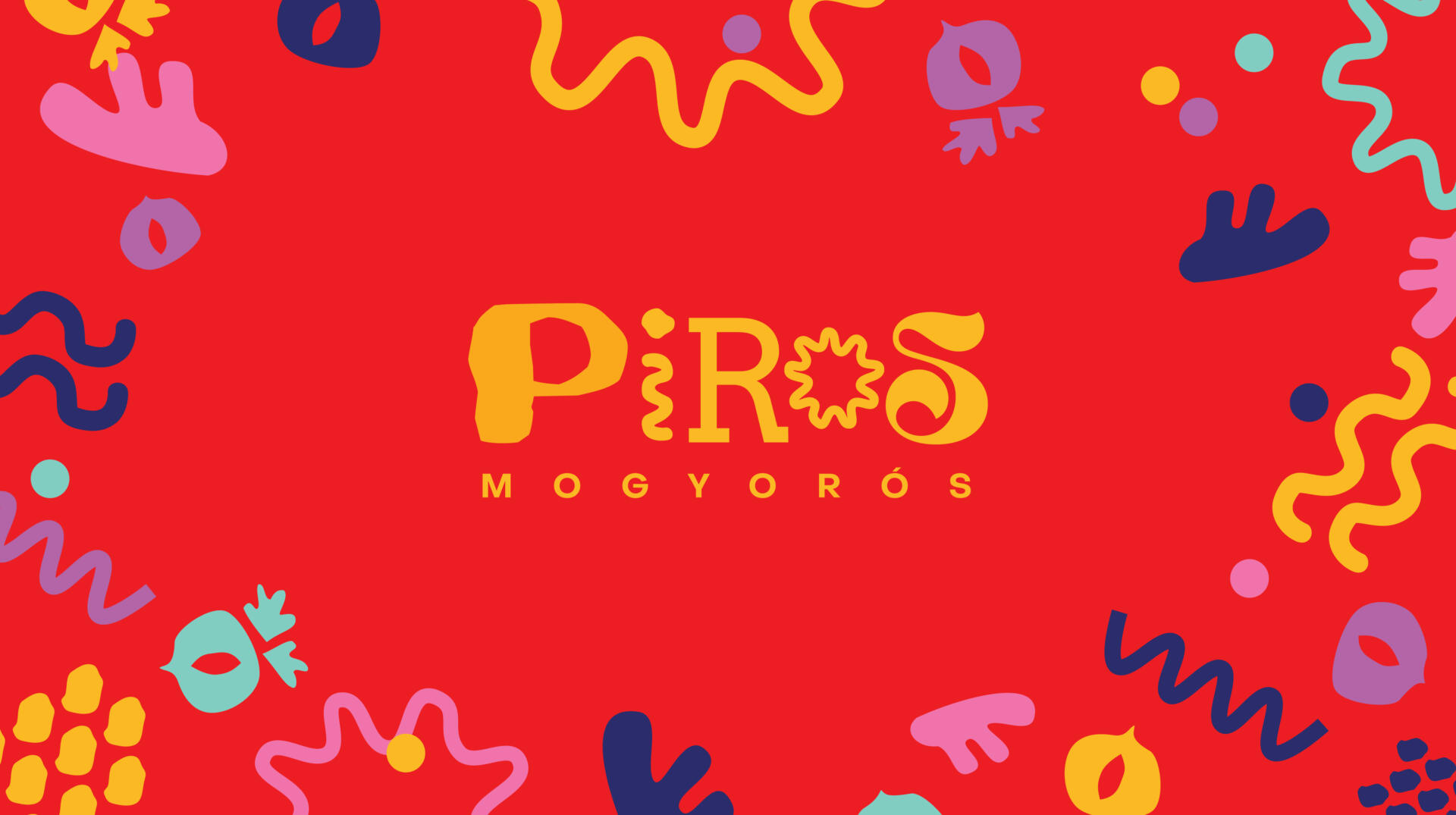
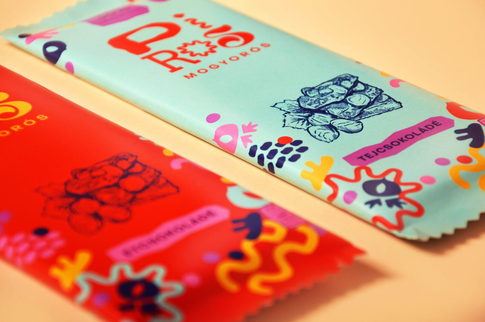
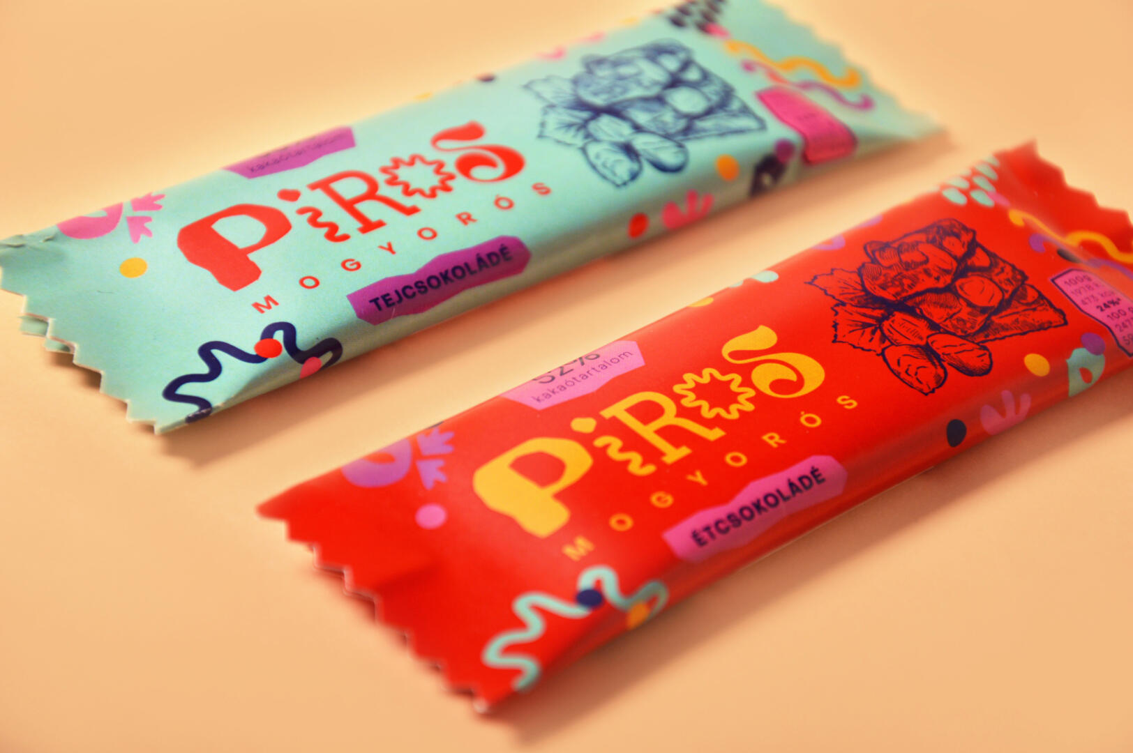
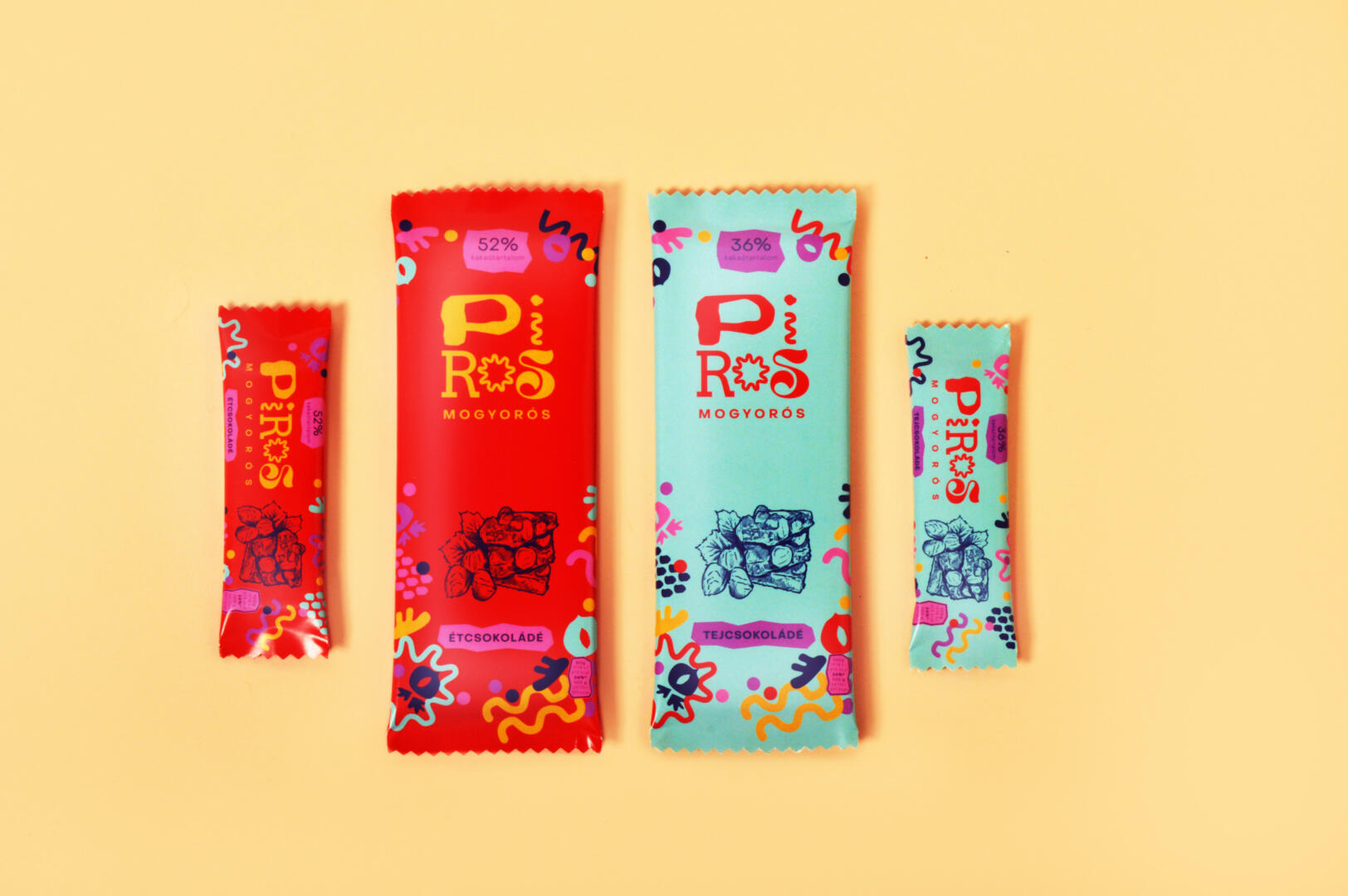
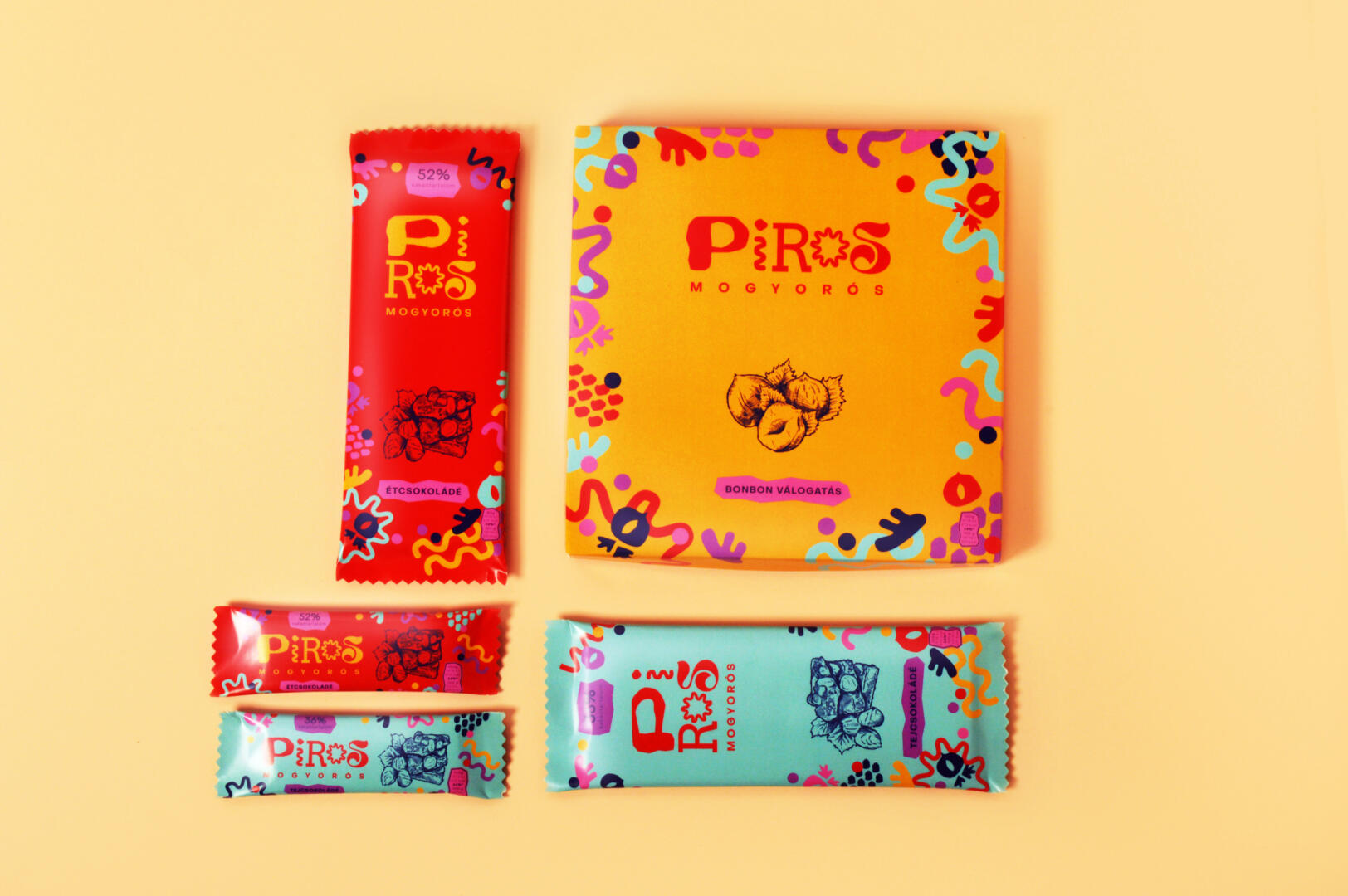
Piros Mogyorós is a popular Hungarian chocolate brand. “Piros” means red and “mogyoró” means hazelnut. These chocolate bars contain whole hazelnuts, making them incomparable with their competitors in the Hungarian market.
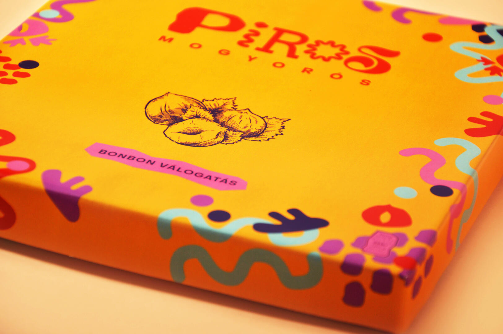
My goal was to shift the target audience to a younger age group, which requires bold changes when it comes to rebranding. Some key words I kept in mind while designing were: playful, dynamic, inviting & fun.
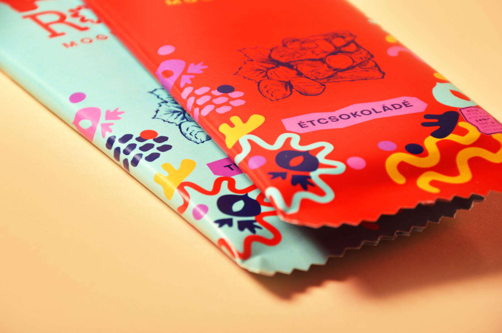
Based on the chocolate market, I used red for dark and blue for milk chocolate bars. Also, it was a challenge to create a logo that works horizontally and vertically too.