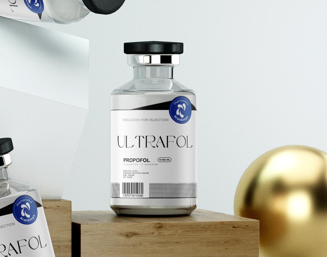
The contents of this substance, which is an anesthetic and is used in the operating room, causes people to sleep, which means relaxation, and the color of relaxation is blue, and because after anesthesia, the person regains consciousness, which means life, so I used the circle shape, which symbolizes There is rotation and life, and in the writing of ultrafol, I used breaks in the writing and took the writing out of the normal state, because when this material is used for a person, that person goes out of the normal state, so I made this short disconnection. I showed it with this fracture, and if you pay attention, behind the circle shape, I have used a black triangle, which is of neutral colors, which means that when this material is used, the soul is almost separated from the body and takes a vertical course. I used a triangle shape to show the upward movement.
Because this product is a specialized product and has medical uses, it is very sensitive and the specifications of the drug should be seen at first glance so as not to cause the doctor to make a mistake. use of white color to background and black text enough to read completely at first glance, and also use the least possible color on the label because this product is for one-time use, so it should be printed as well with the lowest price.
In this design, it has been tried to work on the label based on the trends of the day in Europe and the world, which is completely minimal and simple with the least color available in the design and only with typography, and the label has been tried to have its own style and not at all. Build your own branding identity!