Hanisul is a product that reinterprets the wisdom of traditional Korean medicine and the benefits of nature in a modern way. As a skincare brand inspired by Korean tradition and the aesthetics of nature, Hanisul has developed a unique identity that can solidify its position in the market.
Approach Process
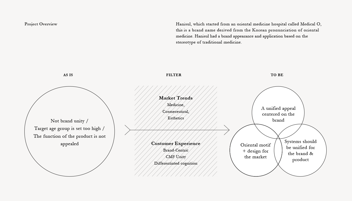
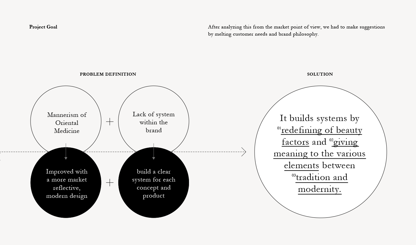
The need for a design that reflects the trends of modern cosmetic brands while maintaining the concept of traditional oriental medicine has emerged. Therefore, after observing the brand’s market and re-deriving keywords that fit the existing philosophy and defined brand values in line with the current market, we proceeded with the design.
Brand Identity
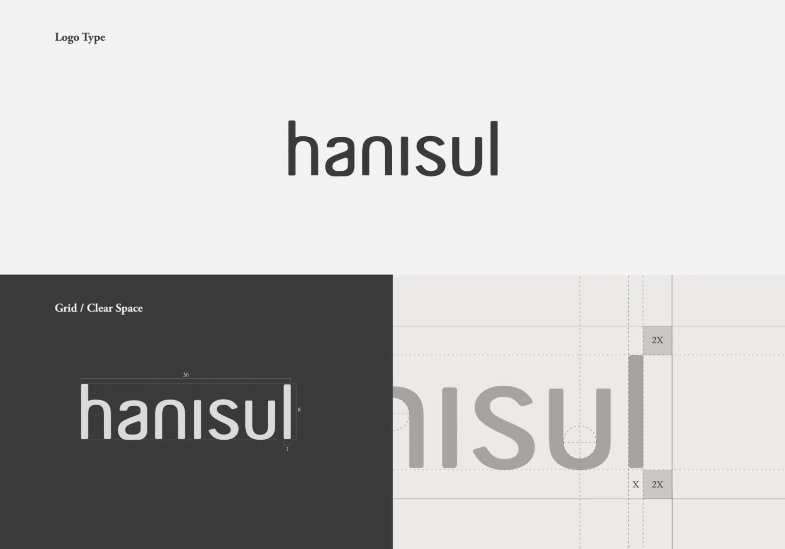
To prevent fading of the originality of Hanisul, which is a modified oriental medicine, we used a font in a form that is not excessively slanted, and designed Hanisul’s unique brand identity by actively utilizing left-right symmetry and curves that emphasize the harmony of yin and yang.
Graphic System
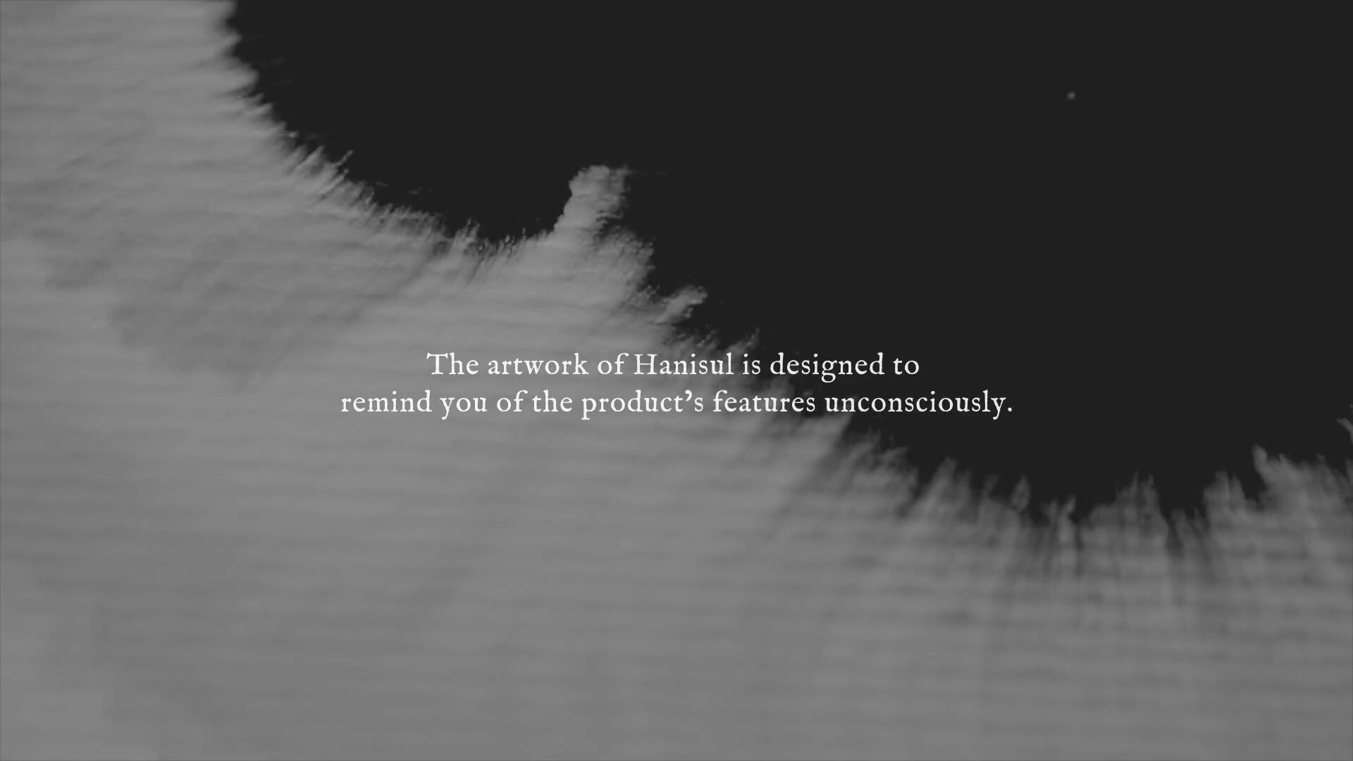
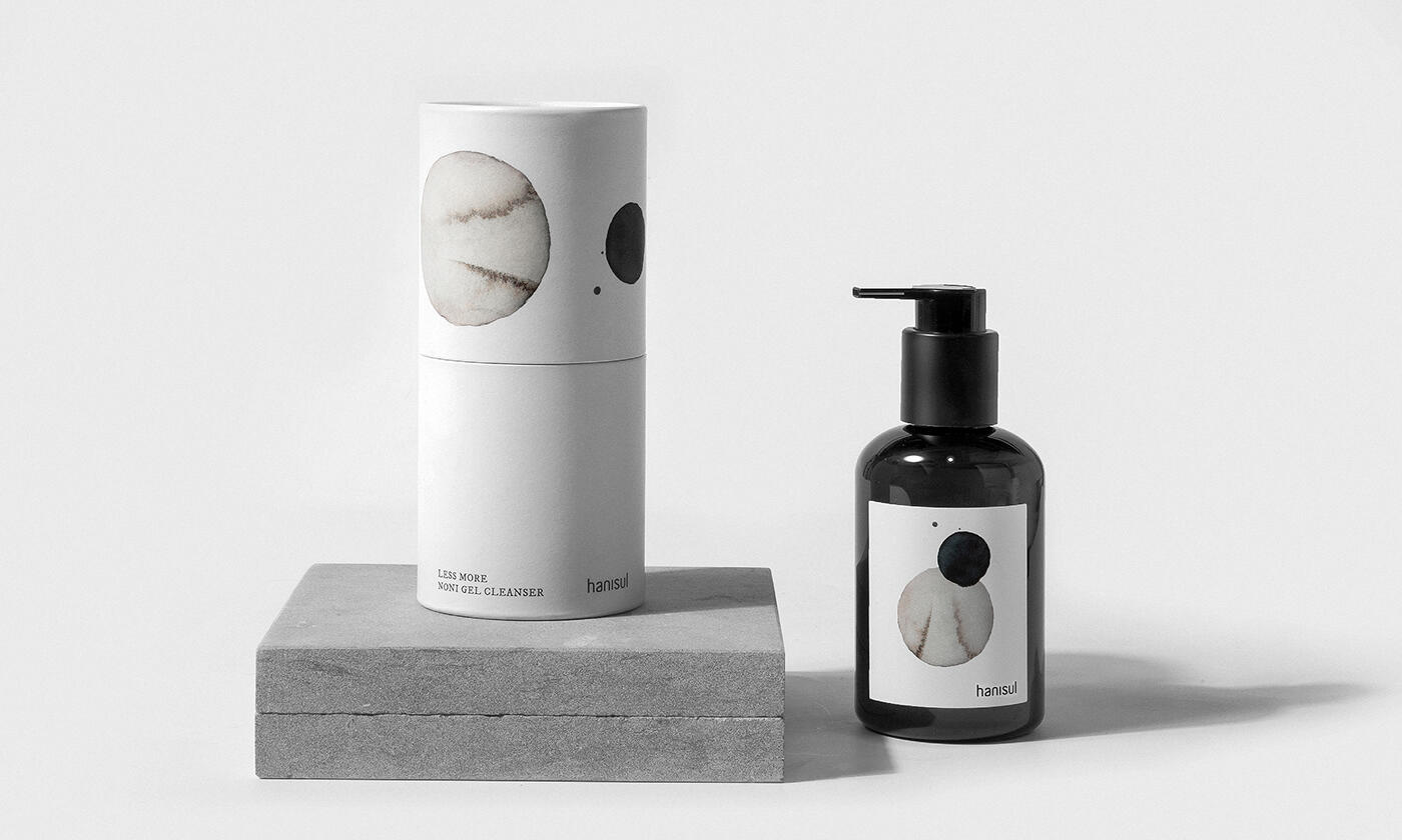
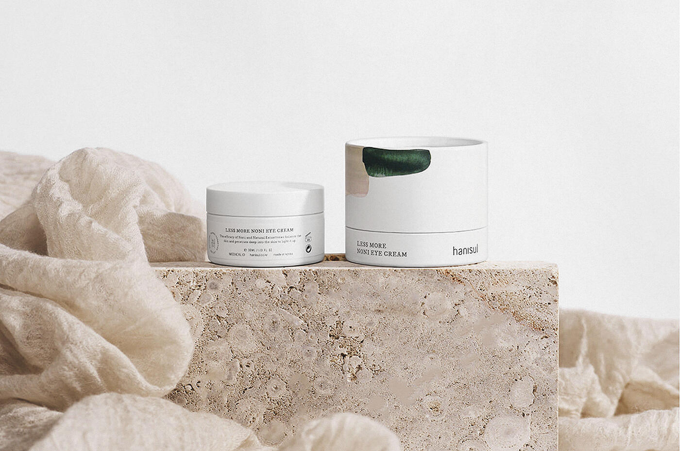
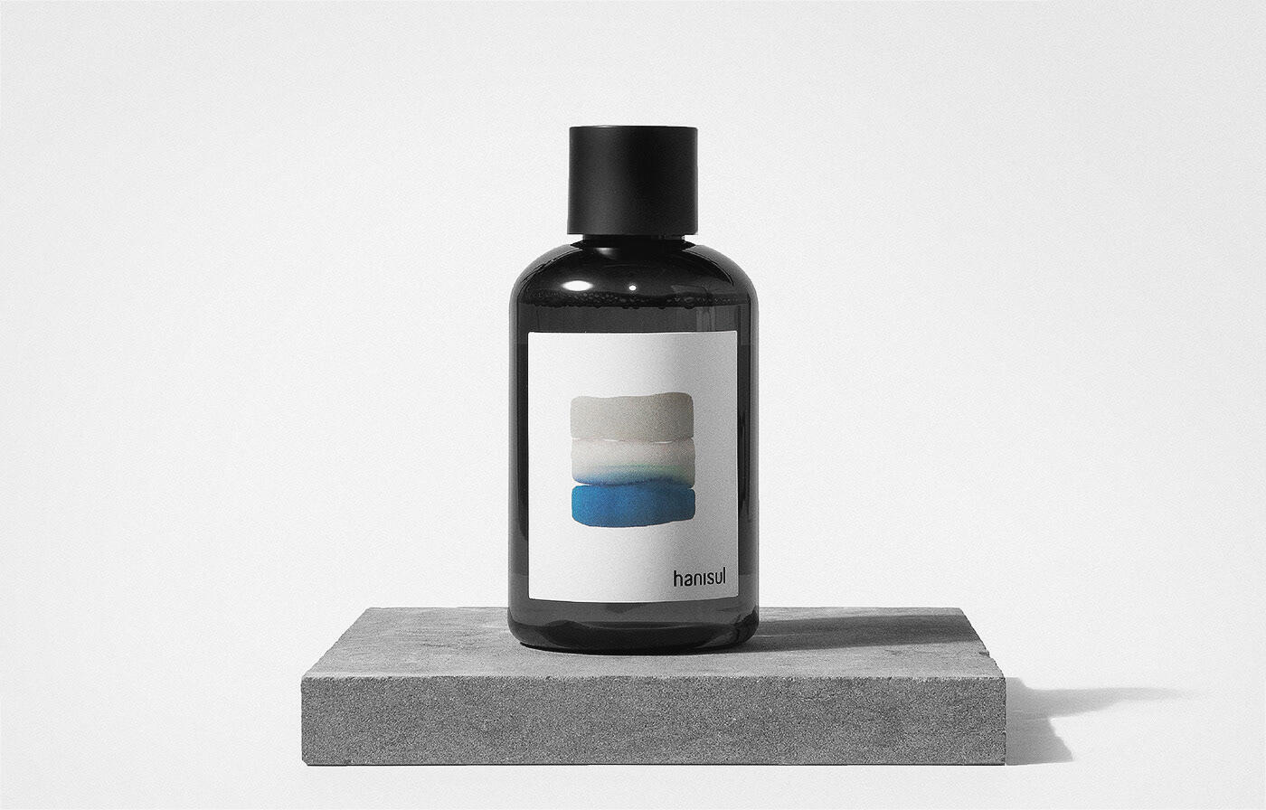
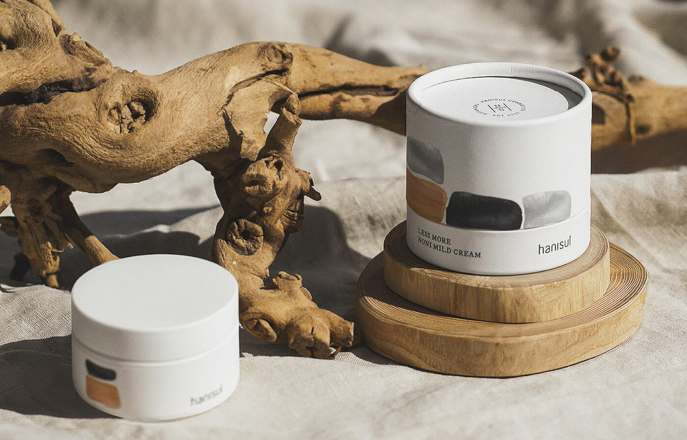
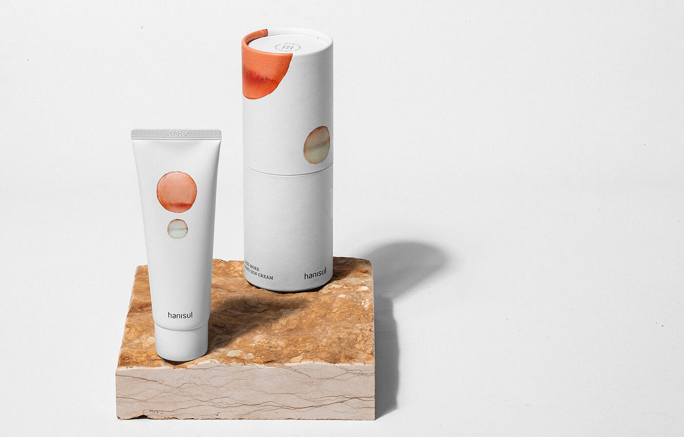
Based on yang, which symbolizes day and yin which symbolizes night, we set a color palette that is used throughout Hanisul. In addition, we designed artworks that can express the effects of the formulation on the skin differently by combining or using various brush-touch shapes to give differentiation to each item.