Branding and packaging design for Olivia Olive Oil, a premium line of olive oils, produced in Methoni, Messinia Greece. They produce high-quality and one of the finest extra virgin olive oil. In order to export their product to the global market they proceeded to a new special packaging. The guideline of the brief was focused on the harmonious coexistence of modern design that the market requires with the traditional character.
Logo Design
For the design of the logo, we relied on a drop of oil and inside an olive tree branch.
Typography
The following fonts were selected to accompany the logo on the corporate identity, packaging, and forms throughout the project.
Color Palette
As a color that represents the logo and the entire corporate identity of the company, I chose a dark olive shade that matches the color of olive. I still use white, black, and gold in my corporate identity. White expresses purity, low weight, and low fat. Black is considered very formal, and elegant and gives prestige.
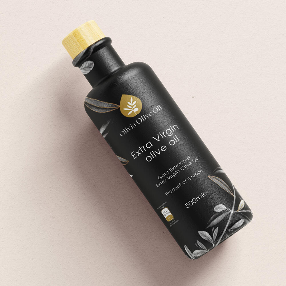
Packaging Design
The minimal approach of the logo favors the relationship between the purity of the product, its character of selected olive oil, and the craftsmanship and care that one wants to communicate. We used a black label with olive branches and a sans-serif font. Finally, applying it to a bottle with a special shape gave the overall package a modern feeling.
Web Design – Social Media
We designed a minimal website where anyone can still find the products and order them at their place. We also designed social media materials.