Agroeco – fundamentally honest meat!
Agroeco is one of the largest pork producers in Russia, which has been producing safe and environmentally friendly products since 2009. Agroeco is a full-cycle agro-industrial holding. The structure of the holding includes a crop cluster, pig breeding complexes, feed mills and the most modern meat processing plant in the country.
Task
To redesign the consumer packaging of TM “Agroeco” (including the logo) based on 2 products (sausages in a tray; neck steak in Skinpak format).
Solution
First of all, an audit was carried out according to our Three Layers of Efficiency methodology, which helped to identify weaknesses in the current design: the invisibility of the logo, the need to refine the food zone, adding more attractiveness to it, and the low efficiency of the contextual layer. It was important to refine the conversion: highlight more product benefits and reflect the positioning of the Agroeco brand.
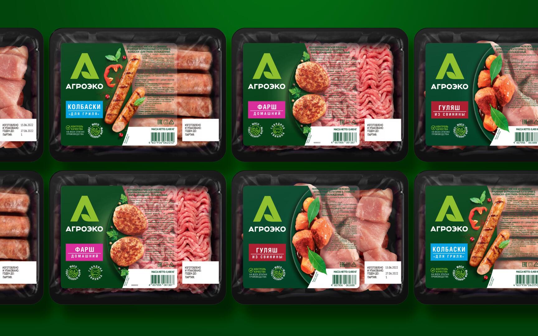
In the previous case, we talked about the new identity that we developed for the company. The design is based on the corporate dark green color, which is clearly identified with the Agroeco company and ensures the monolithic display of products on the shelf. The new logo in the form of a large letter “A” helps to capture the attention of the consumer on the shelf.
We use two types of stickers, opaque – for basic products (minced meat), stickers on a transparent basis – for premium products (steaks, sausages).
On the stickers there is a food zone with a ready-made dish to whet the appetite of the buyer. Colored shapes with category designation (grilled sausages, goulash, ham, steaks, cutlets on the bone) add contrast to the package. More marginal products come in a tray with a cardboard liner for a more premium look. The packaging architecture is made according to certain canons: an ellipse layout is used, which is located vertically to the right of the brand block with the letter A and a demonstration of the food zone.
The hallmarks of “quality control at all stages” and “meat from our own farms” help to reveal the company’s positioning – “fundamentally honest meat”, an honest approach to the product and production.
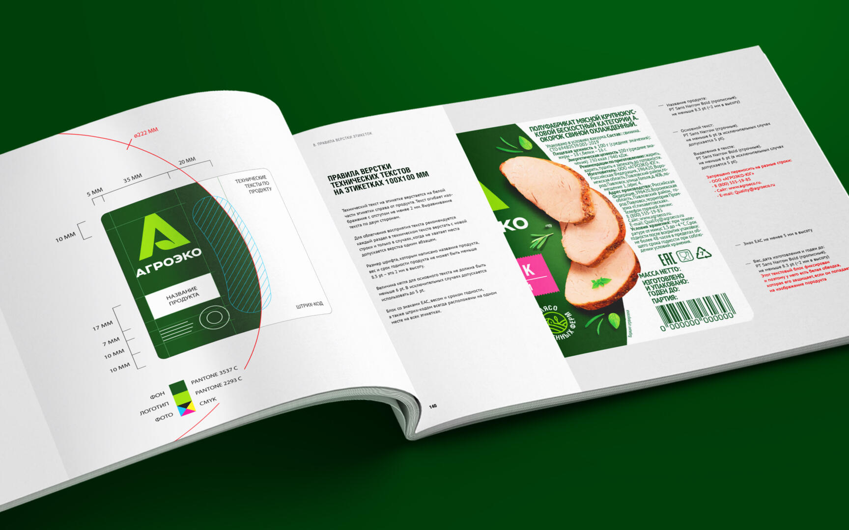
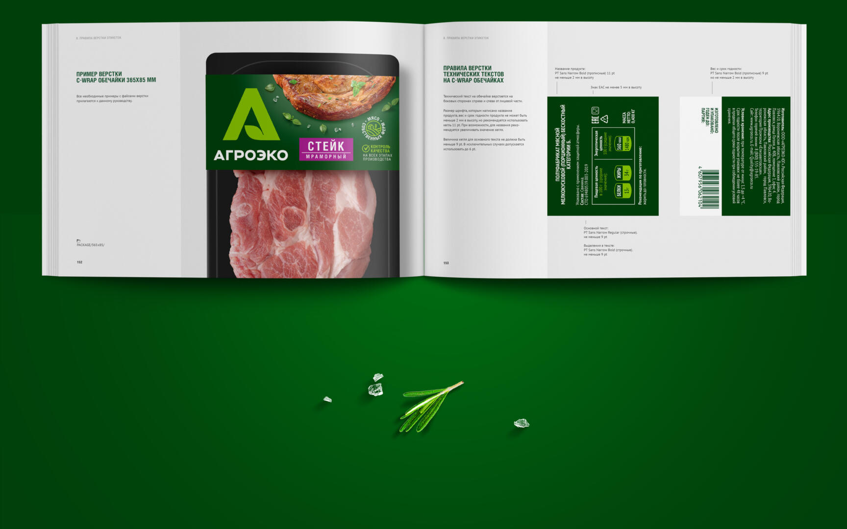
In addition, we developed a brand book, which describes in detail the layout, proportions, fonts, and also gave detailed comments on how to work with the food zone so that the company’s own designers could further adapt the design to other product lines and create labels according to a single standard.