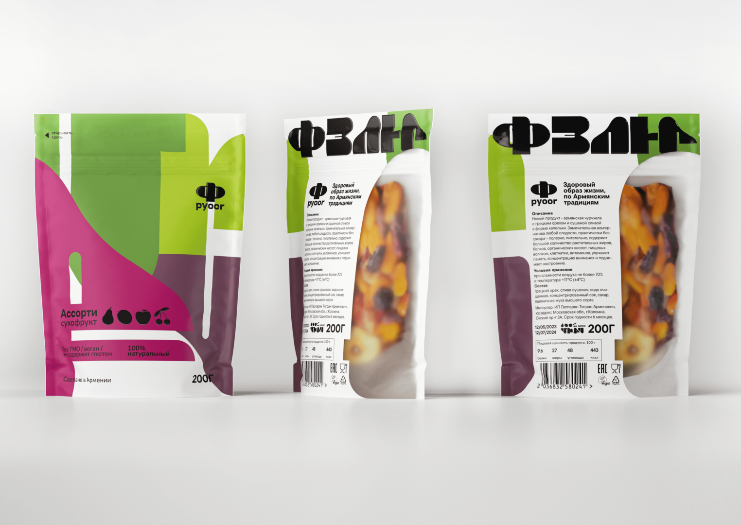
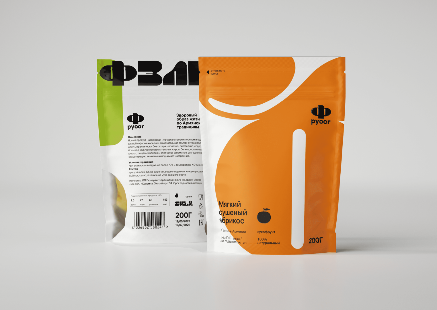
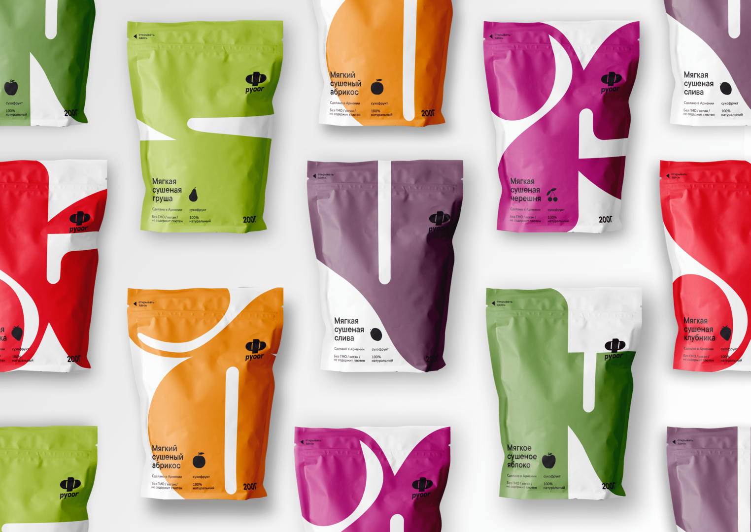
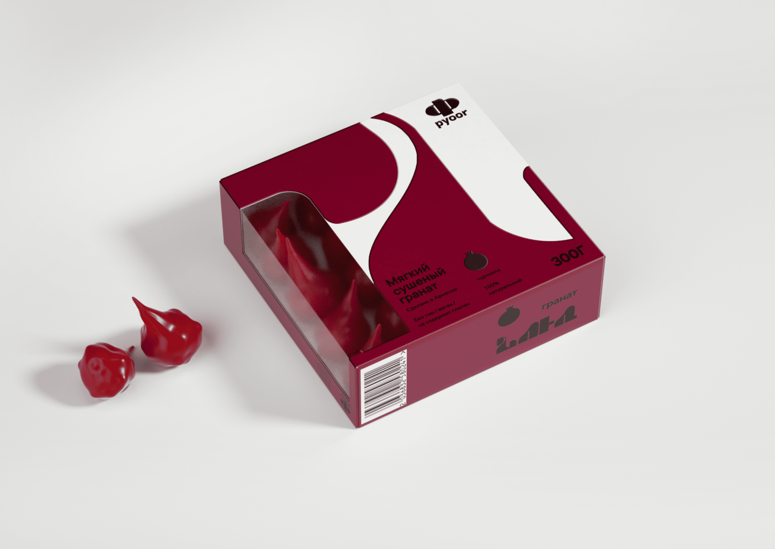
Brand Pyoor is engaged in the production of Armenian dried fruits, churchkhela from natural products. The production shops are located in Russia and Armenia. The product offers a healthy alternative to sweets, with virtually no added sugar. Since the products contain only natural ingredients, they are suitable for PP, fasting, vegetarians, and vegans.
Task: Enter a new market to stand out on the supermarket shelves from competitors.
Solution: Among competitors, the brand should stand out with its local, ethnic origin in order to show all the sunshine and brightness of Armenia
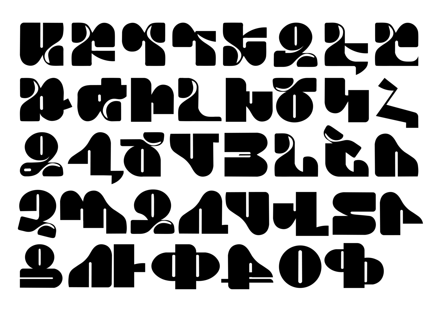
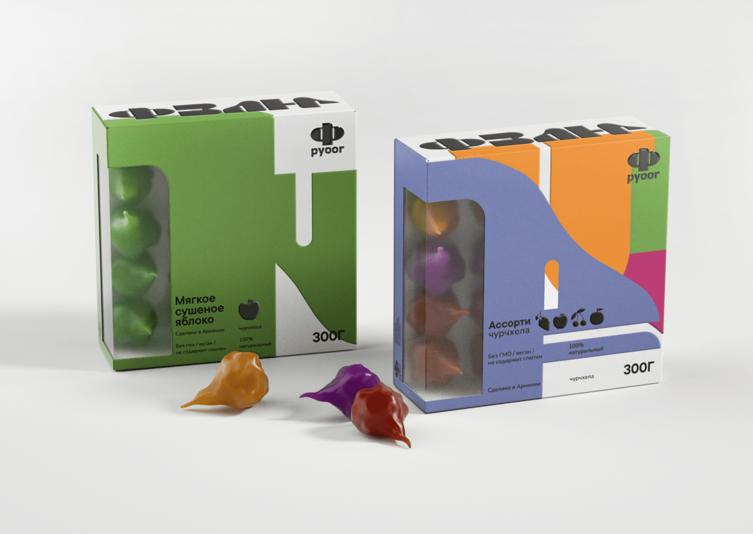
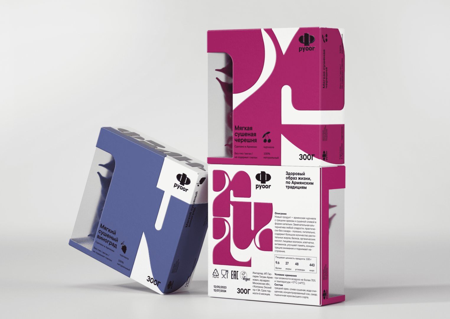
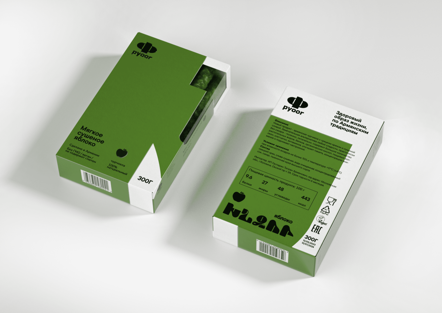
Idea: To emphasize the Armenian origin of the brand, it was decided to create an original stylized Armenian font, with the help of which we will convey the character of the brand and its origin
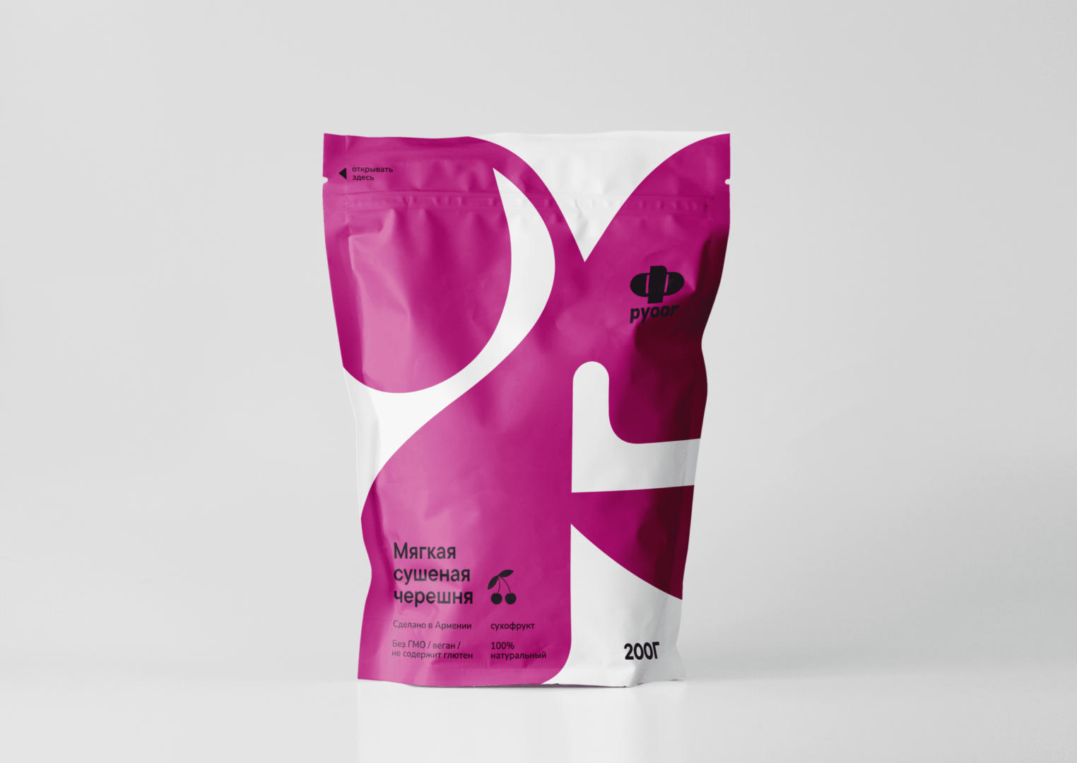
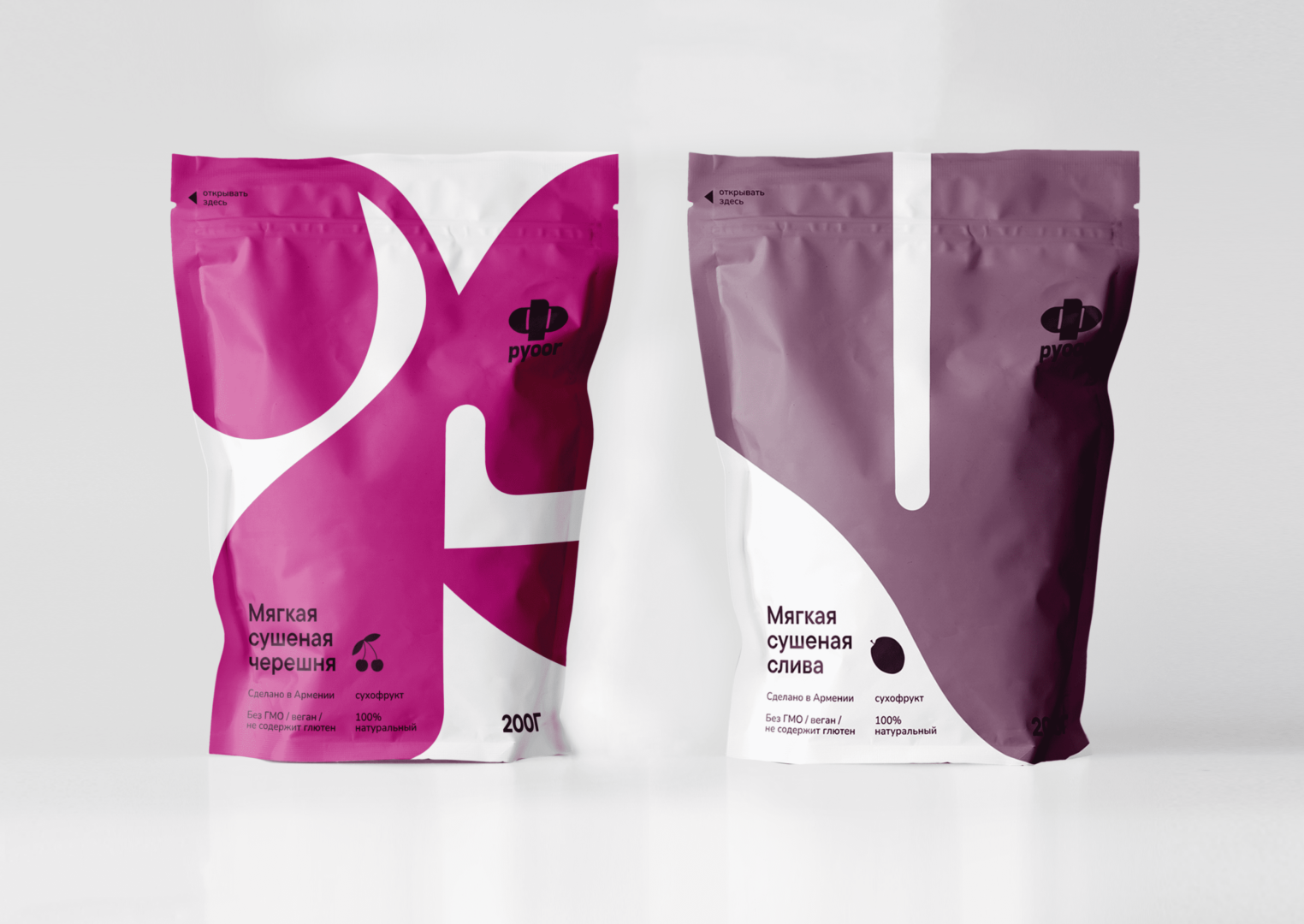
The meaning of the brand name Pyoor was taken from the word pure’s transcription, which shows the product’s healthiness and cleanness. The Full name of the Armenian Capital letter “P” which is on the logo is, “Pyoor”. Each package displays the first letter of the taste and color.
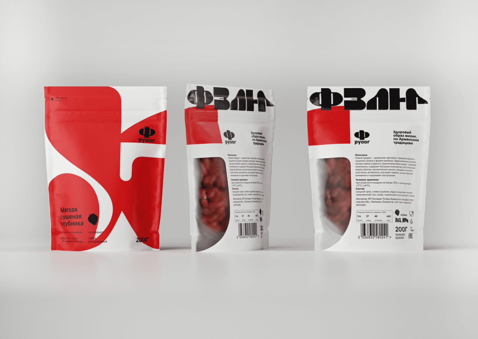
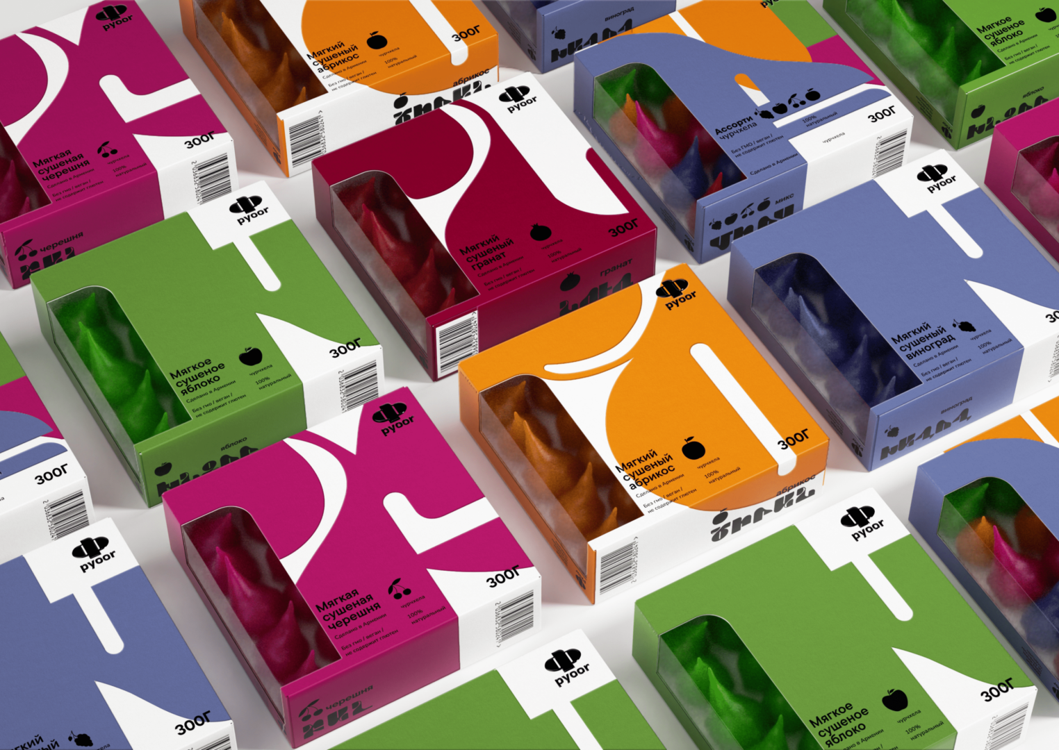
Products are presented in 4 different SKUs and each of them has 5-6 flavors and one mix where all flavors are present. Each package has a transparent window that allows you to see the product.