Agency: BULLET Inc.
Designer: Aya Codama
Project Type: Produced, Commercial Work
Client: Imayotsukasa Sake Brewery Co. Ltd.
Location: Niigata, Japan
Packaging Contents: Japanese sake
Packaging Materials: White porcelain bottle, Paper
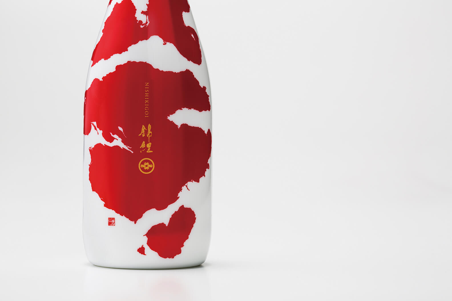
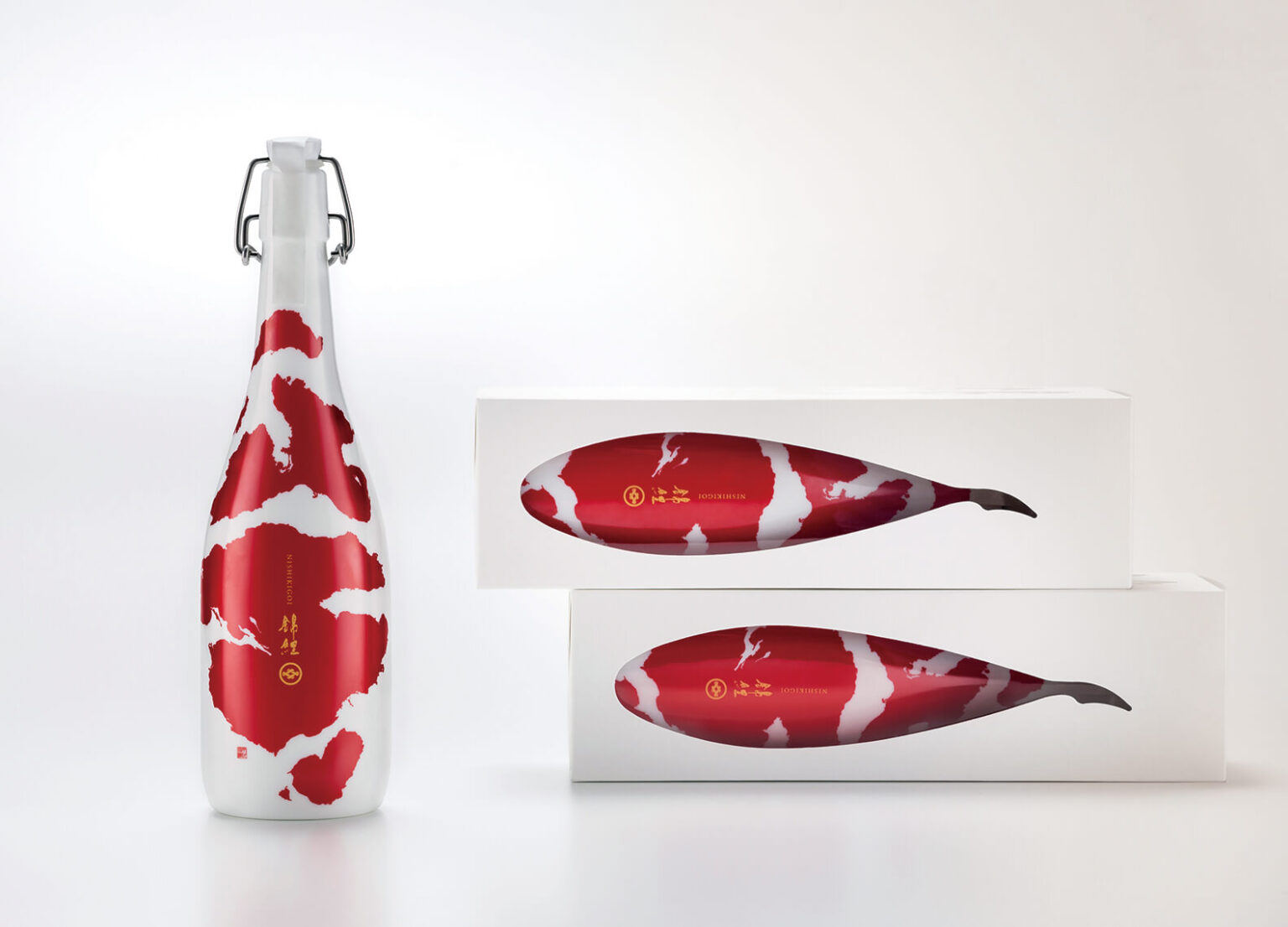
This package is for Japanese Sake, which is called “KOI”.
The “KOI” is a vividly patterned ornamental fish that represents Japan (“KOI” is also known as “Nishikigoi”). “KOI” is ornamental carp that have beautiful colored markings on the spindle-shaped heroic body. They can be defined as inedible carp that have admirable figure, markings or colors. Also they are known as a “living jewel”. In 1918, first “KOI” was born in Niigata Japan where the Imayotsukasa Sake Brewery has their brewery.
In past times, when Japanese sake was shipped in barrels, breweries would often dilute their product with water before selling it to liquor stores. The stores would then add more water when selling it to consumers. People dubbed such sake “goldfish sake”, implying that it had become so watery that goldfish can swim in it.
But it is said that even in those times, Imayotsukasa Sake Brewery, the producer of this sake, never added water to its product, much to the delight of the liquor stores.
“Imayotsukasa Sake Brewery is not a little ‘goldfish’ but a majestic ‘koi’.” This project started with the ambition of creating a majestic sake that manifests the values of Imayotsukasa Sake Brewery.
What’s Unique?
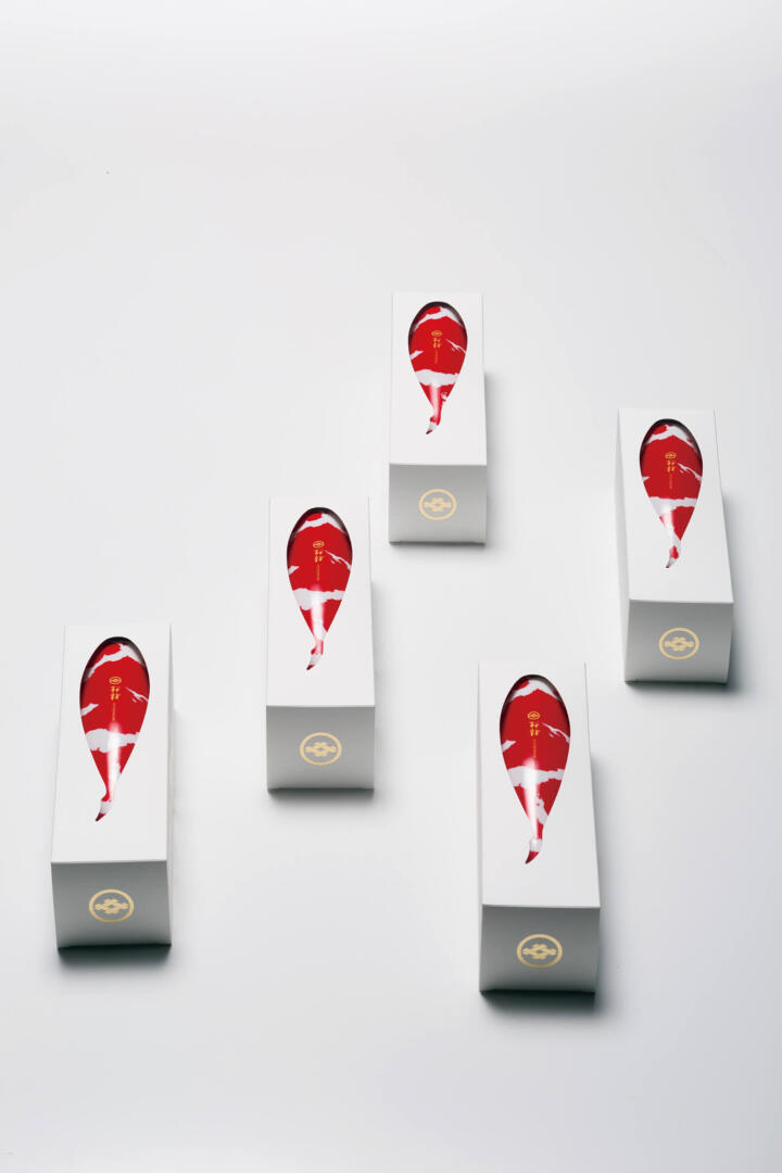
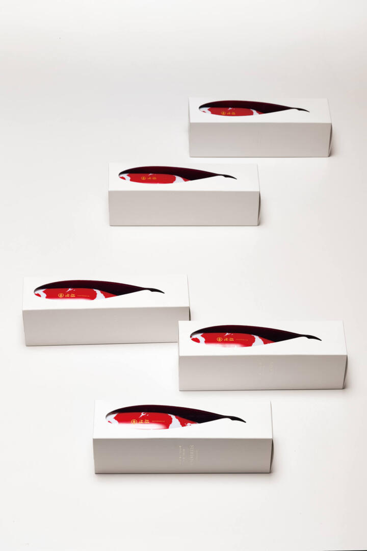
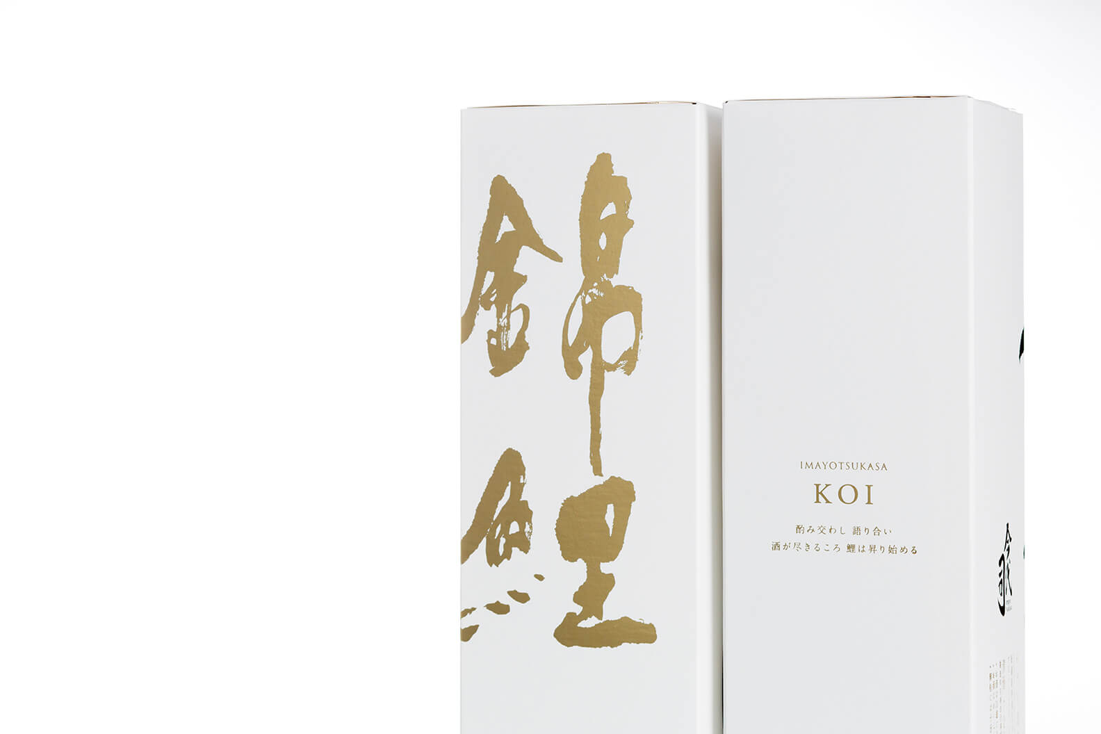
Likening the white porcelain bottle to the shape of a “KOI”, we graphically applied a “KOI” pattern to the surface of the bottle. The package is complete with an outer box, which has a KOI-shaped window to make the display even more appealing.
The target will be the people who don’t drink sake daily. Because “KOI” has unique bottle appearance it is able to appeal to the people who don’t drink Sake much. Of course Sake lovers are also our main targets.