Design: Loonatiks Design Crew
Location: Greece
Project Type: Produced
Client: Keep it Wet
Product Launch Location: Greece
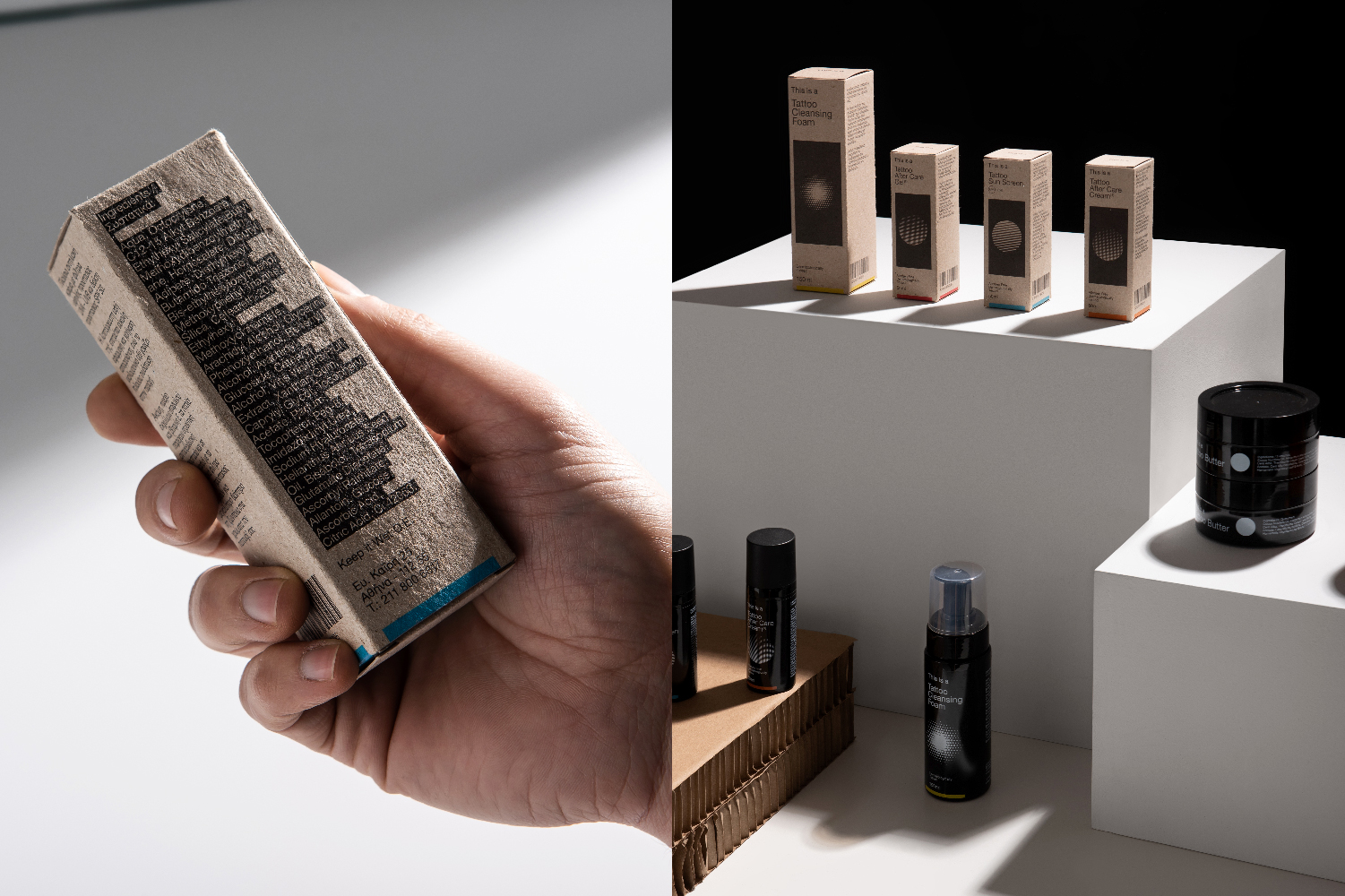
Packaging Contents: Tattoo After Care Products
Packaging Substrate / Materials: Plastic, Paper pulp
Printing Process: Digital, Offset
Keep it Wet has assigned us the naming and designing of their new range of tattoo after care products.
The challenge was that their products are understood even by fools… SURPRISE !!!!!!
Putting aside the stereotypes of fool consumers and keeping the essence, we saw that they needed a name that communicates directly with obvious ways the properties of their cosmetics.

Analysing the word:
obvious
/ˈɒbvɪəs/adjective
easily perceived or understood
clear, self-evident, or apparent.
predictable and lacking in subtlety

We decided to name it “This is a” and let typography to do the job, to communicate the message, “This is a Tattoo After Care Cream”, “This is a Tattoo Sunscreen” and so on.
Subsequently, each product has a circular raster that visualises its properties. For example, in sunscreen, the cycle works like the sun and the raster blocks it; in the after care creams, the rasters gradually diminish and lose, in order to show the healing process that comes from the systematic use of the product, in the cleaning foam we show the foam that comes out of the pump when the consumer pushes it, while in the cleaning soap used by the tattoo artists we give a diagonal motion to the raster with reference to the movement they make when they wipe the tattoo, finally the butter clearly shows the product when someone opens the package, a white circle that has a dense composition.
Finally, at the back of the package we decided to highlight the ingredients just like we do with our cursor in order to indicate a point of interest.