

Design: Lewis Moberly
Location: UK
Project Type: Produced
Packaging Contents: Pet food
Lewis Moberly celebrates DBA win by announcing design that has taken the U.S. pet food market by storm
International brand design agency Lewis Moberly, along with the Partners of Honey I’m Home, today celebrate their DBA Design Effectiveness Award by unveiling their award-winning work: Honey I’m Home! – a range of dog treats that, in just 16 months, has transformed the by-products of India’s village buffalo farmers into a range that has taken the pet food market by storm. In awarding Lewis Moberly, The DBA judges recognise the remarkable business achievements of the design.
Mary Lewis, Creative Director at Lewis Moberly, commented: “In the highly-sophisticated and technologically-innovative $24.6bn US pet food market, the business challenge was to find a way in which to make the low-tech by-products of India’s meat industry – lungs, tracheas and ears for example – and use them to create a new brand capable of becoming a significant, top-tier player.”
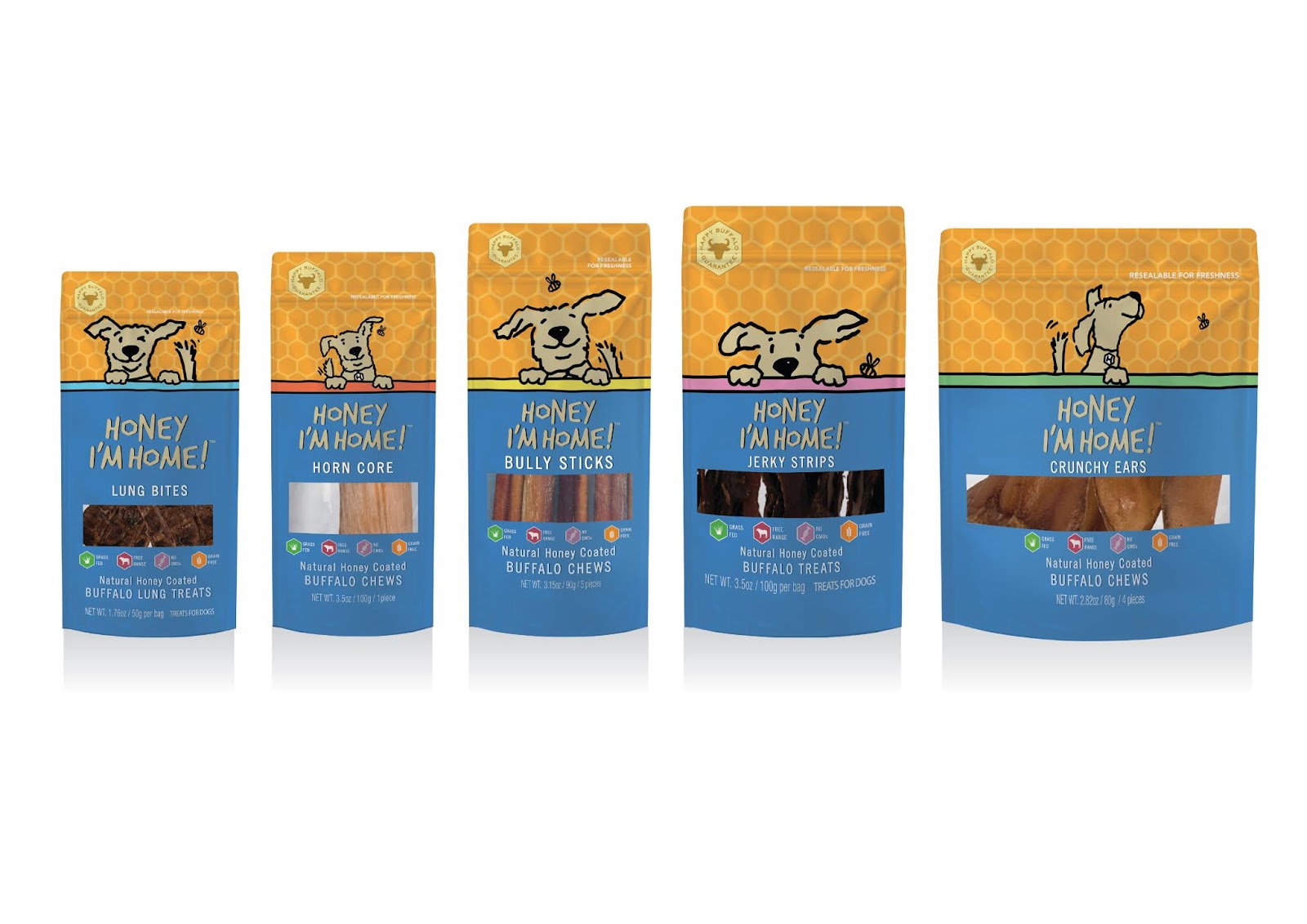
Lewis Moberly’s strategy and design team worked collaboratively with the four-person startup client team, to build a brand from scratch; the clear objective was to conceive a visual identity and packaging design that emotionally connected and resonated with dog owners, whilst sustaining a significant price premium over similar products.
Starting from the market insight that consumers welcome products that give them a closer, more ‘natural’ bond with their pets, and that many value their animals almost as much as their children – with cat and dog owners talking of themselves as ‘pet parents’ of ‘fur-babies’ – Lewis Moberly elected to anthropomorphise the brand, creating a ‘lovable rascal’ cartoon dog called ‘Honey’, inspired by the honey-based coating used on the treats.
‘Honey’ is brought to life in a series of illustrations, one for each product line, capturing the movement and playful energy of man’s best friend. Prominent use of symbols that underscore the naturalness of the product are used throughout – from the cartoon bee and honeycomb pattern that provides a vibrant backdrop design on pack to the “Happy Buffalo Guarantee” marque and series of icons that denote the “grass fed”, “free range”, “no GMOs” and “grain free” benefits of the treats.

“Emphasis on the naturalness of the product was an important part of the overall design approach. Today’s consumer is more health aware and socially conscious. The burgeoning market for natural products across all categories (from beauty to pet care) is testimony to this. For this venture, one of the benefits of small-scale Indian village farming is that it’s pre-industrial. It was free-range and hormone-free long before those terms were invented – making this new brand perfectly placed to speak to the concerns and sensitives of today’s pet owners”, Warwick Cairns, Strategis Partner, Lewis Moberly, commented.
“Honey I’m Home!” captures the emotive connection between human and dog – typically played out whenever a pet owner walks in through the front door and is met with much unbridled enthusiasm and joy by their beloved pet. It’s a dynamic, warm and reciprocal relationship kept alive by shared moments and the rewarding of treats.
The logotype, also delineated with a spontaneous feel, further echoes the ‘natural’ theme, with the hexagonal ‘o’ in ‘Honey’ and ‘Home’ fashioned to reflect both the honeycomb design and the ‘face’ of the brand itself – Honey the dog.
Honey I’m Home! has since achieved distribution in over 1,000 outlets and online retailers, achieving zero to quarterly sales of almost $1/4 million in just 16 months.

“The odds were heavily stacked against an unknown startup building a successful pet food brand using the leftovers India’s human consumers didn’t want. The winning formula therefore needed to have both emotional and rational components. Rationally, it drew attention to the honey coating and natural provenance to distinguishing it from similar, cheaper, unbranded treats. Emotionally, it made a deeply unglamorous product like ‘lung bites’ feel friendly. Starting from zero awareness and running counter to industry trends, brand design was essential to the team achieving and exceeding their business goals,” Warwick Cairns, Strategy Partner, Lewis Moberly, commented.
Lisa Momberger, Co-Founder and CEO, Honey I’m Home!, commented: “Being only a young brand, we were definitely surprised by the traction we’ve gained in such as short amount of time. With the name and the cute packaging, people say our brand feels familiar, like they’d heard of us before. People are also really drawn to the colours and to Honey the dog. They love the playfulness of the packaging; they say it makes them smile and feel happy.”
Lewis Moberly’s Honey I’m Home! brand design has won a DBA Design Effectiveness Award and is shortlisted for the forthcoming The Drum Marketing Awards.
