Design: SoCity – Creative Space
Location: Italy
Project Type: Produced
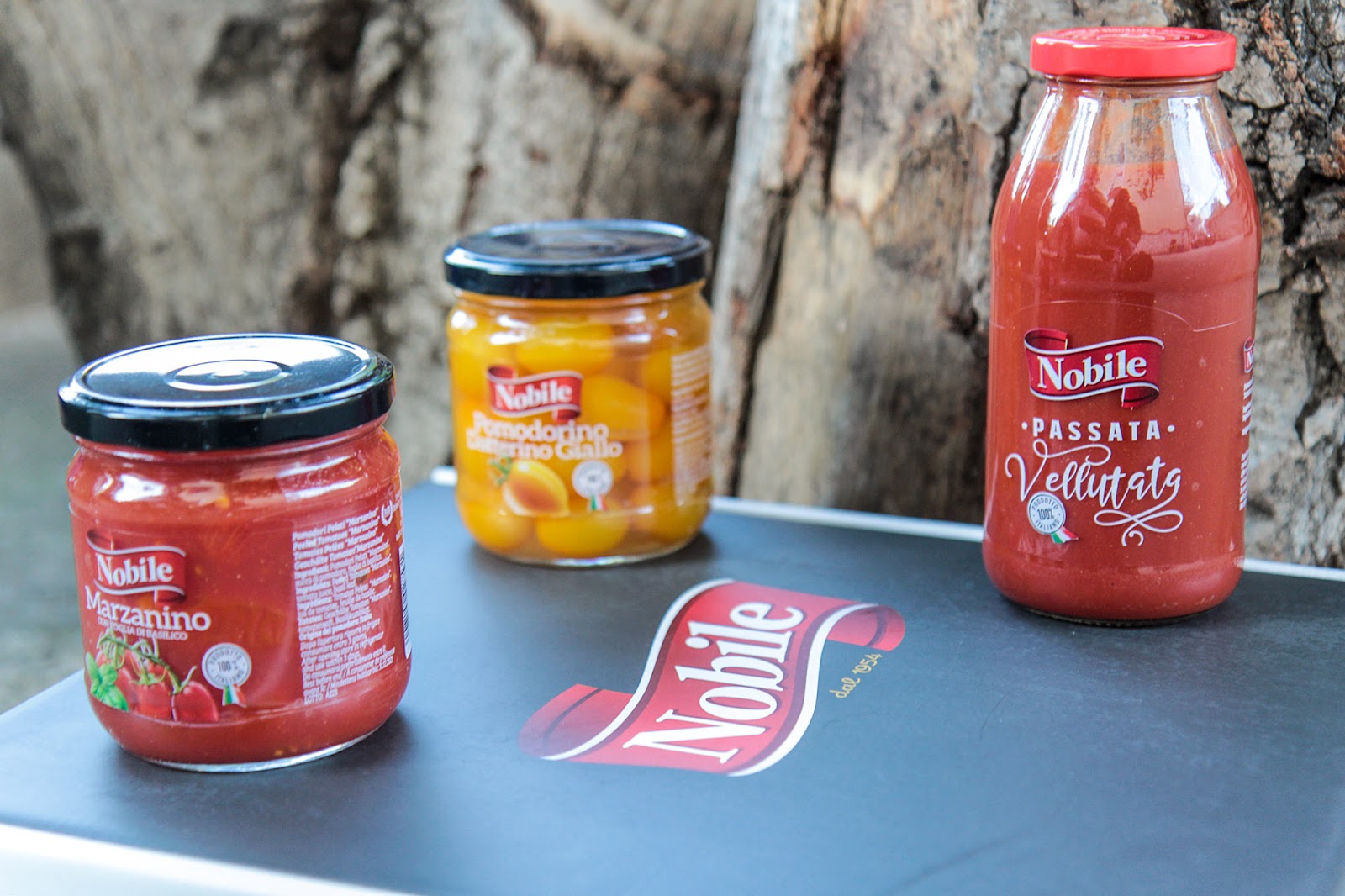
Client: Nobile Pomodori
Product Launch Location: Italy
Packaging Contents: Canning products – tomatoes, preserves
Packaging Substrate / Materials: Cardboard – microwave
Printing Process: Digital printing
In addition to the large sales channel dedicated to large-scale distribution, the Nobile company also sells on its e-commerce channel with a small assortment of excellence. Food packaging made with personalized illustrations is designed as a special gift for a loved one, a welcome gift for a customer or supplier.
Structure, functionality and aesthetics
In fact, the packaging contains a selection of the best Nobile products, such as marzanino and yellow tomato packets. Therefore, in the construction phase, considering the weight, the main input was to create a stable and robust structure. For this reason, a microwave coupler was used which allowed us to obtain a resistant box suitable for transport. The wolf’s mouth opening of the packaging was also designed to ensure greater stability to the products. The side risers that fold back on themselves, on the other hand, double the thickness of the sides, preserving an interesting design and user experience. Telling a story by exploiting every single centimeter of the pack, embellishing it with drawings and illustrations contextualized to the sector and the territory. Imagine, design and create unique experiences for the consumer. All while respecting and always preserving the functional aspect of the box.A visual representation of the company and its values
During the briefing phase, the customer’s desire emerged to have a box in which the customer could arrange different types of tomato preserves, to give as gifts and to compose, according to preferences. In short, we wanted to tell the story of the Noble tomato. But how to do it in an exhaustive way in the limited space available on a box? We did this by designing an illustrated “sequence shot”. The sequence shot is a cinematographic technique that consists in the modulation of a sequence – an autonomous narrative segment – through a single take. All seamless, generally quite long. By applying this concept to the illustration, we have created a single illustration that runs on three sides of the Nobile packaging.Cultivated fields in the first scene, depicting two farmers sowing and working the land with the care and attention of the past. We then move on to the second, where we draw the tomato harvest with the Castle of San Giorgio in the background, the symbol of the company’s hometown. Finally, in the third illustration, where the architectural elements represented contextualize the scene in the municipality of Castel San Giorgio, there are the various phases of tomato harvesting and processing. All re-proposed as if made in the days of our grandmothers. This choice, strongly desired and appreciated by the company, to testify that although today the production process of tomato preserves is different, the quality and attention to the product and the consumer is exactly the same.