Tech Science produces products for nutrition and supplementation of animals and humans, using biotechnological, technological and safe processes.
People are always looking for healthiness, for themselves and for their loved ones, family members and, consequently, longevity. Tech Science aims to deliver this simply and effectively to its consumers. Science and technology participate in the health, nutrition and well-being of the individual, whether animal or human.
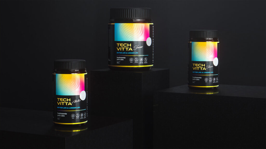
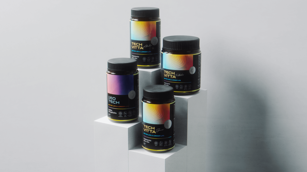
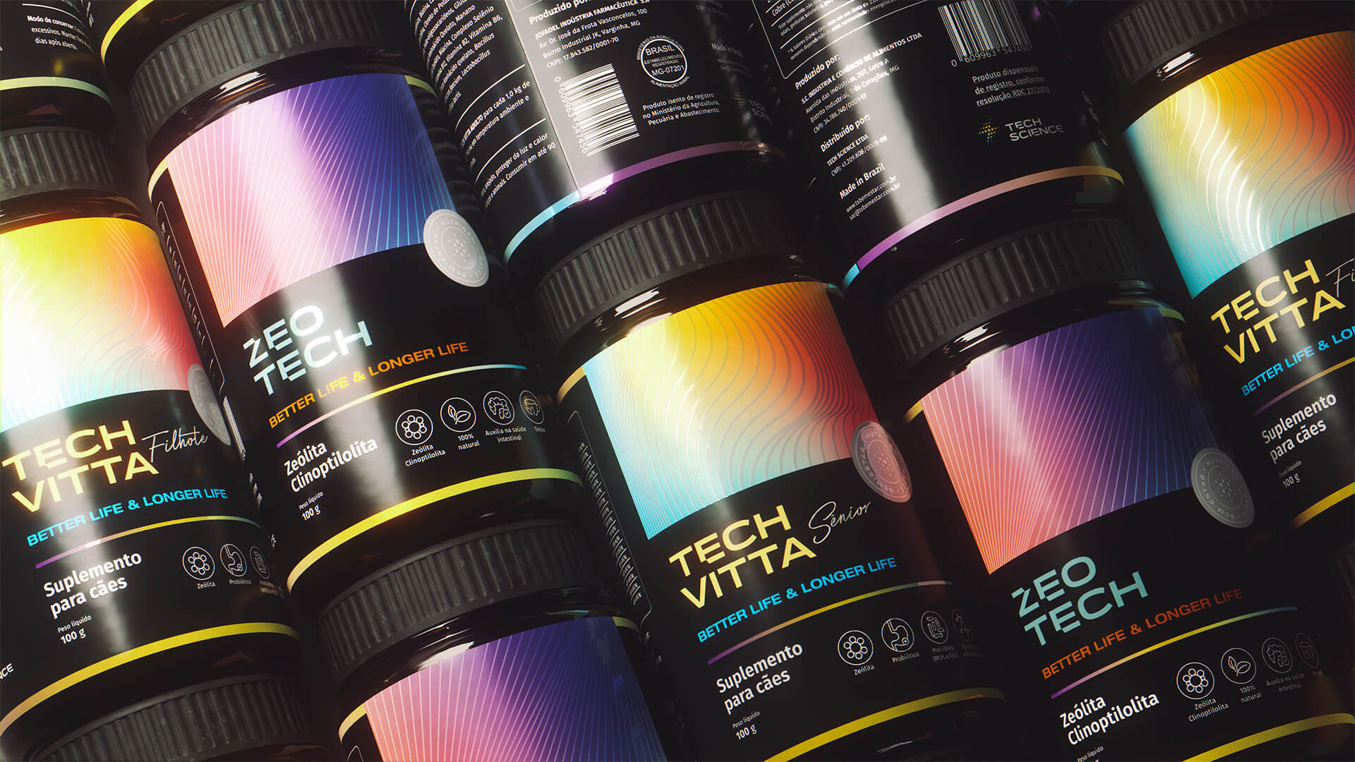
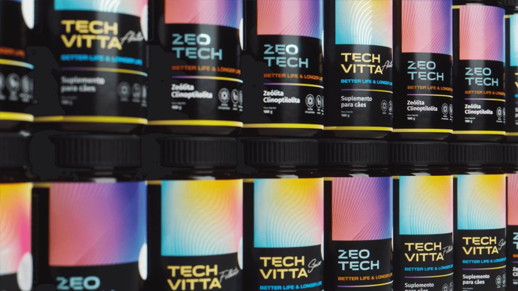
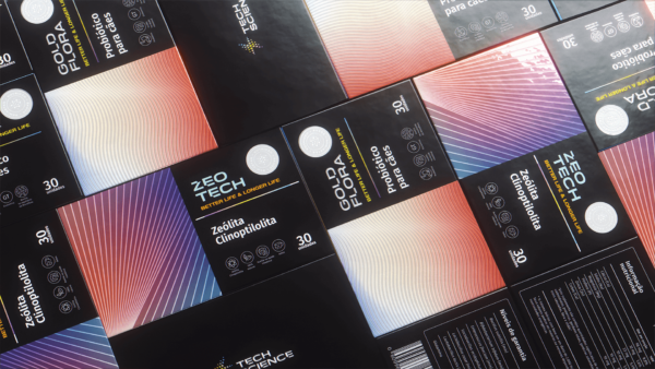
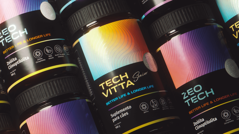
DNA is a molecule present in the nucleus of the cells of all living beings and carries all the genetic information of an organism. Based on molecular geometry, we are inspired by the fact that when a molecule is formed, the atoms are positioned in different ways, so that the spatial arrangement is more stable. Therefore, the compounds have different geometries that, applied to the packaging and labels of the various products, create an absolutely different graphic format for the brand; a strongly identifying design, which evokes the technology of the products and, at the same time, the innovative and dynamic character of Tech Science.
With that in mind, the brand was designed to be bold and exciting. The brand symbol is composed of the junctions of three elements: the ray representing energy, molecules and the letter “S”. With that, we created a symbol that represents movement in a science context. Through the main symbol, we follow the same principles for creating the symbols of the other sub-brands.