About
EazzyPizzy is a pizza, gelato, drinks and other food delivery company from the famous Russian chain of Shokoladnitsa coffee shops.
There are more than 30 pizzas, many types of gelato, soups, salads, pasta, several types of snacks, many drinks, including own-produced ones (lemonades, fruit-drinks, latte, americano, cappuccino).
A distinctive feature of the brand is the unusual variety and blending of tastes in food: sweet, salty, sour and bitter. New non-standard culinary combinations, used in different proportions, expand our conventional ideas of taste.
This product is suitable for gourmets, for those who appreciate unusual food experiences, are open to something new and not afraid to try and experiment.
Idea
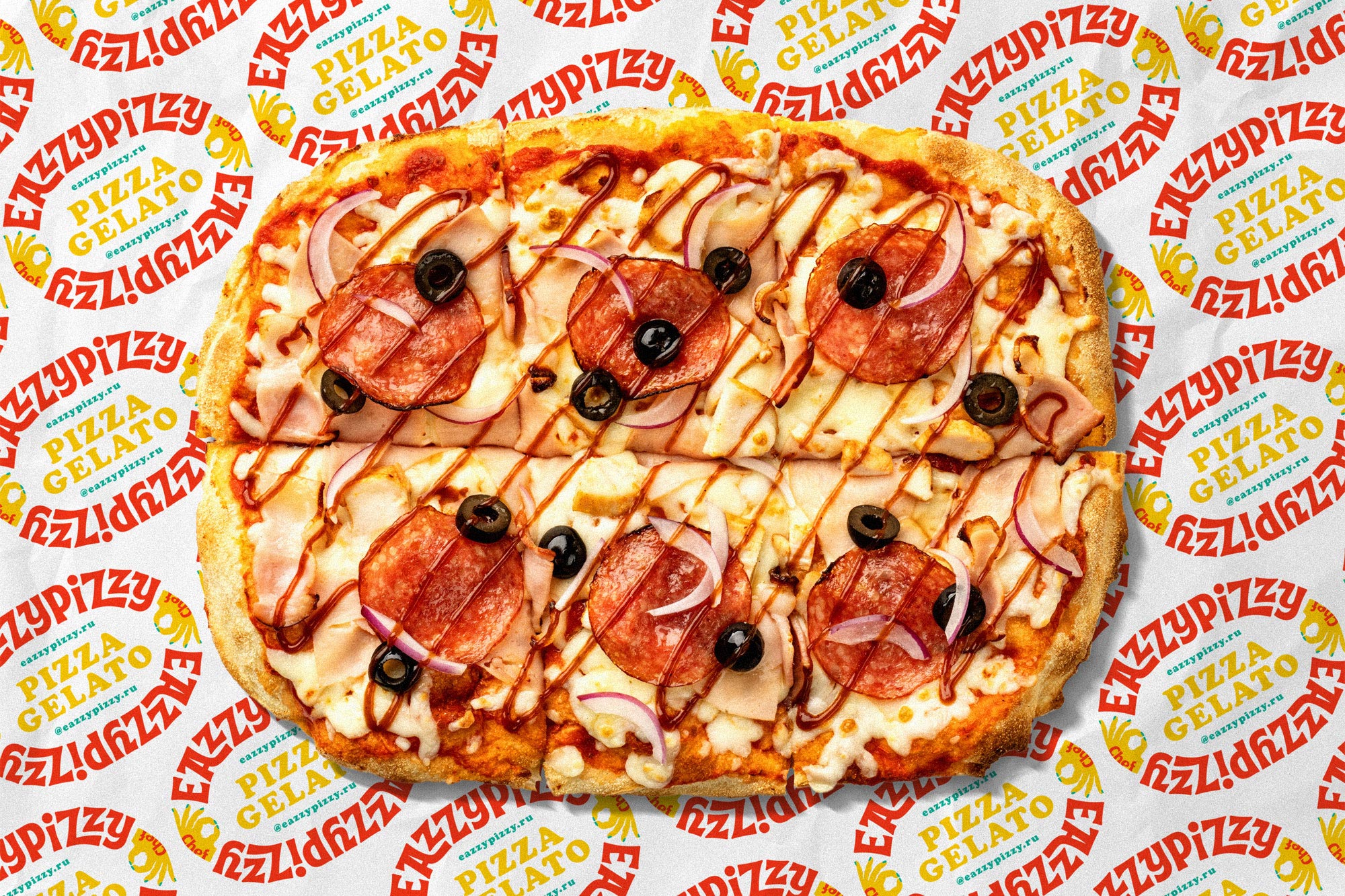
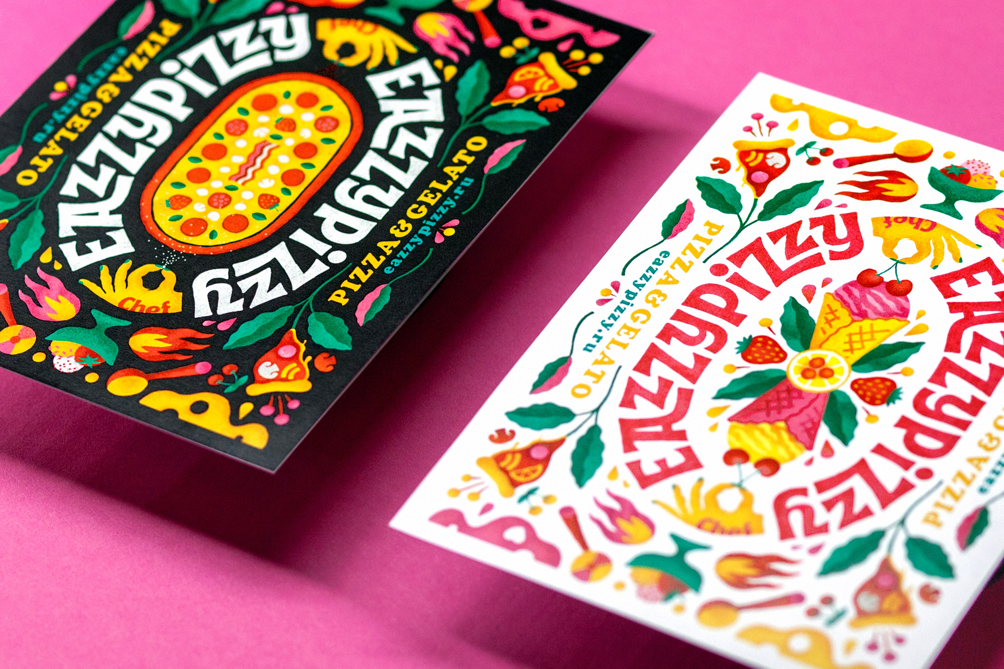
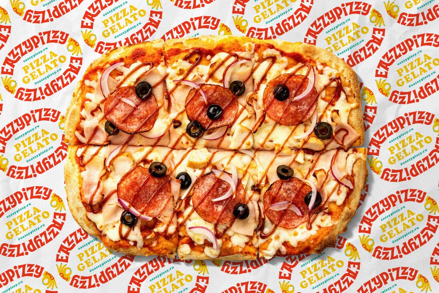
The unique nature of EazzyPizzy is represented in its variety of taste combinations. Therefore, when designing the brand identity, we used a visual technique of contrast in order to emphasize the peculiarity of the brand. The branded pattern features a piece of pizza with orange, scoops of ice cream with tomato, melted cheese and sweet cream, strawberries and salts.
—
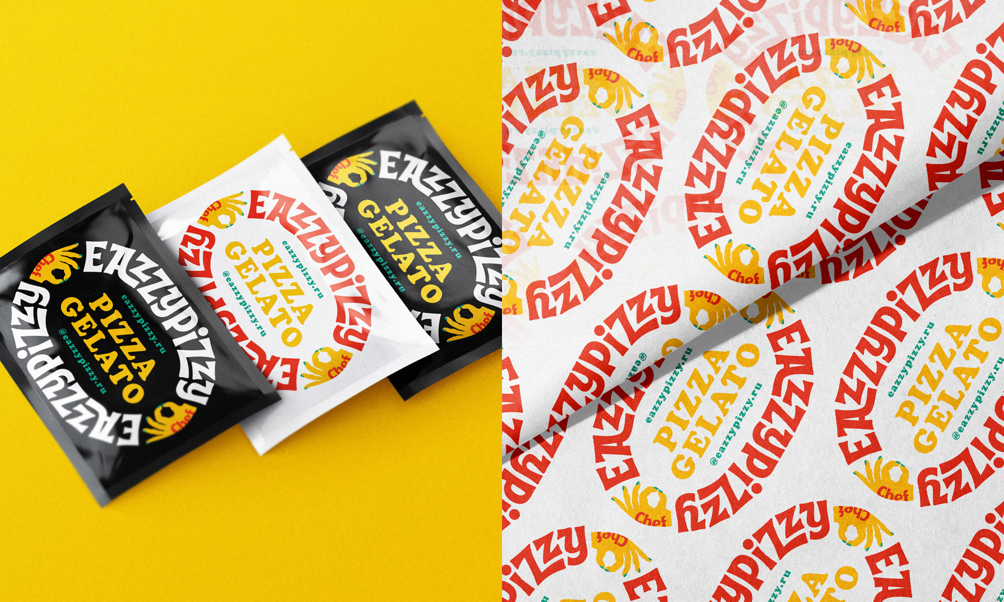
To show the variety of tastes, we designed 2 versions of the logo: the pizza logo and the gelato logo. There is also an additional simplified font version of the logo for application on wrapping paper, brand bags and other items.
The elongated logo in the shape of a “stadium” is similar to the typical elongated pizza shape.
The peculiarity of such a logo is that it is well readable from all sides no matter how you look at it. The pizza in the center is like a point of attraction, and the font looks like a group of people sitting around a pizza and looking forward to a delicious lunch.
The EazzyPizzy lettering has a touch of the Italian classic design due to the individual repeating elements. The well-arranged letters without sharp angles in a smooth clockwise motion form a symmetrical composition and a unique recognizable image.
The chef’s hands that sprinkle spices on the pizza are mirrored on each side, making the emblem more savory. In the second version of the logo, the chef’s hands add cherries to the gelato. The hands also form the cooking “OK” gesture.
—
Pizza packaging is one of the important communication channels linking the customer to the brand. Standard packaging in this field is often made using faded colors and low-quality cardboard. Therefore, it was important to make the packaging as attractive and juicy as possible.
The slightly sloppy bright chaotic graphics of the branded pattern, the juicy mouth-watering colors, the contrasting elements, the use of granularity, the color noise in the illustration – all this gives the impression of a culinary explosion, stimulates appetite and a desire to taste.
We have designed two box options: bright black packaging for everyday use, and white smart packaging for special occasions and holidays.
The brand identity is complemented by nice details including various stickers, postcards, etc.
—
The color scheme consists of 4 eye-catching colors (pink, red, yellow and green) against a black and white background. The digital noise on the colored elements of the illustration gives a sense of craftsmanship to the identity.
Promotional materials for social media and communication use the Cooper font that is pleasant to look at. Its rounded shapes, warmth and friendliness fit well with the overall style of the EazzyPizzy brand.
—
Client: Shokoladnitsa Group
Team: Eugene Wysota & Lesha Limonov
Location: Moscow, Russia
Release: 2021