Founded by a passionate esthetician who fearlessly maxed out her credit cards in pursuit of developing accessible, clean skincare that nourishes the body and mind. The heart of Om Organics is rooted in that same fearlessness. Om celebrates those who have been worn by time, stretched by circumstances, scarred by challenges, and who still refuse to give in.
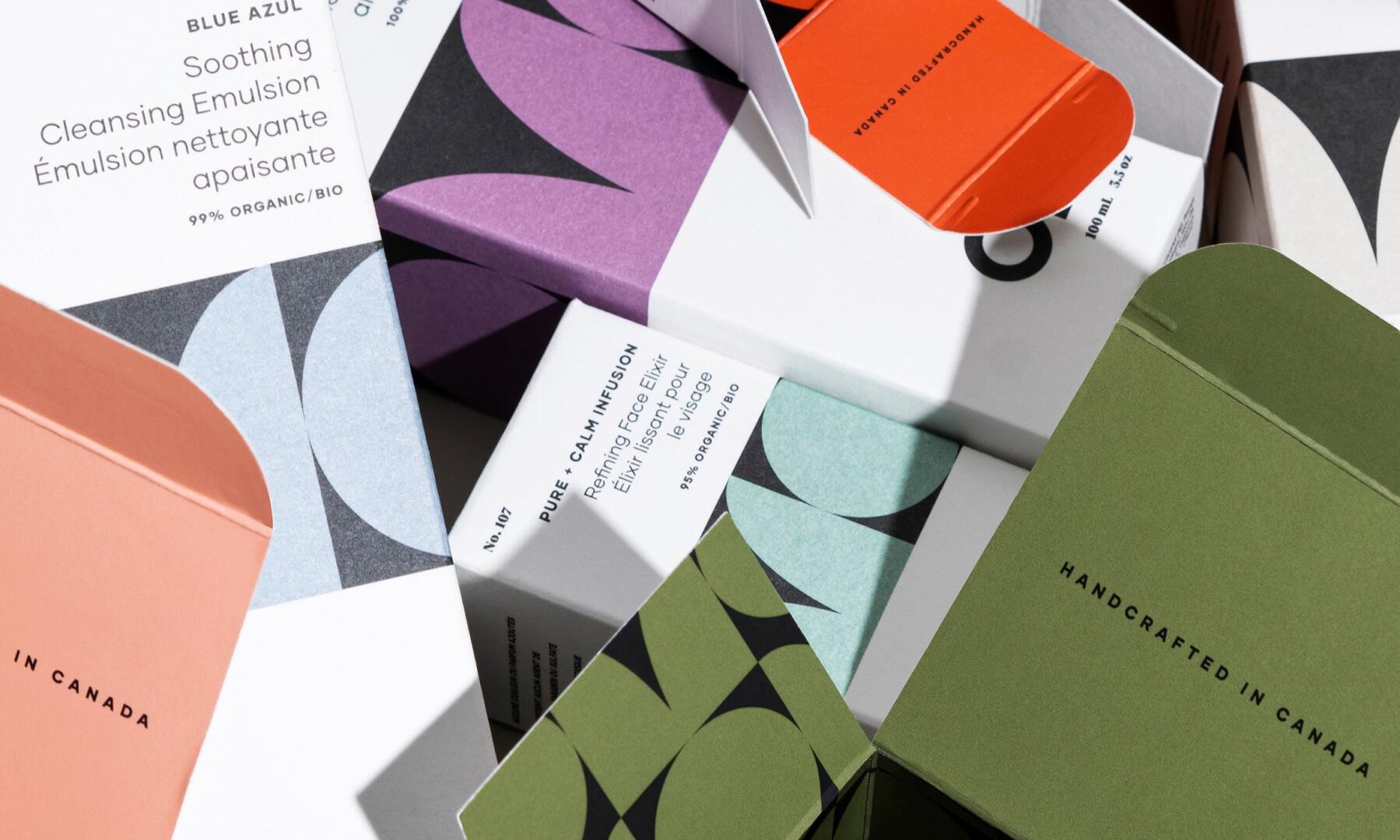
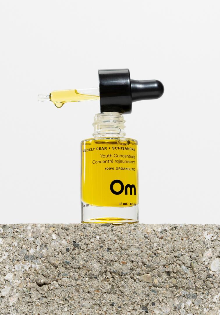
The package design reflects the contrast of strength and softness that makes us human. A parallel is drawn to the radiance and raw beauty of the Om product line and the message that the brand shares – to liberate ourselves from labels, release insecurities and fearlessly show ourselves to the world, as we are, unaltered. The glass bottles were stripped of those same labels – unafraid to be minimal and bold – allowing the pure inner beauty of the products to radiate through. The colour palette was drawn from the natural pigment of the products. No fillers, toxic chemicals or added colour. The geometric ‘OM’ pattern that wraps each box was inspired by mid-century modern shapes that speak to the curves of the body. With over 65 products, coming in a wide range of colours, shapes and sizes, the packaging reflects back the heart of Om; to find power in our natural beauty and celebrate what makes us unique. When it comes to the physical packaging, we chose to keep it clean, simple and sustainable (just like the products). We opted for all glass components that look and feel luxurious yet remain affordable. This also helps to keep things eco-friendly with a refill option at retail locations. The design embodies our greatest hope for Om’s audience: to shine fearlessly through the unique, natural, and beautiful skin that we are all wrapped within.