CONTEXT
Following its relaunch in 2014, the iconic beer of Bilbao has opted to renew its identity and consolidate its positioning as one of the national references in the market. A new image that raises La Salve’s perception of quality and boosts its commitment to the local community.
CHALLENGE
To this end, we redesigned the visual identity of this historic beer, part of the Mahou San Miguel group, capitalizing on its own brewing codes and reinforcing its bond with the local community, all through authenticity and contemporaneity.
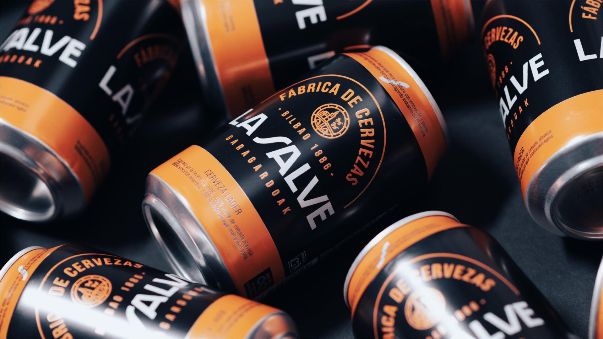
SOLUTION
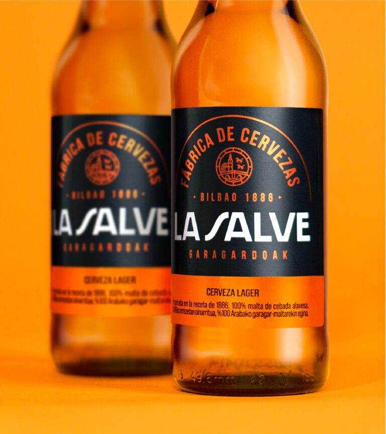
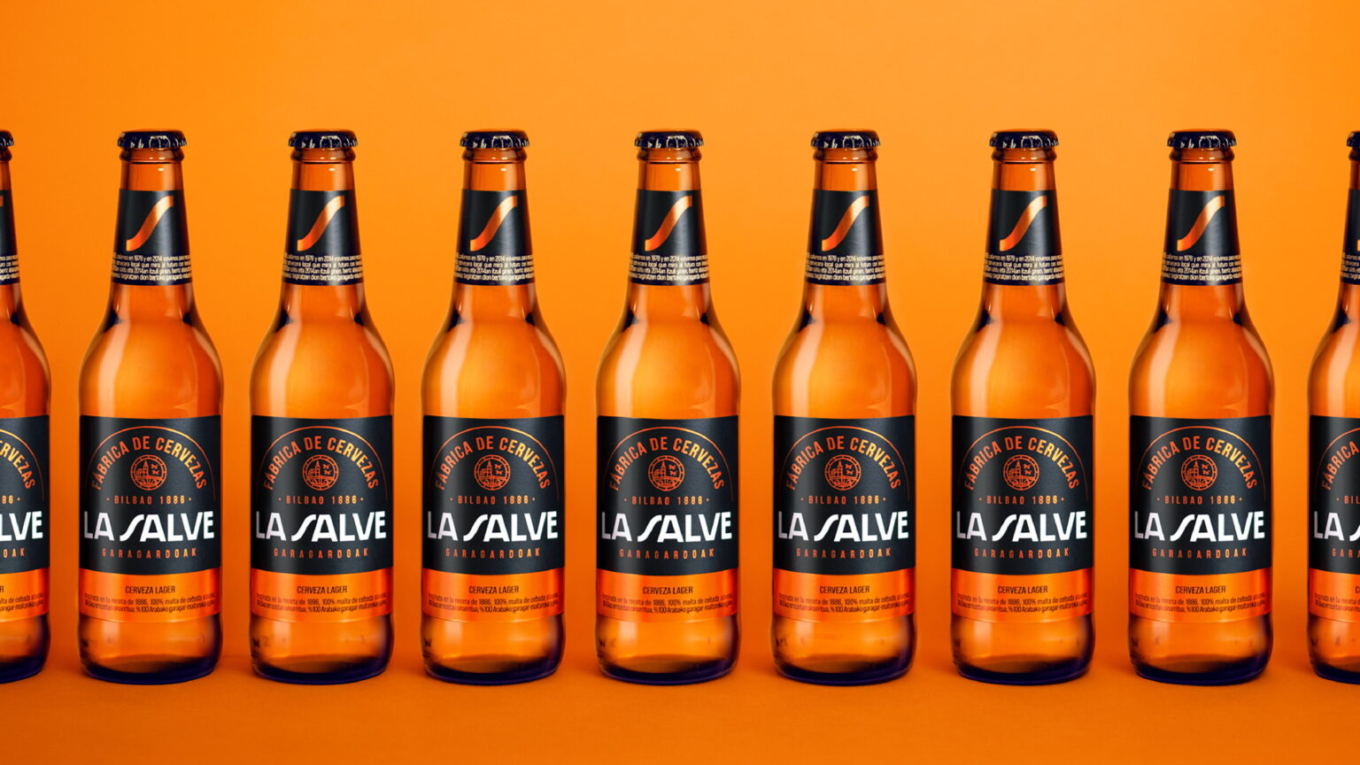
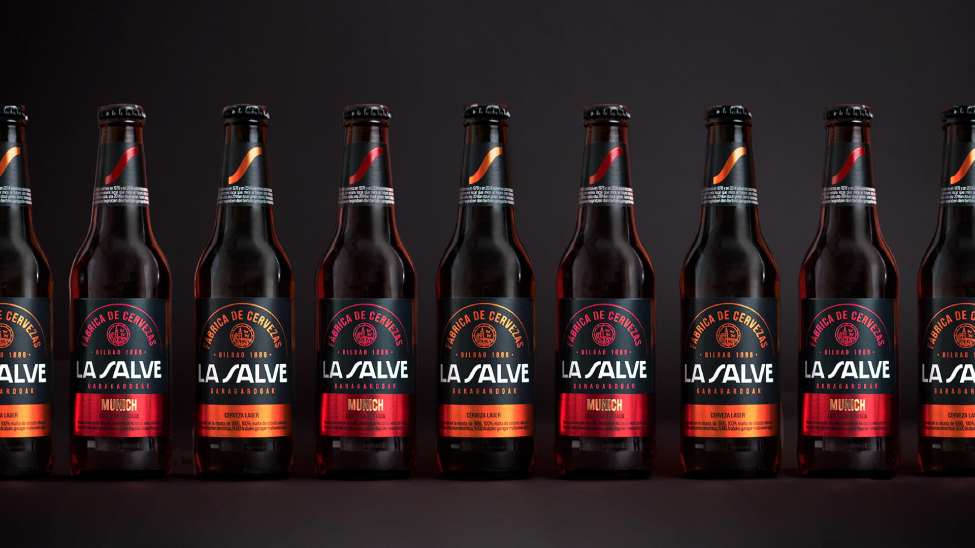
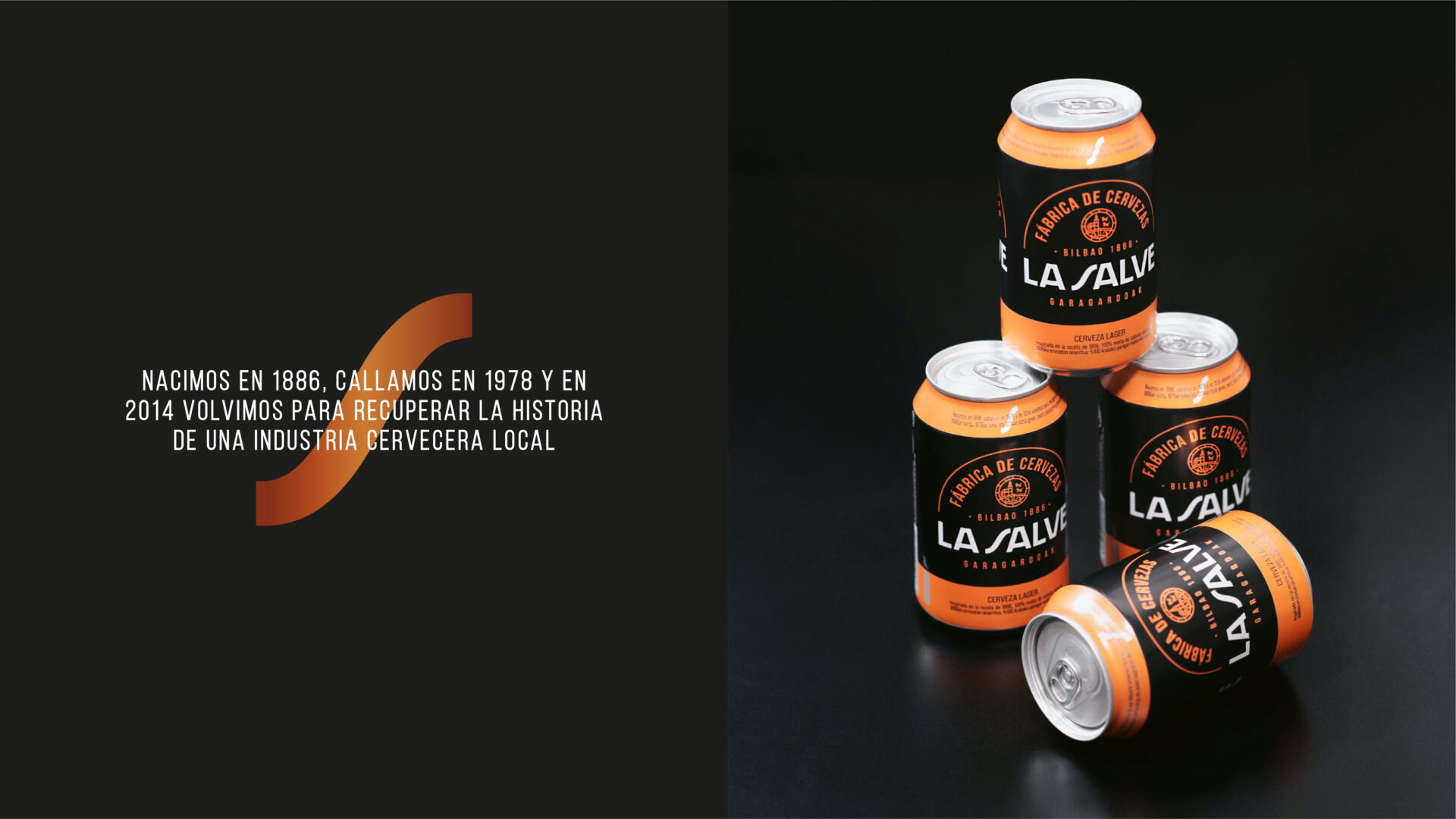
Using its past as a starting point, it recalls the story of the place where the sailors used to sing to the Virgin of the Basilica of Begoña: the emblematic La Salve bridge. On the other hand, it rescues the imaginary and materiality of the factory, steel, fire, and coal of the Blast Furnaces and Shipyards through the use of black and metallic colors that reinforce the character and personality of La Salve. An ode to its industrial roots and its brewing soul. With subtle changes in the logotype, it evolves slightly to gain strength, impact, and visibility. Furthermore, the role of the “S” of Salve is highlighted as a new space of expression, which seeks to capitalize distinctively on the iconicity of the brand, evoking the Estuary of Bilbao. A strong and consistent structure where the new brand identity codes make a clear impact through the packaging design, generating great recognition that promotes the pride of La Salve Brewery. A new chromatic language formed by black, white and metallic orange as the primary pillars of the identity. The new typography and iconography generate a stronger bond with the category codes. At the same time, they allow the new image to expand, creating an authentic beer experience that highlights the committed, collaborative and human character of La Salve.