About Project:
It took us many sleepless nights to understand what we need to design. This project is the top of the iceberg of all the different styles and designs were made in the process. We enjoyed eating honey, choosing the size of the label, choosing colors, making samples and even drawing a boat… But here is no boat as it was a bit overwhelming. Let’s leave the boat for another project. We hope you feel the energy of this project!
Honey Plant:
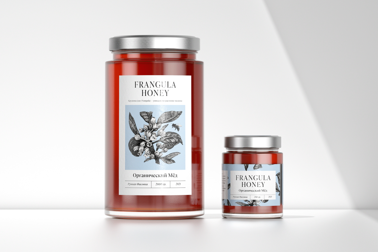
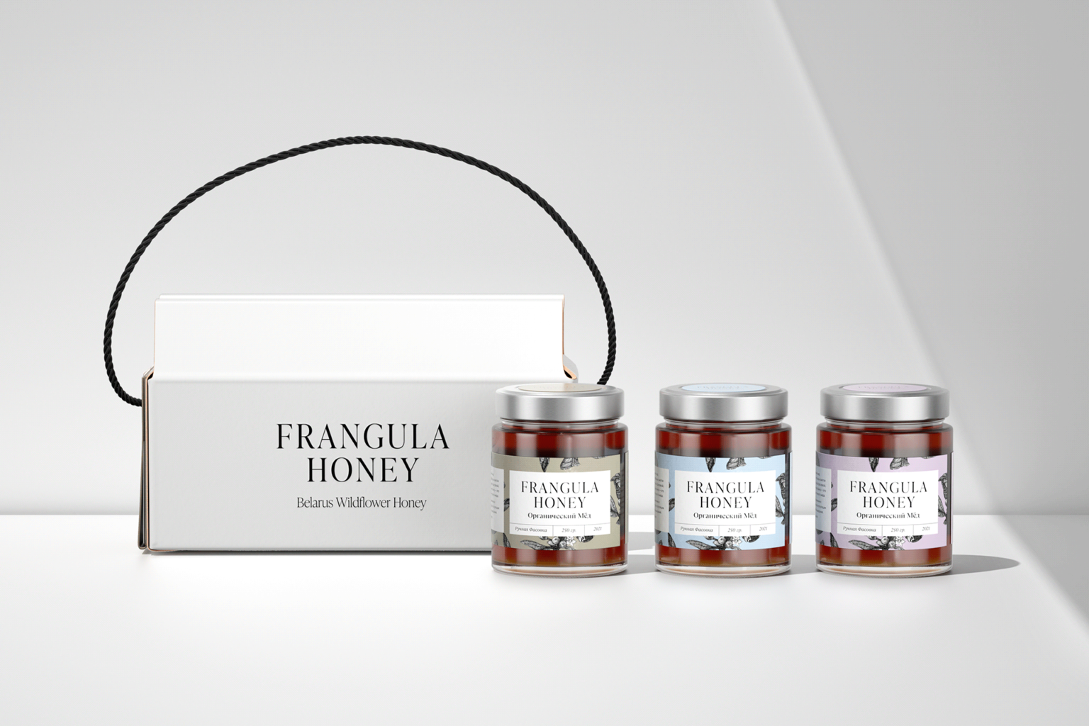
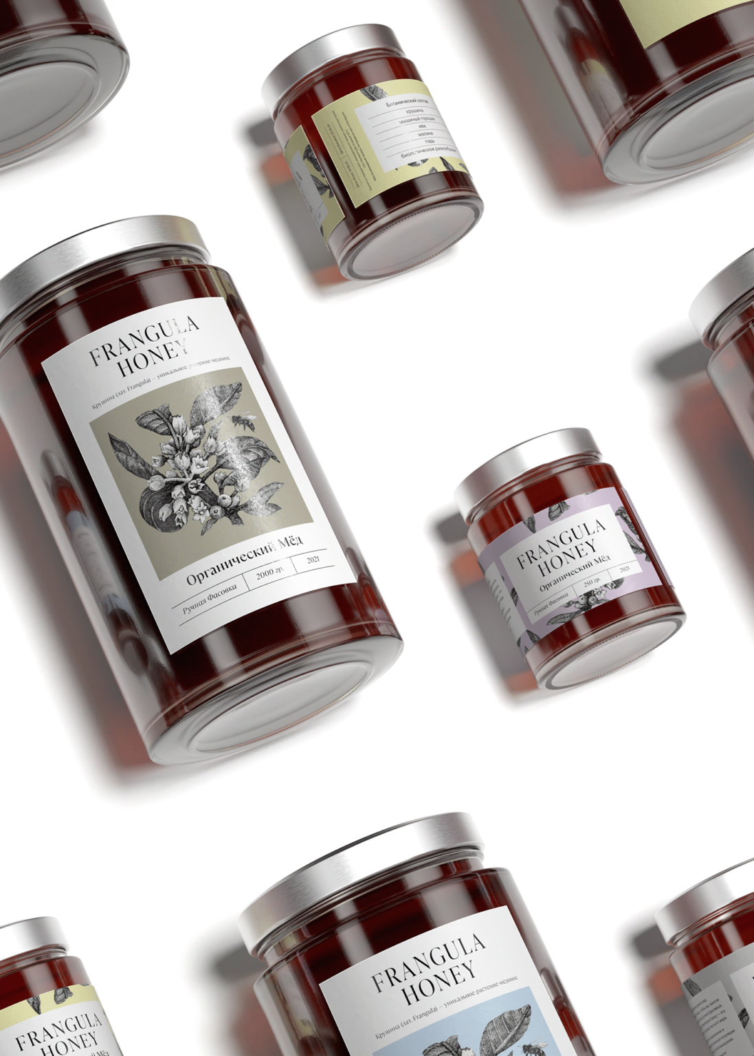
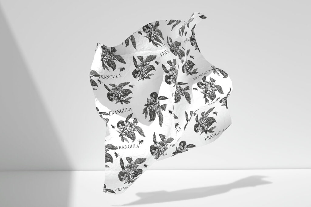
Honey plants form the taste, aroma and beneficial properties of honey. The botanical analysis of each honey is always a secret, until the moment of honey harvesting. Frangula is a unique honey plant with lush greenery and tiny white flowers. It is unique in Belarus as it grows in many places, but few where bees collect honey from it. The illustration of Frangula is at the front label. The name Frangula Honey is an image of the impenetrable jungles around beehives and always unique polyfloral wild honey of Belarus.
Boxes for Frangula Honey are inspired by traditional roofs of wooden houses in South of Belarus. Villages with architecture surround privately held beehives.
The Dark Bee:
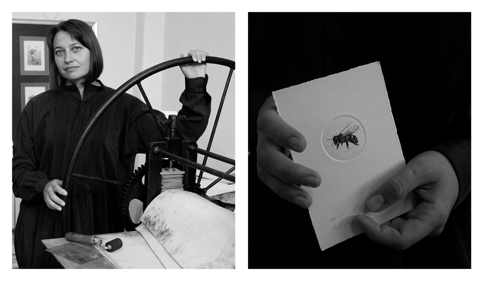
The image of a bee on a wrapping paper is an accurate illustration of The European dark bee (Apis mellifera mellifera). It is a subspecies of The Western honey bee, whose original range stretched from west-central Russia, Belarus, through Northern Europe. Frangula Honey takes part in a project to preserve the European dark bee under the leadership of the Academy of Sciences of the Republic of Belarus.
Local Artist:
The visual identity of Frangula Honey is aligned with the idea of botanical illustration, the font and the graphic image are inspired by old books with studies of plants. We invited a Minsk-based graphic artist Sophia Piskun to create artworks in a rare etching technique, native to botanical illustration. The craft of etching is a precise and detailed work on a metal with the use of acid and a printing machine.
