The Challenge
The longstanding tradition of drinking coffee in Greece is a direct relative to the Turkish tradition and has a large impact on greek society, so much so that the coffee shop is often considered to be the heart of every village’s social structure. Greek coffee, loukoumi and spoon sweets come into play to complete the coffee table and accompany the conversations, backgammon and arguments of Greeks in the past 200 years.
In 1919 the Loumidis brothers opened their coffee mill and slowly began selling their ready-made packaged coffee. Today, Loumidis Coffee Shops consists as one of the oldest and most iconic brands in Greece in the coffee industry. In the company’s 100 years of operation, its flagship store in the heart of Athens acts as a hotspot for coffee drinkers from all around the city.
A.S. Strategy was called in to design the packaging of some of the company’s most popular products; Their new espresso capsules, coffee, the traditional loukoumi and spoon sweets. The packaging design should be encompassed in the already long standing brand identity of Loumidis Coffee Shops that the greek consumer is familiar with.
The Concept
When one picks their favorite confectionary to complement their coffee, we know that what he picks is based on traits of their character. A character that is boldly showcased by the people around the coffee table, through their points of view, outlook on life and even the details and way of speaking during the small talk. This aspect of the greek Coffee tradition could not be absent from the packaging.
In the fashion of greek pet names taking the suffix “aki”, thee name of the products themselves changed from loukoumi to Lukumaki and from “glyko tou koutaliou”, spoon sweet in greek, to Kutalaki. Pet names are something reserved for those close to us, such as the characters that accompany us during our usual haunts at the coffee shop.
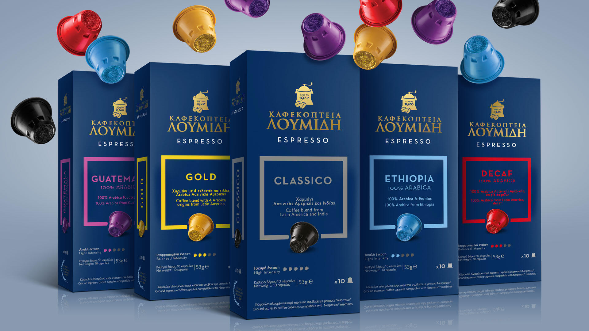
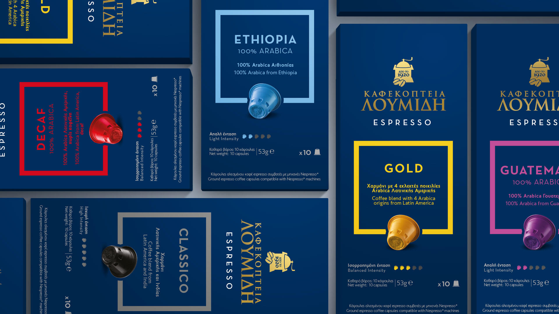
In regards to the coffee packaging, in all of its forms, should reflect the Loumidis Coffee Shops’ brand identity that the greek consumer is familiar with and the long history of the brand.
The Design
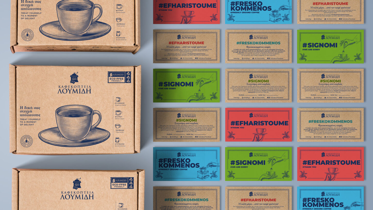
To reflect the concept of colorful characters, the packaging design of Lukumaki and Kutalaki feature a colorful palette, along with illustrations of the product. These illustrations are in a vintage style in the same manner the patterns on the packaging, as a means to communicate the brands history. The brand identity of the Loumidis Coffee Shops is present on the packaging in a stripe at the topmost part, in a manner reminiscent to a gift.
The packaging of the coffee is in line with the brands identity. The deep blue color is the strongest characteristic of the identity, since it is present throughout it and in all the coffee shops of the company. The composition and typography have hints of art deco elements and represent the history of the brand.