While I’ve never been to the East Coast of Canada (yet), I’ve had this idea floating around for a while now. I wanted to come up with an East Coast inspired identity and see how that could play out with various identity assets and packaging.
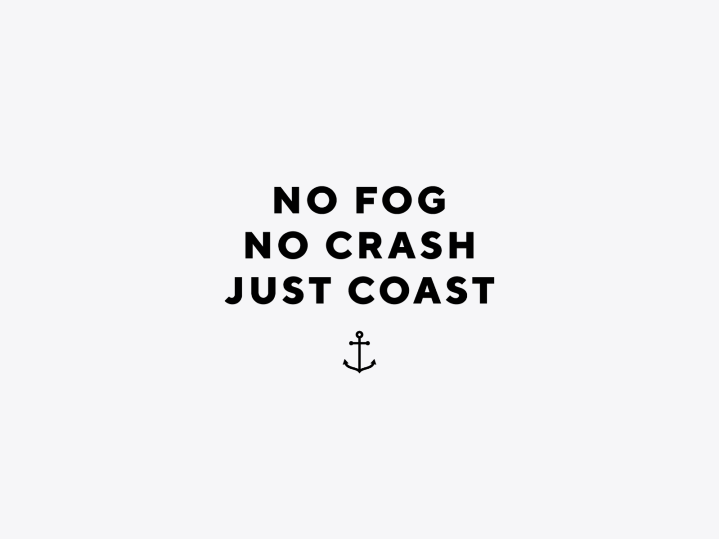
Before I even finished working on the nameless identity, I already had this “No fog, no crash, just coast.” tagline in my head. It had to be for a coffee company! The fictional East Point Coffee was born.
Once I had the name, identity and tagline sorted out, I got into the coffee packaging. The waves from the identity were used to add separation to the bag where the name and flavour notes are displayed, while the angled stripes from the lighthouse create the pattern on the side.
The tagline lives at the top of each bag while a subtle anchor, well… anchors the bottom of the bag. Each product is named with a lighthouse or nautical theme, with a Dirty Heads album reference in there as well.
With a visual language established, I expanded the look into the next logical step for a coffee company… cold brew! The layout and colour palette is very similar to the coffee bags to help create continuity across the brand, with the added flare of the instruction lockup on the side.