THE DEAL
Raven Crest Botanicals is a herbal apothecary brand created on a beautiful small-scale organic, medicinal herb farm and retreat center tucked away in the forested hills of upstate New York, U.S.A.
Owned by passionate herbalist, Susanna Raeven, her herbal remedies and artisanal skincare products are made with fresh plants grown and sourced by organic and sustainable growing methods from the Raven Crest Botanicals farm and created with great love for Mother Earth.
After consulting with fellow herbalist and brand strategist, Justin Tilia, they concluded that while the earlier inhouse branding served to launch Raven Crest, a redesign was essential to help build a cohesive visual look and feel that would elevate the products yet stay true to the core brand philosophy.
Enter Artisticodopeo.
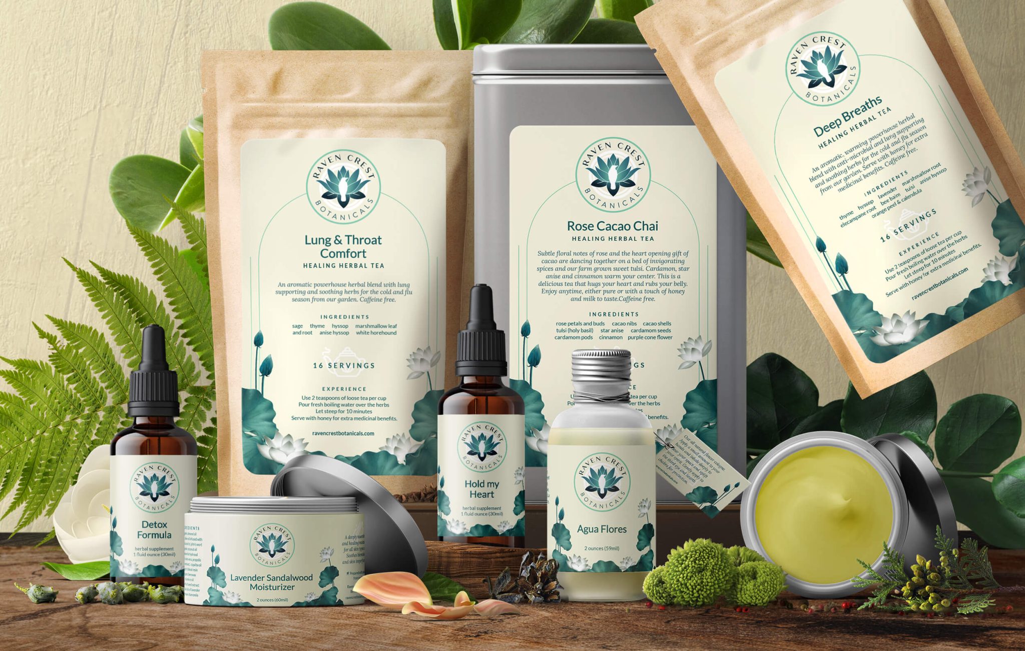
I was commissioned to conceptualise, re-design and develop the brand visual logo, identity systems and product label designs for the US based herbal brand.
THE DOPE
It was clear during the discovery call and briefings that we wanted to create a brand that was dynamic while still maintaining the traditions of Susanna’s roots in botany and herbalism.
Since the brand logo incorporating a lotus and white raven held deep meaning for her and also had good recall value with her loyal consumer base, she preferred on retaining the logo mark with maybe slight refinements to its colors whilst redesigning the logo type to give it a fresher, renewed look.
I agreed.
At its core, the Raven Crest Botanicals mission is to bring medicines to the people through holistic herbal remedies created with the deepest intention to help heal the body, mind and spirit of the community and our home planet.
They do this by growing medicinal herbs with sustainable, organic farming practices and wild craft healing plants honoring Mother Earth every step of the way with gratitude, wisdom and respect.
Centered around this idea, we chose an earthy color palette of deep greens and pastel browns. One of the challenges we faced were the small product label sizes and how best to showcase a consistent visual design brand hierarchy whilst following government specific rules and regulations regarding font sizes for ease of readability.
It isn’t a surprise when you see dodgy font sizes on product labels. Its 60% regulations…and 40% lack of good design folks.
Refining the brand logo typefaces for the rebranded logo was simpler than trying to create a design theme that solved our label challenges!
It became evident to me through the course of multiple concepts very early on, that I needed to approach the brand logo much more differently than originally discussed – if I needed to give it due importance across product lines.
We opted to keep the primary logo as was originally created albeit with new colors and typefaces, but I decided to design a secondary brand logo by modifying and encapsulating the logo within a circle to create a visible distinction with the rest of the content. This helped to redefine the brand hierarchy while upholding and focusing on the essence of the brand.
A circle that represents Mother Earth and at its heart, the white raven surrounded by the lotus in full bloom.
I curated beautifully illustrated lotuses and leaves as meaningful focal elements growing around the product title distinguishing it from the rest of the content. This removed the prior need of having a seperate box for the product title.
Since each product label is printed and lovingly hand pasted on each product on the farm, we chose to create 5 to 6 master templates where the product name and details could be easily edited and printed by Susanna or her team.
This allowed her greater flexibility in terms of introducing new seasonal products, having greater control over product shelf life, a faster design turn around time and minimizing expenses and wasteage of paper which greatly tied in with the brand philosophy as well.
Functional design is fun, isn’t it?
Guided by the newly created brand design guidebook, I used our new logo, colors and fonts to create a cohesive visual language across the brand identity such as stationary, packaging and promotional materials to support each other in a way that helped to communicate Susanna’s brand ideology.
A slew of specially curated icons were also sourced and refined to support the brand across product labels and the upcoming new website.
THE EXPERIENCE
“Rajesh is a skillful and highly talented artist and designer. While working on up-branding our current logo and label design, he went out of his way to accommodate every fine detail of my own vision with his masterful design skills and branding expertise.
The result is outstanding. He captured the essence of the company and our product offerings in the most beautiful and elegant way.
Rajesh is very generous with his time, and delivers the finished design in a professional and timely manner. He is easy to work with, has great communication skills, and is one of the nicest people you will encounter in your professional life.
I enjoyed working with him on every level, and highly recommend him for any design or branding project.”
- Susanna Raeven, Herbalist & Founder, Raven Crest Botanicals.
Raven Crest Botanicals’s new redesign clearly communicates Susanna’s vision and brings her value offerings of Mother Nature’s gifts to the forefront. It encapsulates the uniqueness of Raven Crest and helps her loyal customers feel their best by offering a wide range of herbal remedies and artisanal skincare that are made from natural quality ingredients and delivered in a friendly, personable way.
Where they are not just buying meaningful products—but are part of the growing Raven Crest family!
Now begins the exciting journey as the upcoming new website and product range steadily showcases the familiar yet all new Raven Crest Botanicals branding!


