Trademark development U N A T U N A
We were faced with the task of developing a packaging design for nutritional supplements under the Una Tuna trademark in an above-average price segment for marketplaces and pharmacy chains. Buyers are tired of overpaying for popular brands – they want to get good quality at an affordable cost and be sure that the drug will benefit their health. We decided to build the brand concept on expertise so that the consumer can entrust his health to a new product. The founder of the Una Tuna brand, Evgenia Kolodkina, a nutritionist, nutritionist, healthy lifestyle coach, enjoys the trust of the audience due to her extensive knowledge in the matter of healing the body.
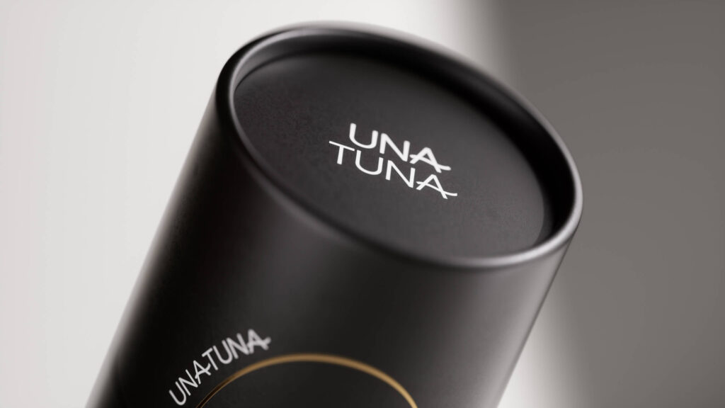
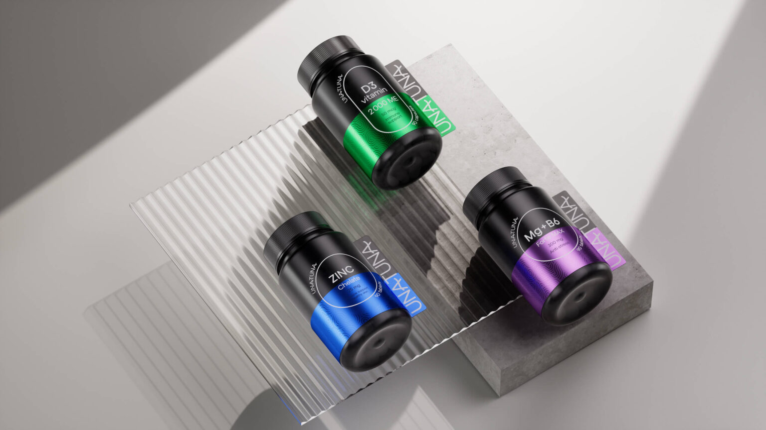
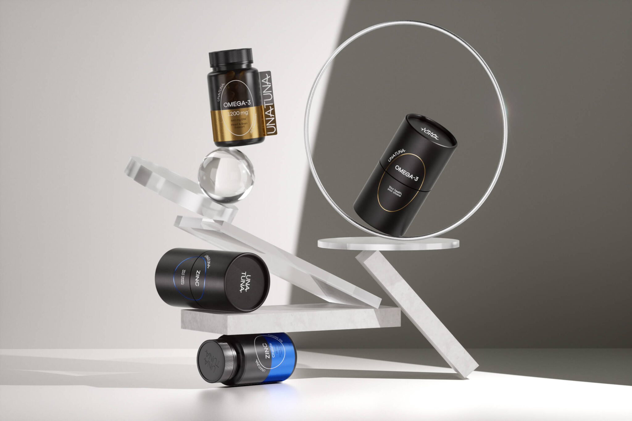
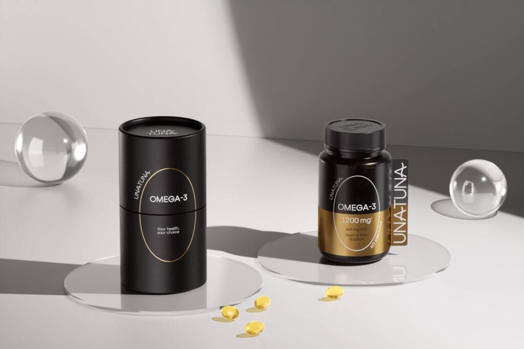
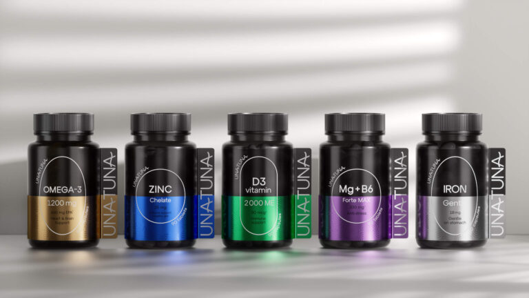
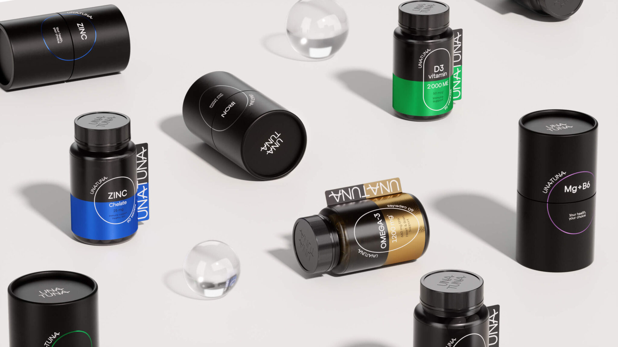
The nature around us in all its diversity is perfectly balanced. The same applies to a person who needs an accurate balance of microelements in the body for a healthy life. In design, we maintained a balance between familiar pharmacy packaging and new solutions. The main graphic element is the product itself: the capsule and various tablet shapes. The TM name is located according to the shape of the product, at the same time it is presented in a large format on the side, which allows you to see it from a long distance, for example, on a pharmacy shelf.
The black color unites the line, while the additional shade helps to easily differentiate specific products. This helps to identify the right dietary supplements without reading the product name. The result is a package that matches the category, but at the same time arouses interest and trust among consumers. In addition, the packaging stands out on the shelf in the pharmacy, among the goods in the marketplace and is perfectly remembered. The result is a package that corresponds to the category, but at the same time arouses interest and trust among consumers. In addition, the packaging stands out on the shelf in the pharmacy, among the goods in the marketplace and is perfectly remembered.


