Ultratech has developed a new product which helps in sealing minor cracks on walls and furniture which is completely new in the market. The brief was to create packaging structure, visual identity, and packaging graphics for Ultratech’s consumer product with a unique offering for the mass audience
Challenges:
-Designing Ultratech’s first B2C product around the existing brand colors to leverage the equity that Ultratech has built.
-Identifying the nozzle size for optimum flow.
-Design should be scalable to both 50gms and 70gms
-Incorporating a scrapper in the packaging.
-Making the whole packaging ergonomic.
-Developing secondary packaging and combo packs for the same
-Designing a chain of blister packs with perforations for a heavy product.
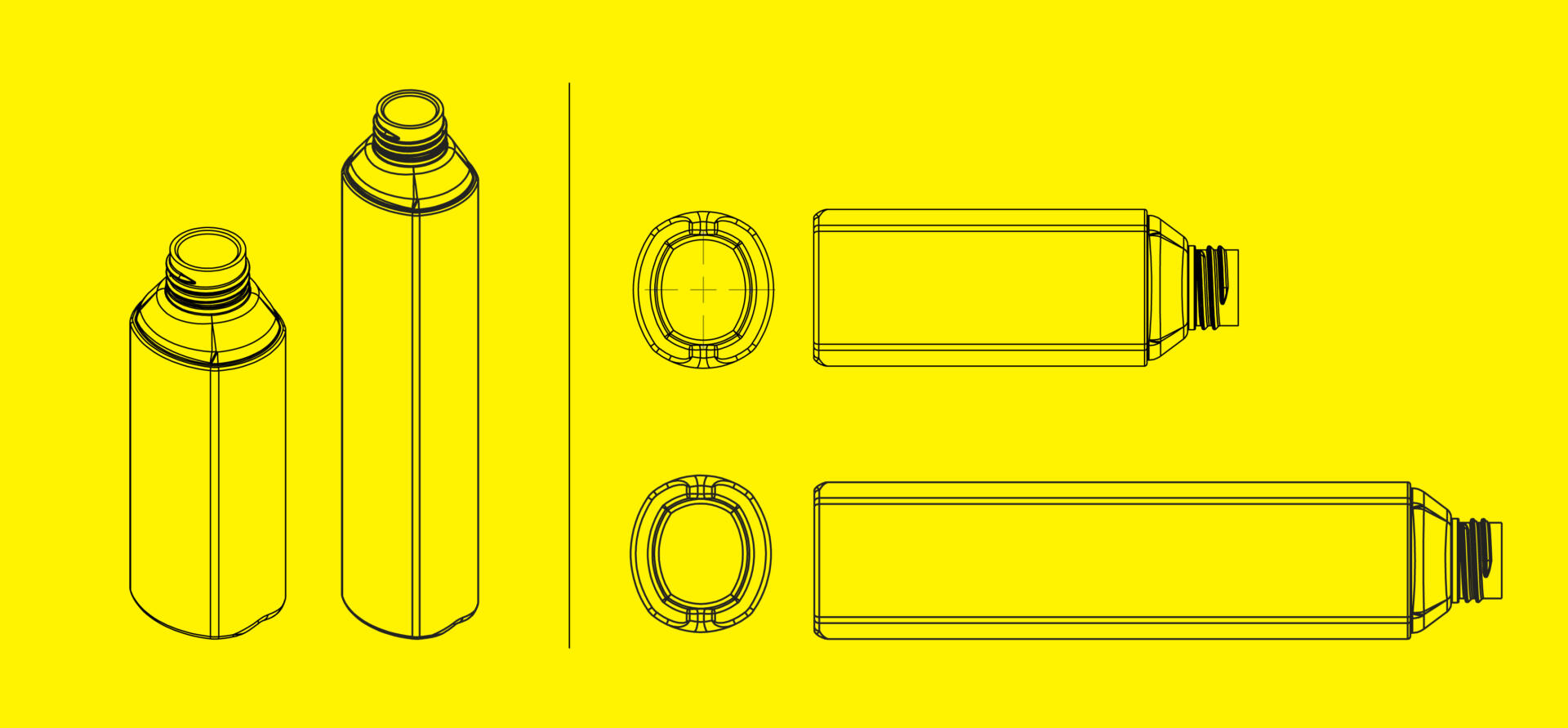
Design Process – Structure
After doing in-depth primary research we found critical conditions for designing a package for this product. There were three major components that needed to be designed.
Scraper: Integrating the scraper along with the cap to reduce the number of parts and to avoid losing the scraper. For designing the scraper we tested different profiles using multiple mockups. In the end, we came to a solution of having two different angled scraper meetings at 90 degrees to reach every corner and spread evenly.
Nozzle: For the nozzle, we had to try out different nozzle sizes and shapes to determine the best possible outcome. The liquid was filled into tubes and squeezed out through the nozzles at different time intervals. The preferred diameter is found to be 1.2 mm.
Bottle: Designed the bottle with filleted rectangle cross-section to increase the squeezability and to have an ergonomic design. Two different Bottle sizes were designed for 40 gm and 70gm.
Design Process – Graphics
Leveraging the equity that Ultratech has created for itself by using the brand colors: Yellow & Black was crucial. This was an important aspect to create resonance with the consumers. The brand identity is a clear & bold logotype that showcases what the product does. The packaging was designed keeping in mind the newness & educative aspect of the DIY product. Since it is a new product there was a requirement to educate the audience while making sure the product stands out on the shelf. This was done through iconography and realistic imagery for application areas.