Crista Spices is a fourth generation spice brand – Whether it’s a set of signature whole spices, authentic spice blends or beautifully curated gift boxes, Crista Spices offers a range of options that are sure to impress. It is a brand that celebrates culinary excellence, sustainability, and community.
Beyondesign’s solution for the brand’s logo and packaging was carefully crafted to reflect the brand’s values and identity. The spoon coming out of the “C” in the logo is a design element that serves as a subtle nod to the brand’s focus on culinary excellence. The spoon represents the tool that is essential for cooking and is often associated with the act of preparing and serving food, which aligns perfectly with the brand’s mission to offer high-quality products.
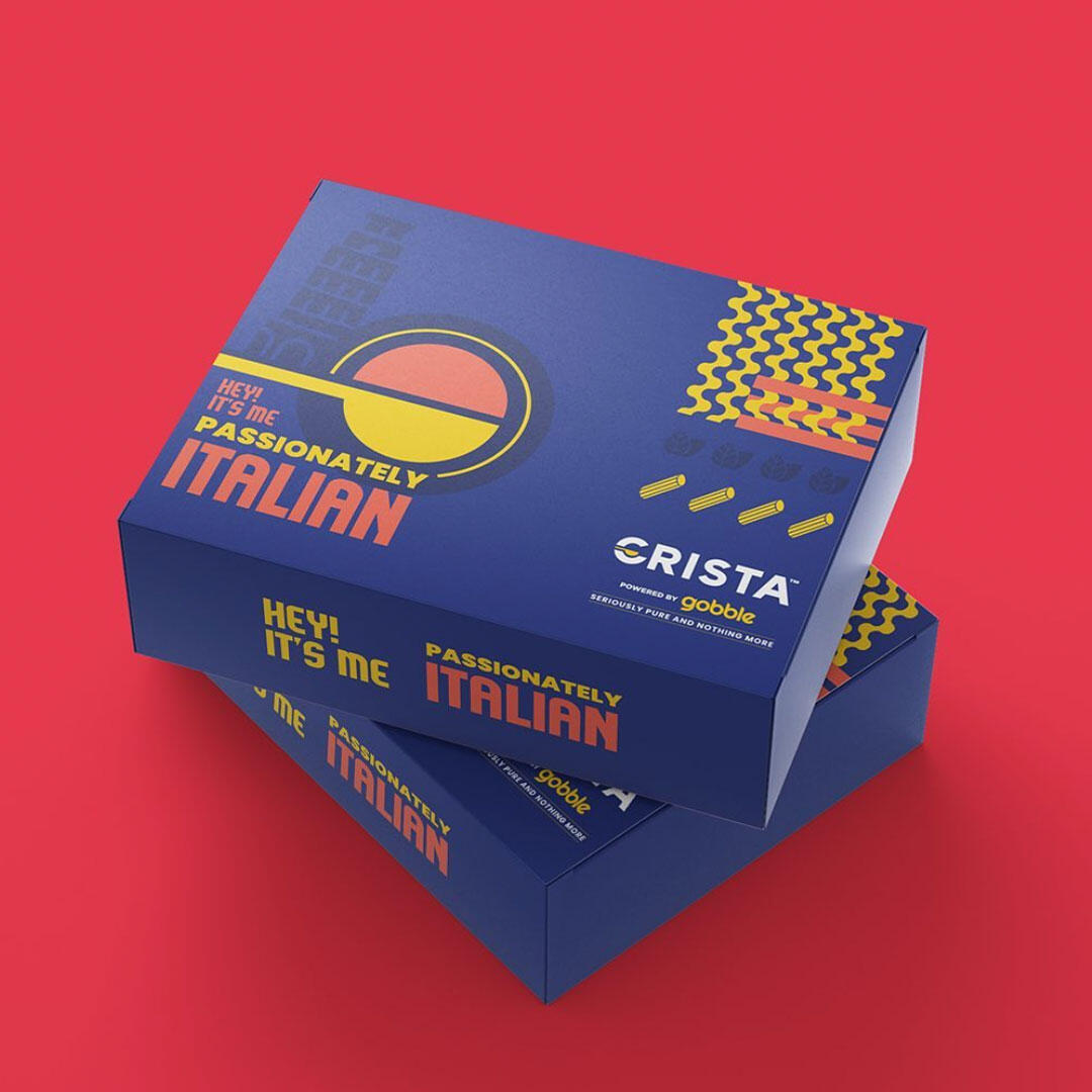
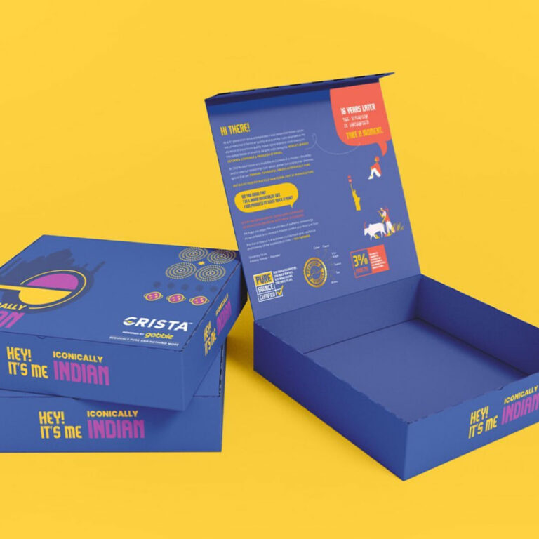
The packaging of the brand’s products is also noteworthy. The use of fun and vibrant pop colours makes the packaging stand out on the shelves, catching the consumer’s attention. The packaging language has been very carefully designed to highlight the brands commitment to quality and sustainability which they achieve by working closely with their farmers and suppliers, ensuring that their spices are grown and harvested in a way that not only preserves their natural flavours and aromas but also respects the environment and the communities that depend on them. The packaging design very interestingly communicates these attributes to the target audiences, bringing forth the brand as a new-age, fun one.
Beyondesign is thrilled to have been a part of the journey of creating the logo and packaging for this exceptional brand. We believe that our design perfectly captures the essence of the brand and its values.