Kleenex® Core Tissues product range redesigned to propel brand expansion
Brand design and innovation agency Echo, continues its long-standing partnership with Kleenex®, with the launch of a significant redesign project to take Kleenex® forward and build momentum for the brand in the next 5+ years.
Nieves Genovese, Kleenex® UK & Ireland Marketing Manager commented: “In the last 99 years, Kleenex® has been evolving to better respond to consumer needs and provide comfort to their streaming eyes, stuffy noses, tears of joy and sadness. With the new design, our objective was to ELEVATE the brand establishing an unique and premium look & feel, SIMPLIFY the portfolio, improving clarity of each variants and creating an holistic consistency across the variants and REFRESH the brand image to appeal to a whole new generation of shoppers”
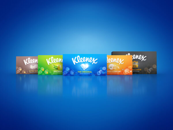
The work embraces Kleenex®’s rich heritage by prioritising its well-established brandmark and caring brand personality to deliver a contemporary, stripped-back aesthetic that draws focus to a clearly accentuated product benefit. The look and feel is expressed through powerful associated iconography and bold colours. This simplified expression brings a defined stamp of quality and identification to the products, resulting in effective shelf navigation across various markets in addition to overall market stand-out. The newly created design principles will provide the necessary framework and inspiration for all ongoing and future innovations within the Kleenex® product portfolio.
Nigel Ritchie, Creative Director at Echo commented: “We needed to ensure the redesign was impactful and ownable. Through bold use of colour, refined benefit driven iconography and the use of aesthetics rooted in the brand DNA, we have moved the brand significantly forwards whilst retaining strong brand recall at shelf.”
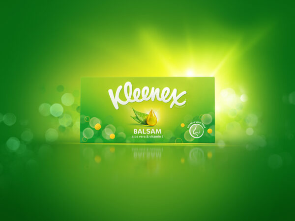
The new design impacts the whole Kleenex® portfolio across all variants and including boxes, pocket packs and wipes propositions. Each variant already had strong colour recognition at shelf, so a revised colour palette that delivers a bolder and more contemporary expression of those colours has been introduced. To enhance the brands ‘softness’ proposition, a new brand pattern has been introduced which uses a ‘bokeh’ soft focus graphic effect that has been colour adjusted across the range and works in unison with the new colours.
The revised Kleenex® brandmark retains its dominant position on each pack, supported by a new benefit driven icon system that sits centrally across all products. Each new icon depicts a key product benefit and is highlighted through a spotlight of complementary softened colour. The variant communication is executed on the front of pack, whilst the bokeh pattern has been meticulously expanded across all pack faces further enhancing the simple design aesthetic.
Lucy Fretwell, Design Manager at Kleenex® commented: “the key challenge for Echo was to create a family of individuals within a holistic portfolio, retaining current loyalists whilst appealing to new, younger shoppers. The new designs capture the essence of the brand with a unique Kleenex® look and feel that is impactful at shelf and attractive in-home.
Echo ensured the packs were able to work beyond the supermarket shelves as a piece of design for the home. The different pack faces work together to create a harmonious design that blends nicely into its surroundings. The packs have been designed to be a statement, yet understated in their modern colour palette, so they can fit perfectly in any home.