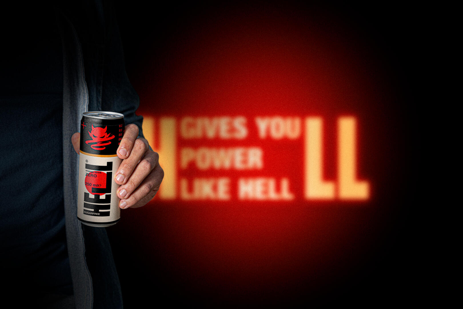
I redesigned the basic visual concept of one of the most popular energy drink brands.✨⚡️
HELL ENERGY reborn under my hands, at least I hope it has taken its first steps
HELL ENERGY is one of the fastest-growing FMCG brands in the world, as proven by its explosive export expansion and growing global popularity.
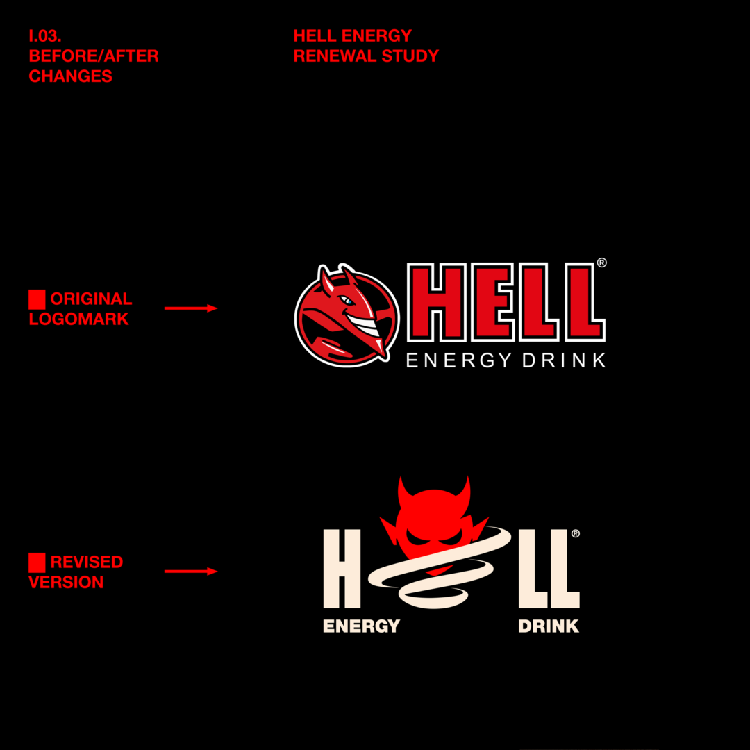
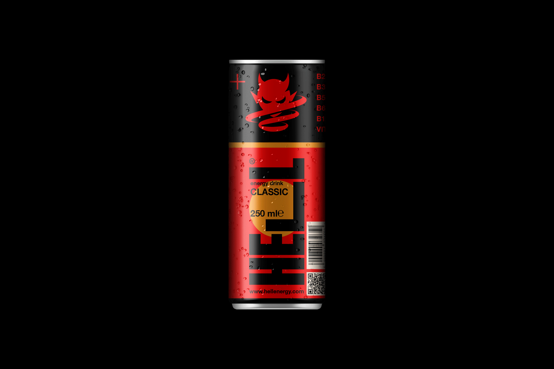
My concept’s goal was to achieve an imperceptible but still significant change in the image of the brand. The aim was to make a cool branding with the same feel and look with a much more positive brand message.
The most important keywords were:
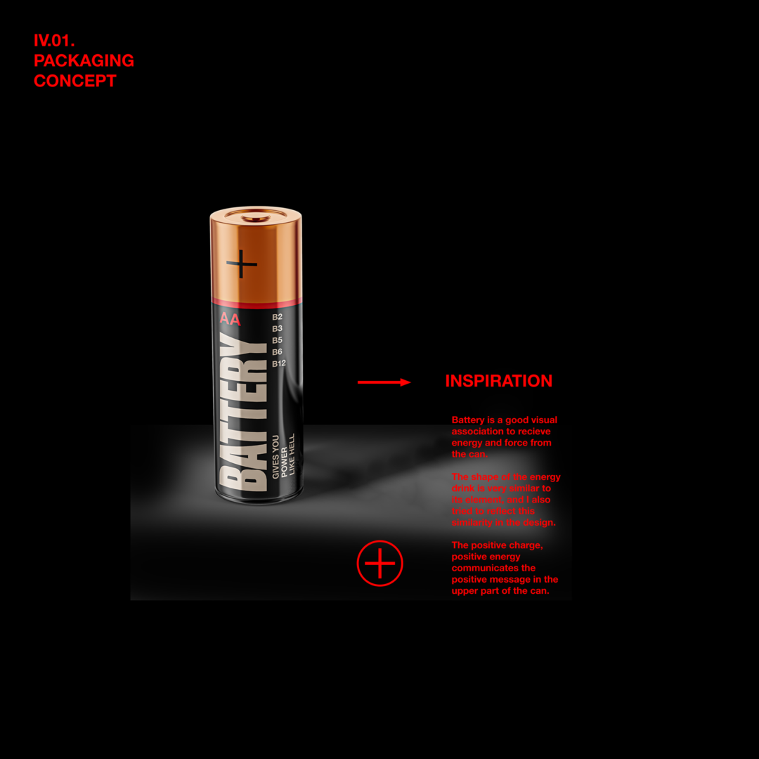
- recharge
- strong
- force
- dynamism
- classic
- youth
- positive
- after-life
- energy
This was necessary in order to provide a positive brand message and conceptual system to a previously negative and ugly brand look. I did all this in such a way that the main markers of the former packaging remained recognizable to those who know and love this brand.