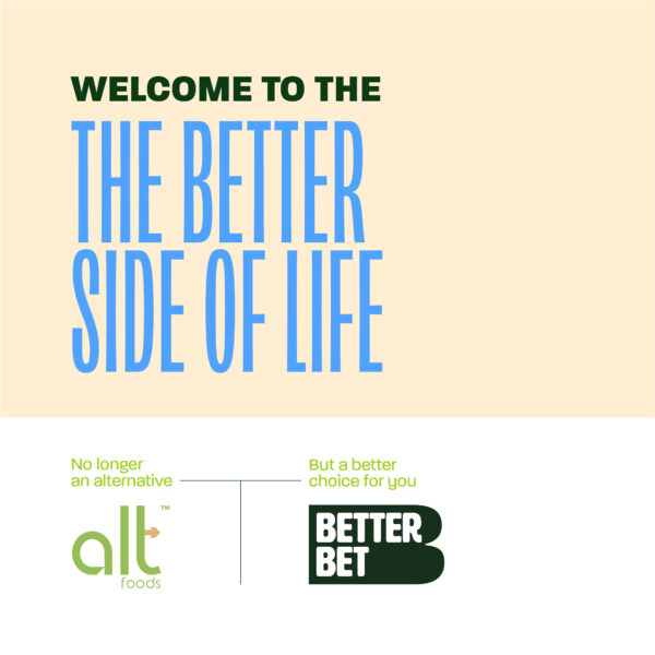
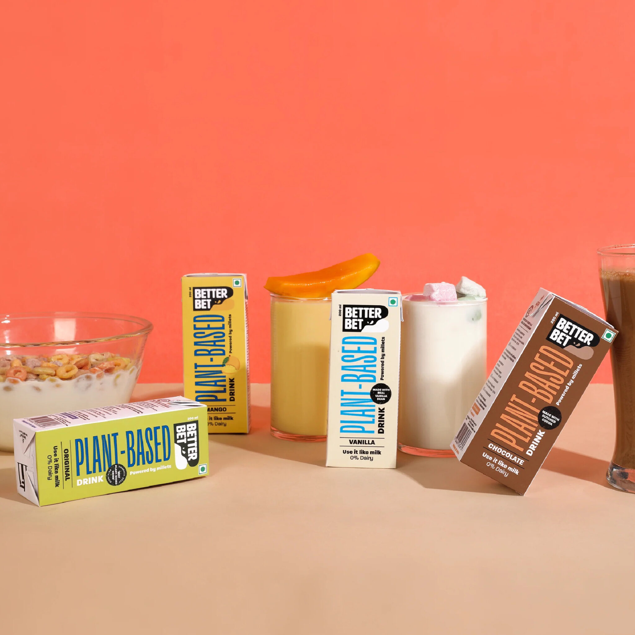
Beyondesign gave a fresh new approach to a revolutionary brand called Alt Foods, now rebranded as Better Bet.
The brand language was refreshed to suit their product offerings, ensuring they can visually communicate in a contemporary way and help their brand stand out among others.
The thought was to bring out the aspect of ‘better’ through every angle of the brand, be it in the way the elements are used or the way the brand communicates. Owing to such a massive shift in the strategy, we rebranded Better Bet to reflect a higher sense of confidence while retaining authenticity to the product innovations and their core mission of providing better.
Having products backed in research, the dynamic logo has a strong, identifiable base to represent that confidence and strength. It justifies the trust of the users for betting on these products, a choice that’s better for their health, for their lifestyle and for the planet.
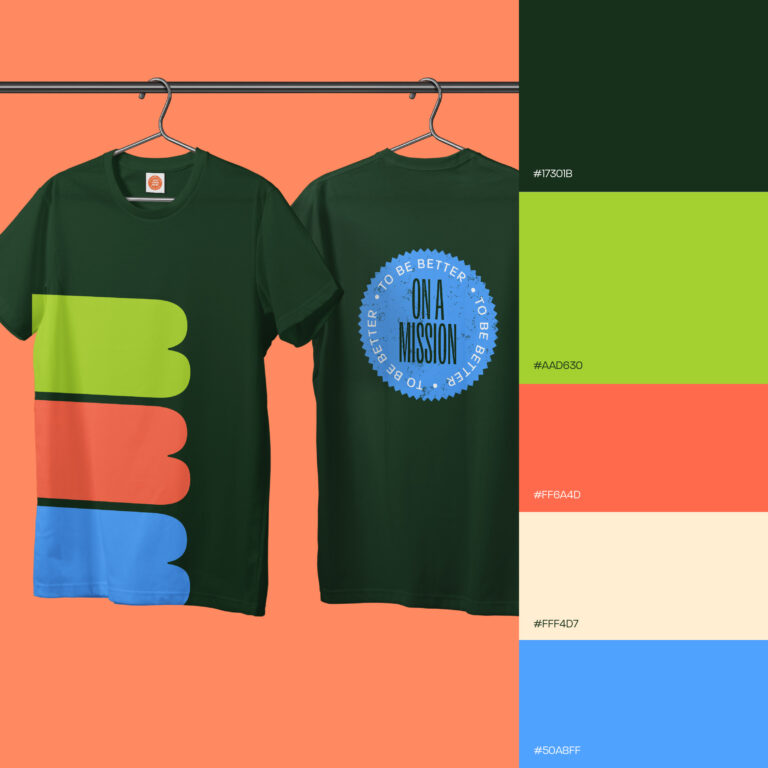
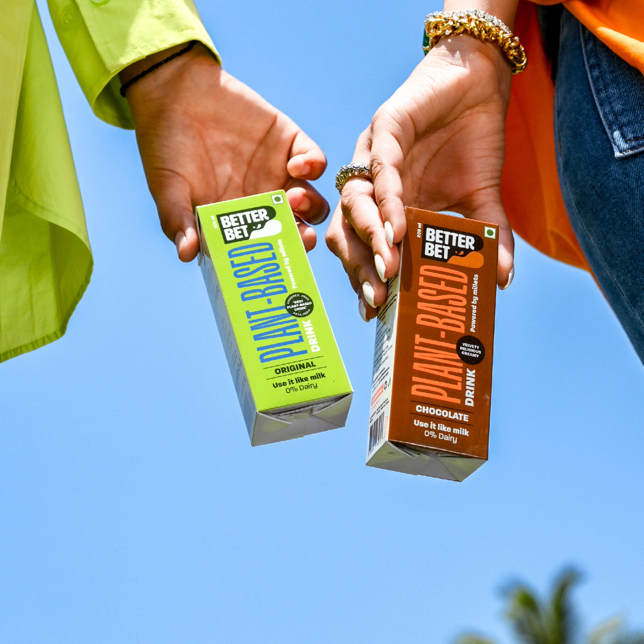
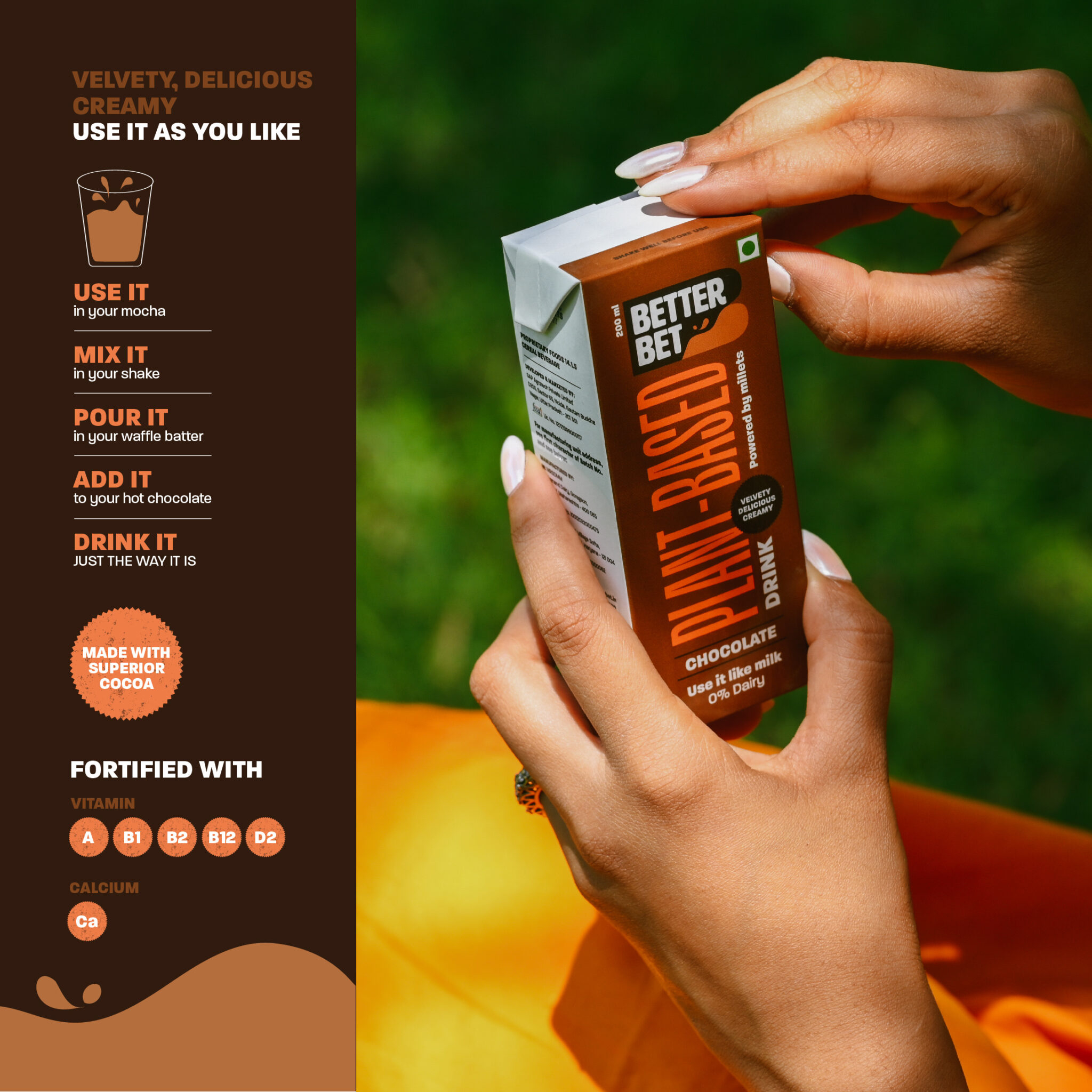
With a brand so unique, the identity is as fun and dynamic! Using the brand logo, vibrant colours, bold type and illustration combinations, an energetic personality comes to life in order to encourage the consumers to make the better choice!
