Let’s dive into the story of SUZUKO and its packaging in this edition of Curator’s Insight which I find truly inspiring – it’s all about resilience and hope.
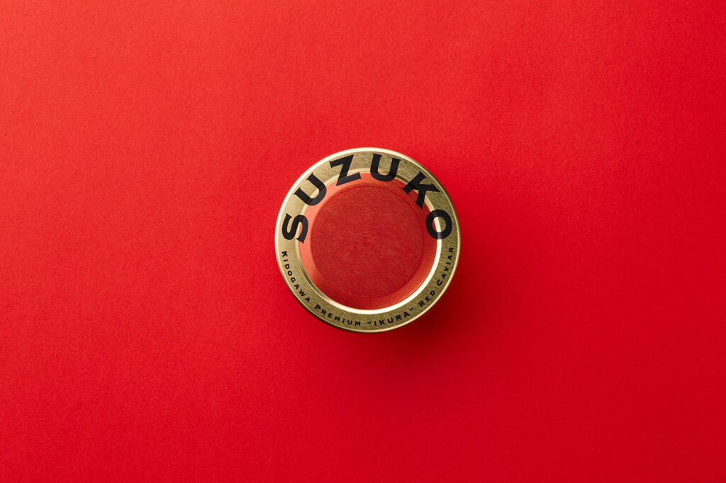
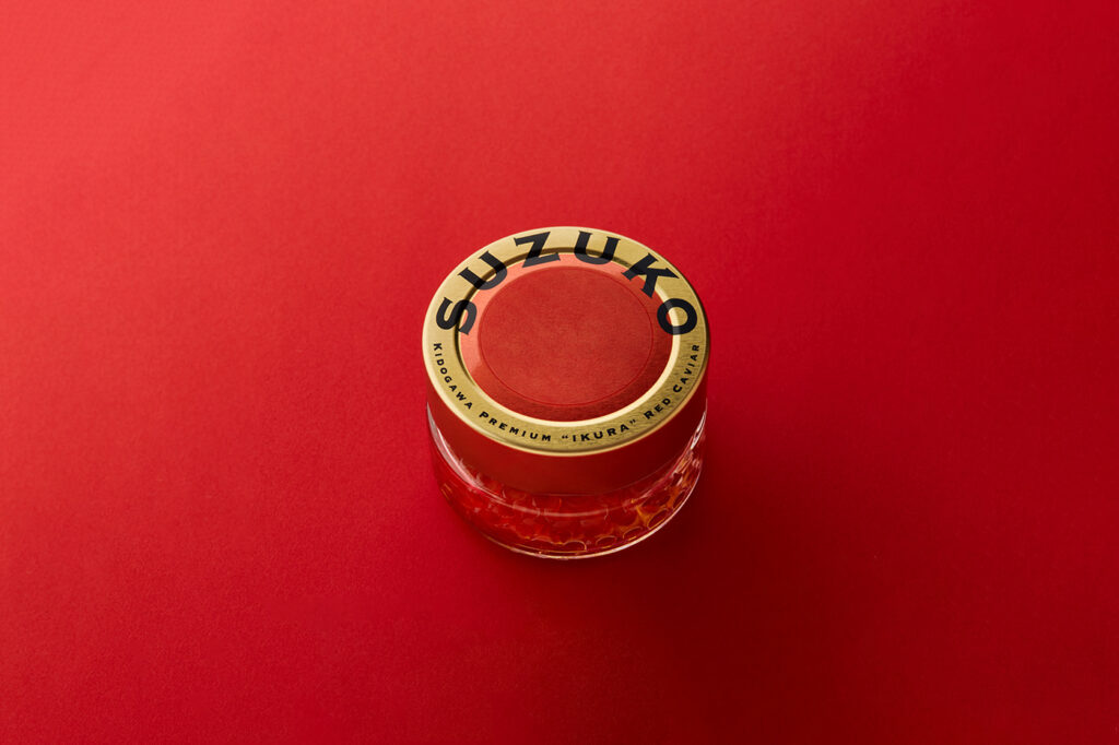
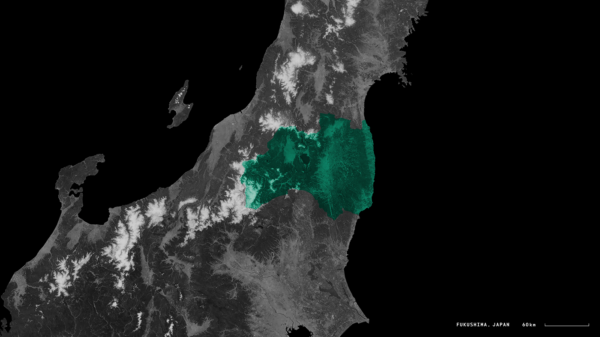
At first glance, SUZUKO is shouts Made in Japan. The logo design cleverly represents the salmon roe as the sun, a symbol of hope and renewal. By superimposing the image of dawn on the salmon roe, it’s as if SUZUKO is saying, “We’re ushering in a new era for Fukushima’s fishing industry.” It’s a visual metaphor that conveys optimism and rebirth – a symbol of recovery for Fukushima’s fishing industry. The background story of Fukushima’s challenges with harmful rumors and the decline in salmon roe production sets the stage for SUZUKO’s significance.
The use of gold cans is a brilliant choice. Gold not only adds a touch of luxury but also shimmers beautifully, reminiscent of red caviar. The certificate of guarantee is another thoughtful touch. In a world where food safety is paramount, this certificate reassures consumers that the product has passed safety certification tests. The calm, subdued tone of the certificate communicates trust and reliability. It’s like a promise to the consumers that SUZUKO is not just delicious but also safe.
SUZUKO’s packaging is a testament to the human spirit’s ability to overcome adversity. It’s about turning challenges into opportunities, and it’s a beacon of hope for Fukushima’s fishing industry.
Design: evolution thinking
Art Direction: NOSIGNER (Eisuke Tachikawa)
Graphic Design: NOSIGNER (Eisuke Tachikawa, Tomoro Hanzawa, Ryota Mizusako)
Web Design: NOSIGNER (Eisuke Tachikawa, Tomoro Hanzawa, Ryota Mizusako)
Development: NOSIGNER (Naoki Hijikata)
Photograph: NOSIGNER (Ryota Mizusako, Yuichi Hisatsugu)


