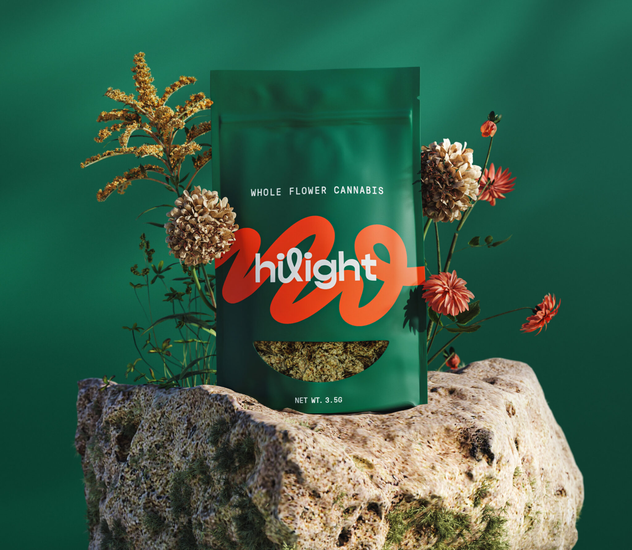
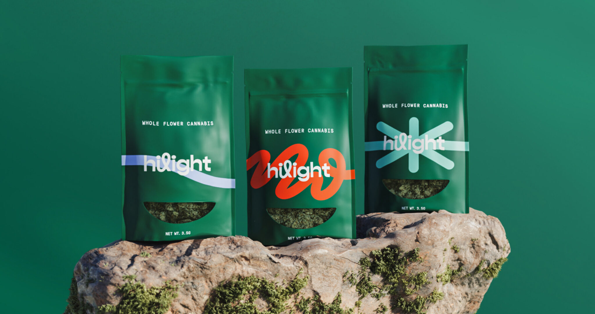
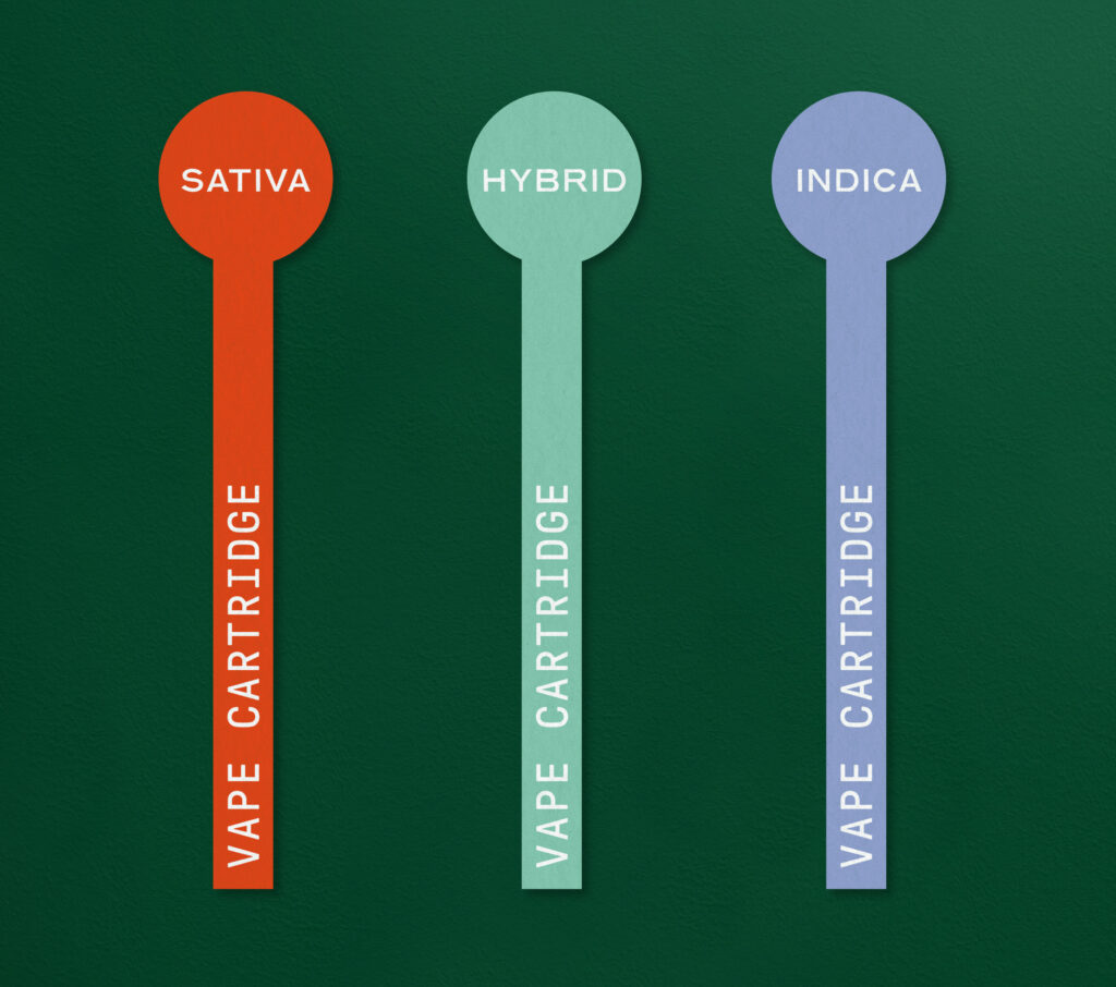
Carpenter Collective developed the brand strategy, the brand name, the fully-customized logotype, the identity system which utilizes a series of linear graphics to help tell the story of each strain effect which helps educate new consumers on their product selection, as well as a very in-depth packaging system.
Cannabis is inspirational in the way it can genuinely change people’s lives and Hilight aims to offer consumers the keys to unlocking a better life. This new medical cannabis company targets the consumer who loves to try new cannabis products and values simple formulations that offer a balance of price and quality. We developed the Hilight name, a robust brand strategy, brand identity system, a packaging system and a social media strategy. This brand was designed to be simple yet empowering, just like Hilight.
Each patient’s cannabis journey is unique, as are their preferences and needs around potency and consumption methods. The simple formulation of Hilight’s cannabis product is matched with approachable branding that is easy to understand. The linear brand graphics are a core design element within the brand identity. The characteristics of the linear graphics are reflective of the strain effects and help educate new consumers and build confidence in their product selection.


