COFFEE SO GOOD IT’S ABSURD
TwoX Studio was tasked with developing a new packaging design for Maxim Coffee Roasters, for their retail coffee bags, something that would reflect their values and get people excited. They wanted something that could feel timeless, and upscale, but also approachable and understated. They needed a system that could allow them to stay nimble as they interchange flavor profiles depending on the different varietals and blends they use throughout the seasons. Creating ‚ Maxim – coffee has been a flavorful journey. The brand was born out of the belief in the good life – one with happiness and enjoyment, just as with a responsible and conscious attitude towards others and the environment. As a brand with such a strong mission, Maxim’s branding and design needed to reflect exactly that.
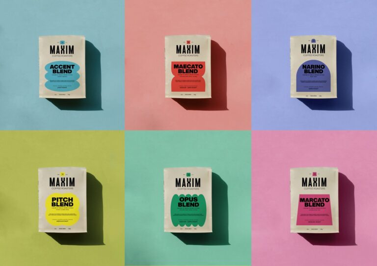
From the opinionated naming and the strong colours to the colorful imagery, as well as the very vocal icon-style signs communicating the brand’s key-messages and benefits, everything is aimed towards a confident appearance ready to bring a breath of fresh air to the world of coffee. The challenge was to find a way to produce packaging with high visual impact in a small amount.
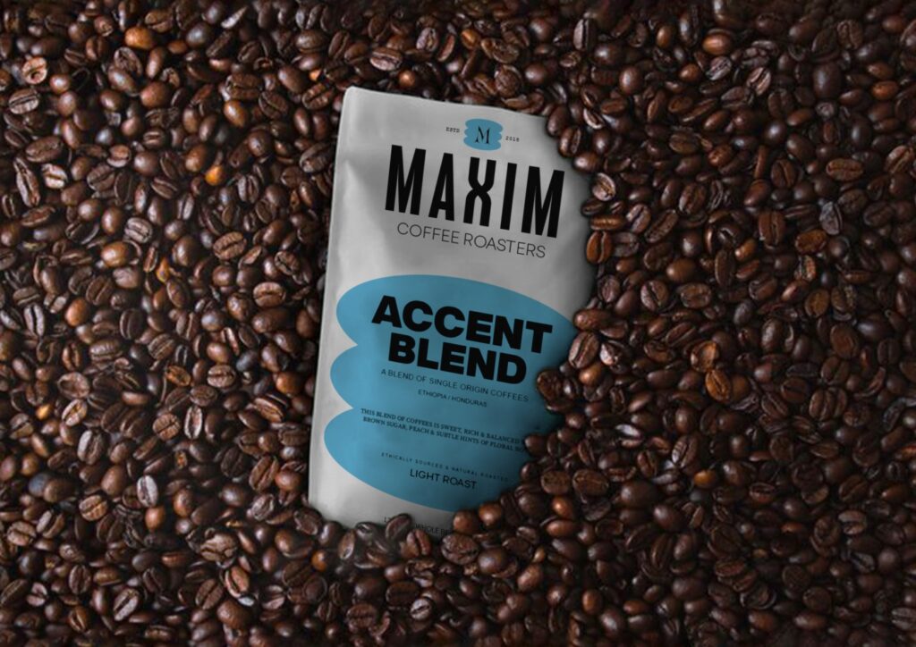
The brand has a versatile visual identity, capable of being applied consistently across multiple coffee packages. In terms of packaging design, we use different colours to convey different coffee flavours. The goal to create an original and fresh design that would look compelling in online stores. I created a very minimalistic identity, with certain graphic elements designed to suit the characteristics of e-commerce platforms and the online buying experience, especially by making them pop up when the product is viewed in “preview” mode. The graphic approach is based on a playful interaction between typography and other elements incorporated into the design.
Discover a new world of coffee one sip at a time.


