Too Yumm Instant Noodles Packaging Design & Branding
Company/Brand Background: Guiltfree Industries Limited (GIL) is a part of RP Sanjiv Goenka Group and leads the group’s venture into the FMCG sector. Too Yumm! is the flagship brand of GIL, known for offering a wide variety of Western and Indian snacks with disruptive flavors. The brand has carved a niche in a crowded market through product and flavor innovations like Multigrain Chips and Wasabi Foxnuts. Now, Too Yumm! is set to enter the instant noodles category with a unique proposition featuring exciting South-Asian flavors.
Challenge
Too Yumm! aimed to enter the competitive instant noodles market with a product that offers disruptive, appetizing, and unique flavors from South Asia. The challenge was to design packaging that:
- Creates Curiosity: Hook consumers and instigate trial generation.
- Communicates Flavor Profile: Highlight the unique and spicy flavor profiles effectively.
- Stands Out: Outperform competitors while retaining an Indianized touch and Too Yumm! brand identity.
The packaging needed to appeal primarily to urban millennials (age 15-30) who are experimental, trend-savvy, and active on social media. Moreover, the client expressed a desire to infuse the packaging with a distinct Korean touch, emphasizing the spicy aspect of the product. This additional requirement added complexity to the design challenge, necessitating a creative approach to seamlessly integrate Korean elements while maintaining coherence with the brand’s overall vision.
Solution
DesignerPeople approached the project with a strategic blend of research, creativity, and brand alignment. Here’s how we tackled the challenge:
1. Curiosity Factor:
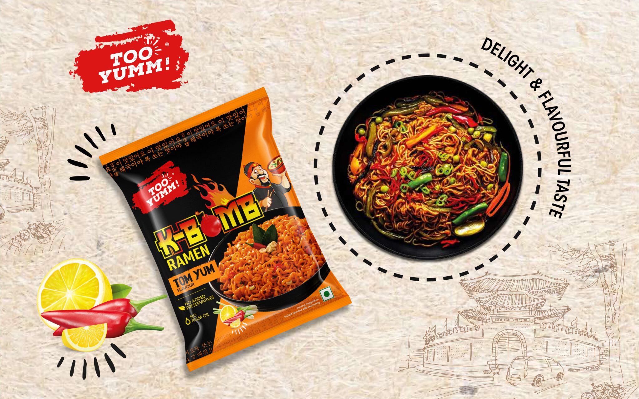
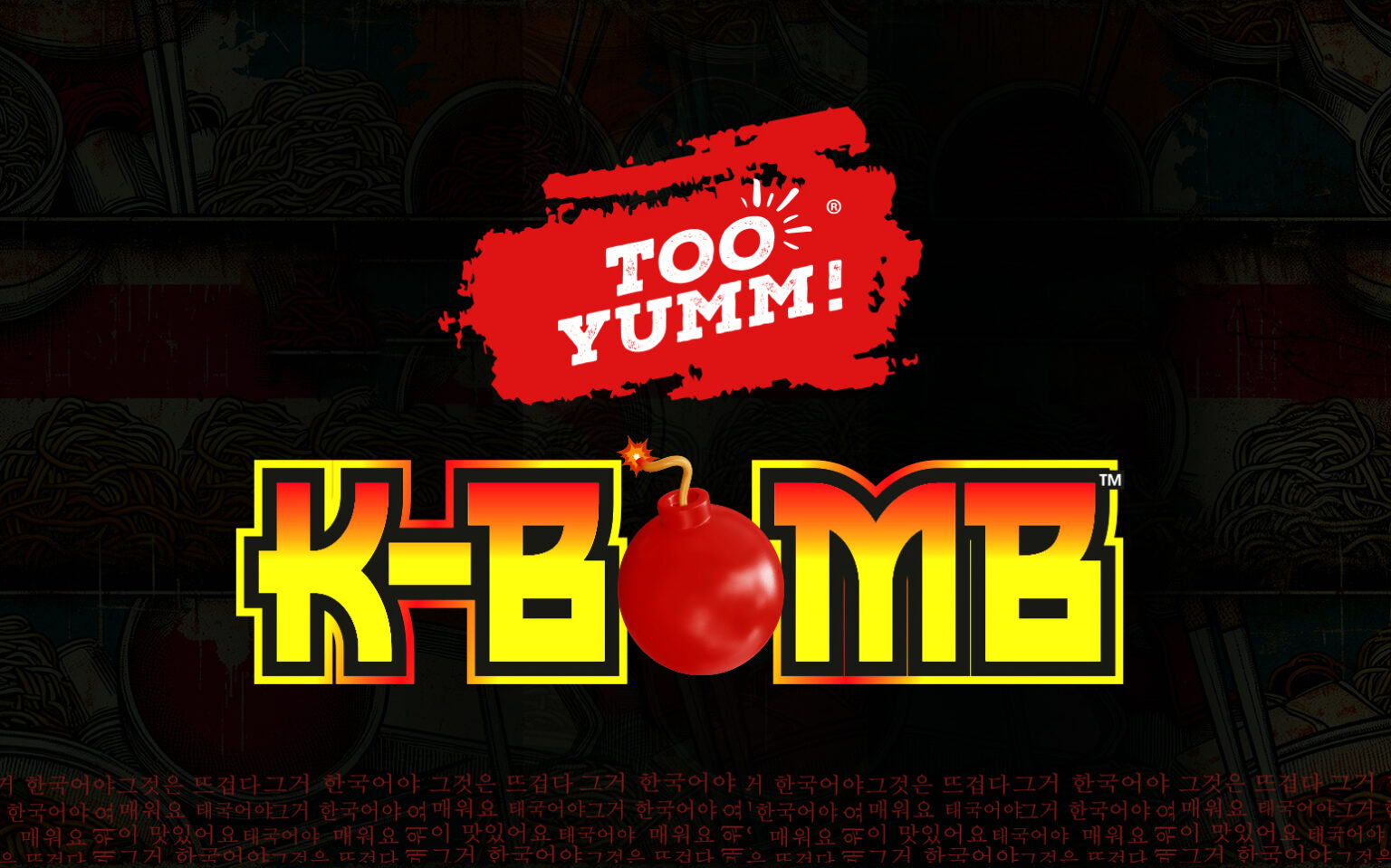
Logo and Imagery: We created an engaging logo for K-Bomb, featuring a fiery look to symbolize the spicy flavors. Incorporating a Korean chef and Korean text in the background added authenticity and appeal to the Gen Z audience.
Design Elements: Fire elements were added to signify spiciness, and the packaging used trendy, fresh, and edgy designs that resonated with the target audience.
2. Flavor Communication:
Visual Appeal: The packaging used vibrant colors and a sophisticated layout. Each flavor variant had distinct Pantone colors, making it easy for consumers to identify their preferred flavors.
Imagery: The use of a Korean chef and Korean text helped in communicating the authentic Korean feel.
3. Standout Packaging:
Cultural Integration: We balanced the Too Yumm! brand colors with Pantone colors relevant to each variant (e.g., Tom Yum, Mi Goreng). This ensured the packaging looked familiar to the category but stood out as unique.
Modern Aesthetics: The packaging design featured a blend of modern aesthetics with traditional elements, giving it a premium yet relatable look.
Outcome
The final packaging design for Too Yumm’s K-Bomb noodles achieved several key goals:
Market Differentiation: The packaging successfully stood out in the crowded market, combining trendy and edgy design with cultural authenticity.
Consumer Engagement: The design generated curiosity and trial among the target audience, with positive feedback highlighting the appeal of the Korean chef imagery and fire elements.
Brand Alignment: The packaging maintained Too Yumm!’s brand identity while introducing an innovative product to the market.
Client Feedback
“We are thrilled with the new packaging design for our K-Bomb noodles. It perfectly captures the essence of Too Yumm! while appealing to our target audience. The design is not only trendy and edgy but also highlights our commitment to offering unique flavors. The response has been overwhelmingly positive.” – Too Yumm Team
Conclusion
The successful packaging design for Too Yumm Instant Noodles showcases the power of combining cultural elements with brand identity to create a standout product. The project aligns with DesignerPeople’s philosophy of creating impactful, consumer-focused designs that resonate with the target audience and drive market success.


