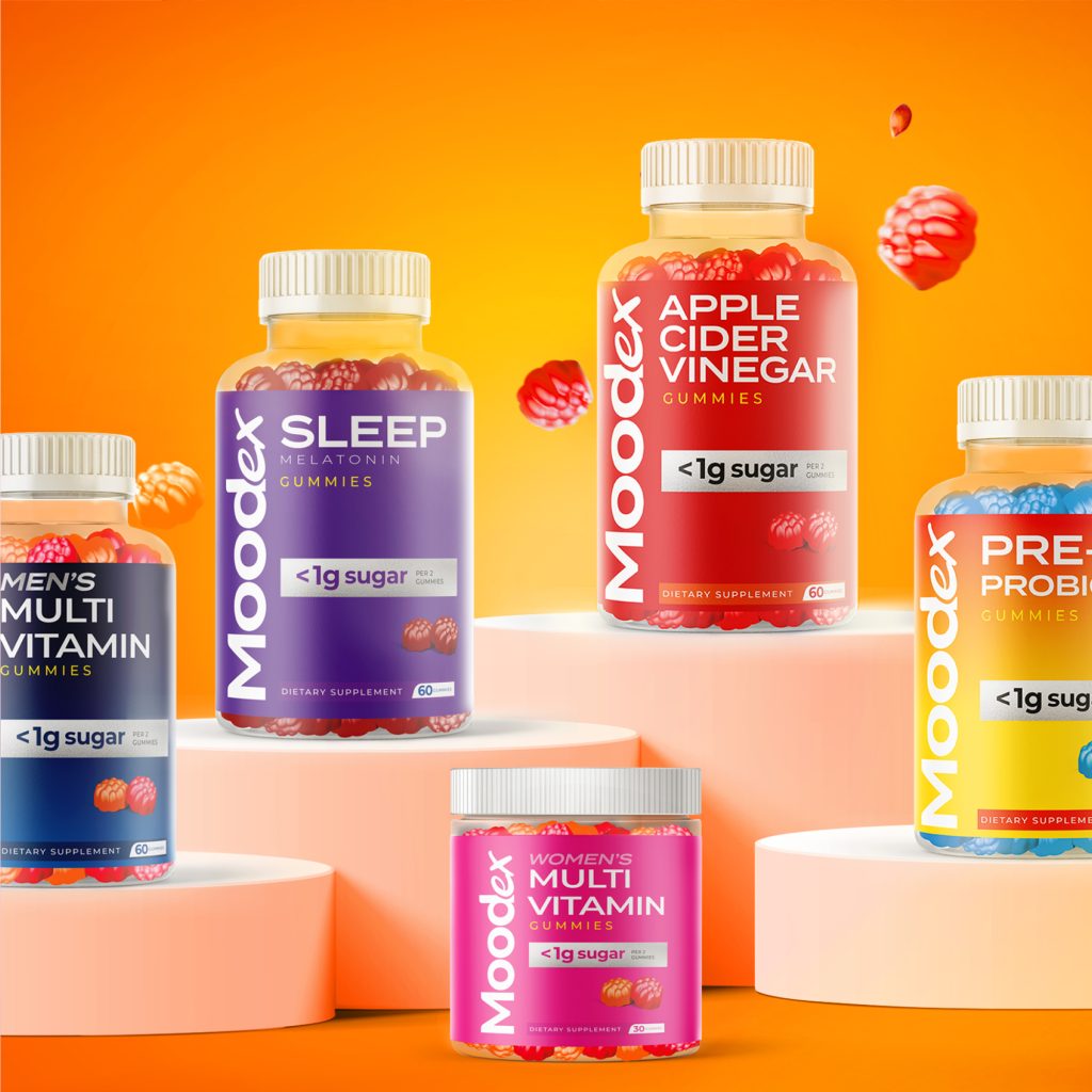
These designs for the Moodex brand are chosen specifically for those experiencing a lack of energy. The design, aligned with its purpose, incorporates vibrant and energetic colors, with red symbolizing energy and movement, alongside other bright colors that create high value. Some areas of the product label are left metallic to catch the consumer’s attention on the shelf by reflecting light under spotlights. In this design, which includes typographic arrangements, we avoided complexity and used a simple and clear image to effectively position the product in the right place.
