About the product
Cogoo is a ready-to-drink coffee brand offering various chilled coffee options for active customers who are always on the go.
Design concept
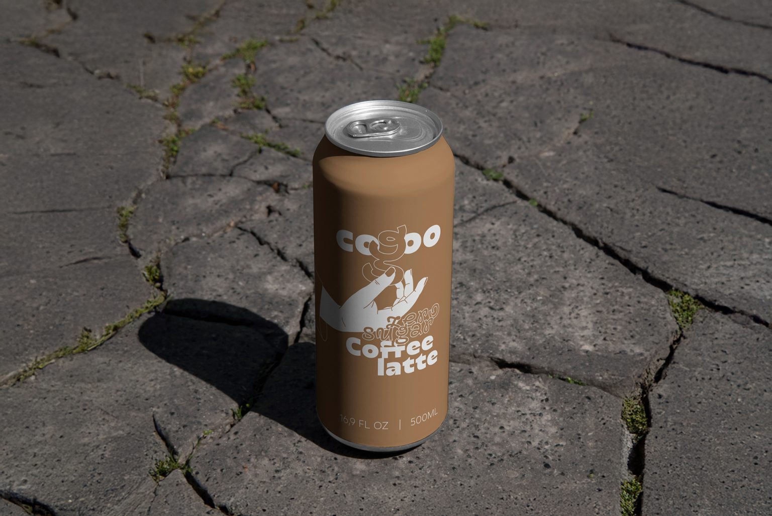
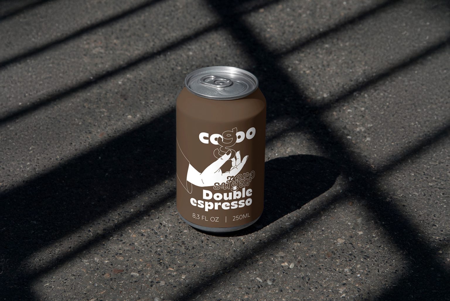
The packaging design for Cogoo reflects its target audience’s fast-paced, modern lifestyle. The minimalist and functional can design, with muted tones, gives the product a clean and straightforward look.
Solution
The design strikes a balance between simplicity and intrigue. Each flavor has its unique color tone, giving consumers a visual cue for the type of coffee they select. The packaging is designed with the practicality of portability in mind, as consumers can quickly grab their favorite chilled coffee while in transit.
Techniques used
The design uses a flat, vector-style illustration combined with sans-serif typography. The playful typography for the brand name ‘Cogoo’ and the swirling elements within the design create a sense of movement and energy, reinforcing the brand’s association with active and busy lifestyles. Matte finishes on the cans give the product a premium and tactile appeal.
Uniqueness
What sets this packaging apart is its ability to communicate speed and convenience while maintaining a sense of sophistication. The bold decision to use a hand illustration in the packaging design makes the cans stand out from other ready-to-drink coffee brands. The hand symbolizes a personal touch, subtly linking the idea of handcrafted coffee with a product designed for instant consumption.
Results
The minimalistic yet practical design ensures brand recognition and shelf appeal. The matte cans catch the eye with their sleek design while conveying a sense of premium quality. The uniformity across the range makes the brand easily identifiable, helping it stand out in a crowded market.


