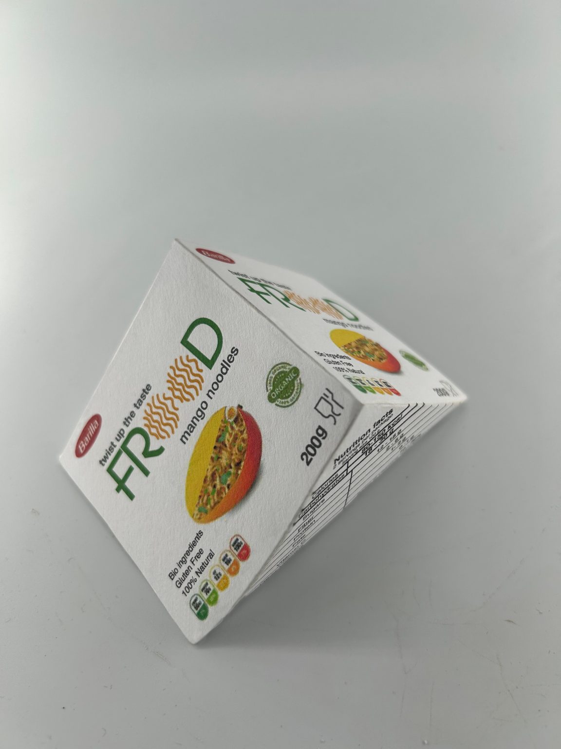
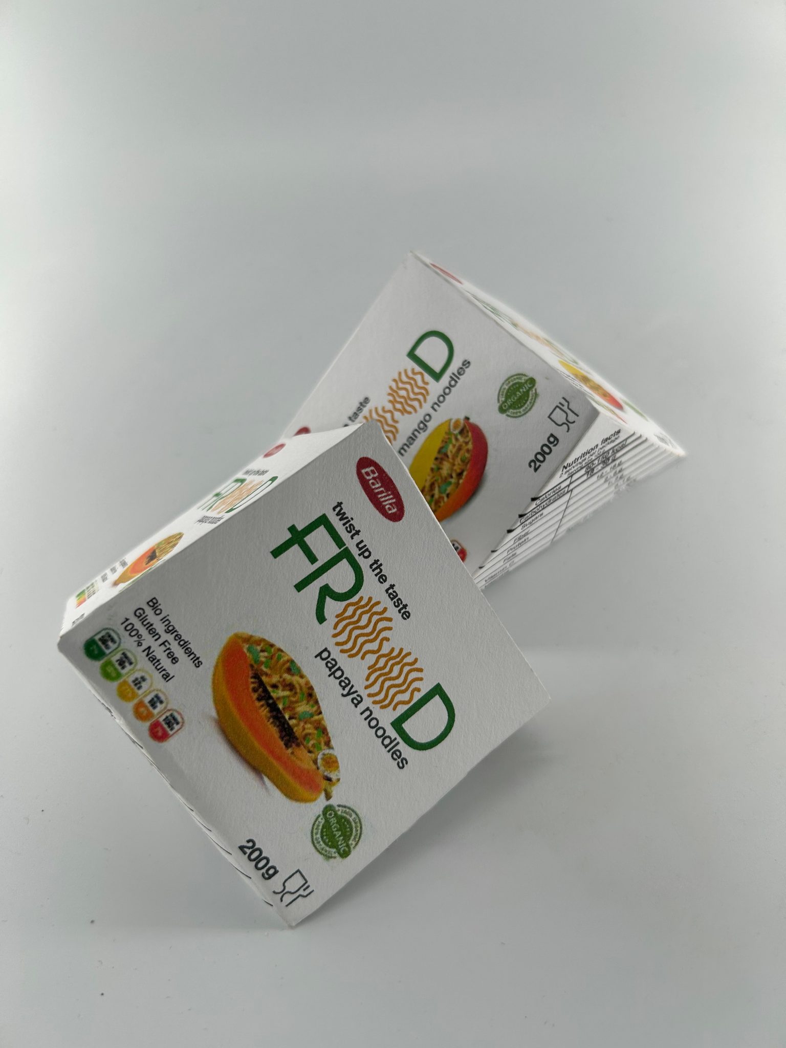
The packaging for FROOD fruit noodles combines a clean, modern design with a focus on natural and organic appeal. Made from sturdy, eco-friendly paper, the package reflects a commitment to sustainability while ensuring durability. It highlights the unique mango, papaya, pear, and apple noodle varieties with vibrant fruit imagery and bold, attractive text.
The layout is minimalistic yet engaging, with the brand name “FROOD” prominently displayed in a playful font. The double “O” in the name is cleverly stylized with a noodle-like pattern, reinforcing the product’s identity. The flavor is clearly labeled, accompanied by a visually appealing image of the featured fruit and the noodles, making it easy for consumers to identify and select their favorite variety.
The overall design balances simplicity and vibrancy, targeting young adults with an interest in unique, healthy, and sustainable food options. Compact and neatly structured, the packaging is designed for both visual appeal and practicality, making it stand out on store shelves.


