IndiGo is an Indian confectionery where you can immerse yourself in the world of Indian sweets. Here visitors can go on a culinary journey, enjoying a wide range of traditional desserts prepared according to ancient recipes. IndiGo offers a unique experience of discovering India, its rich culture, cuisine and national desserts.
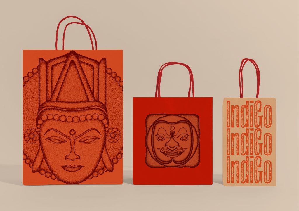
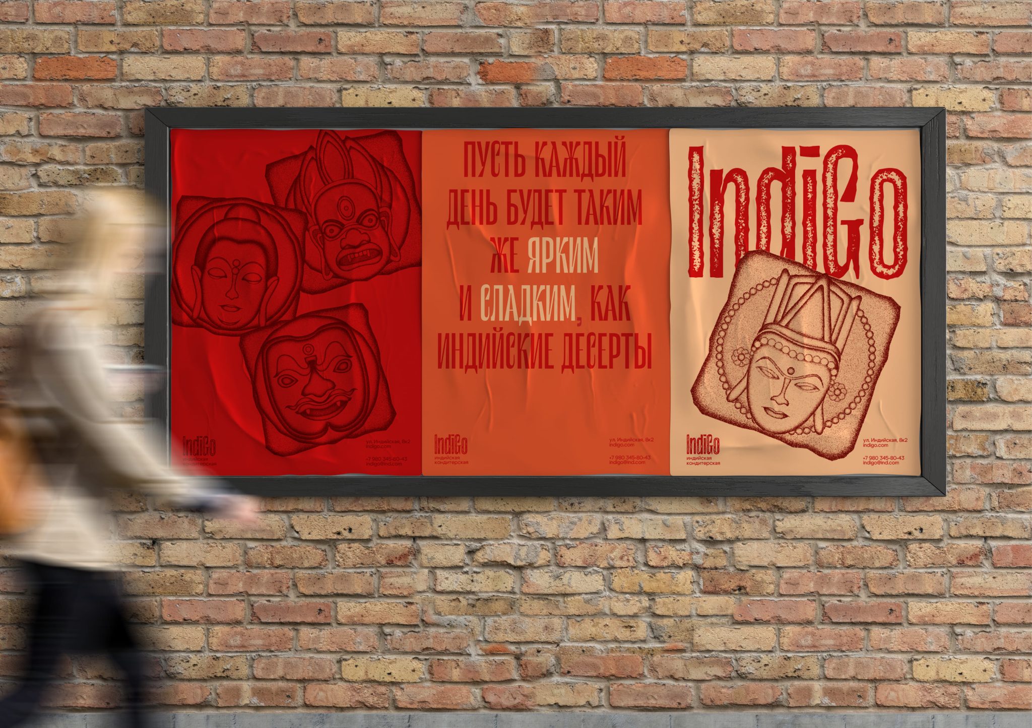
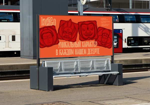
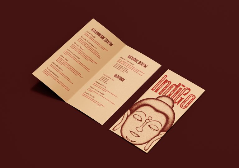
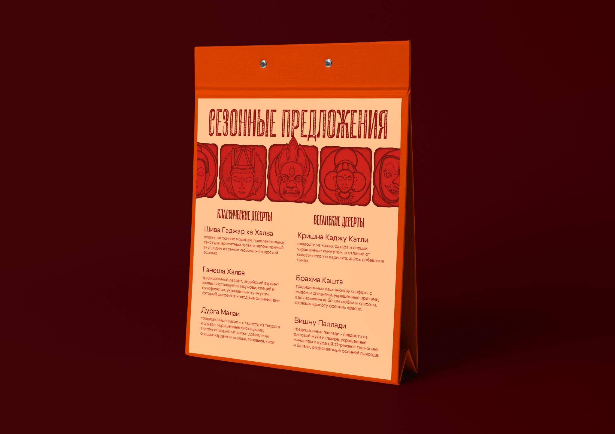
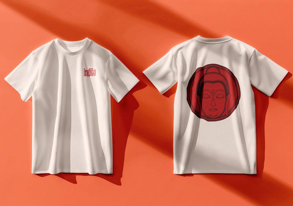
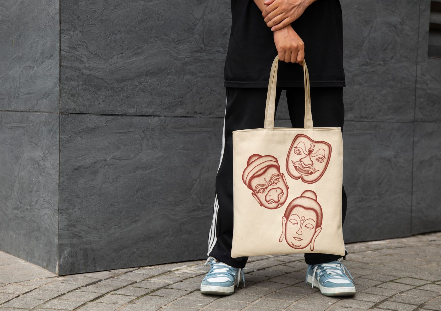
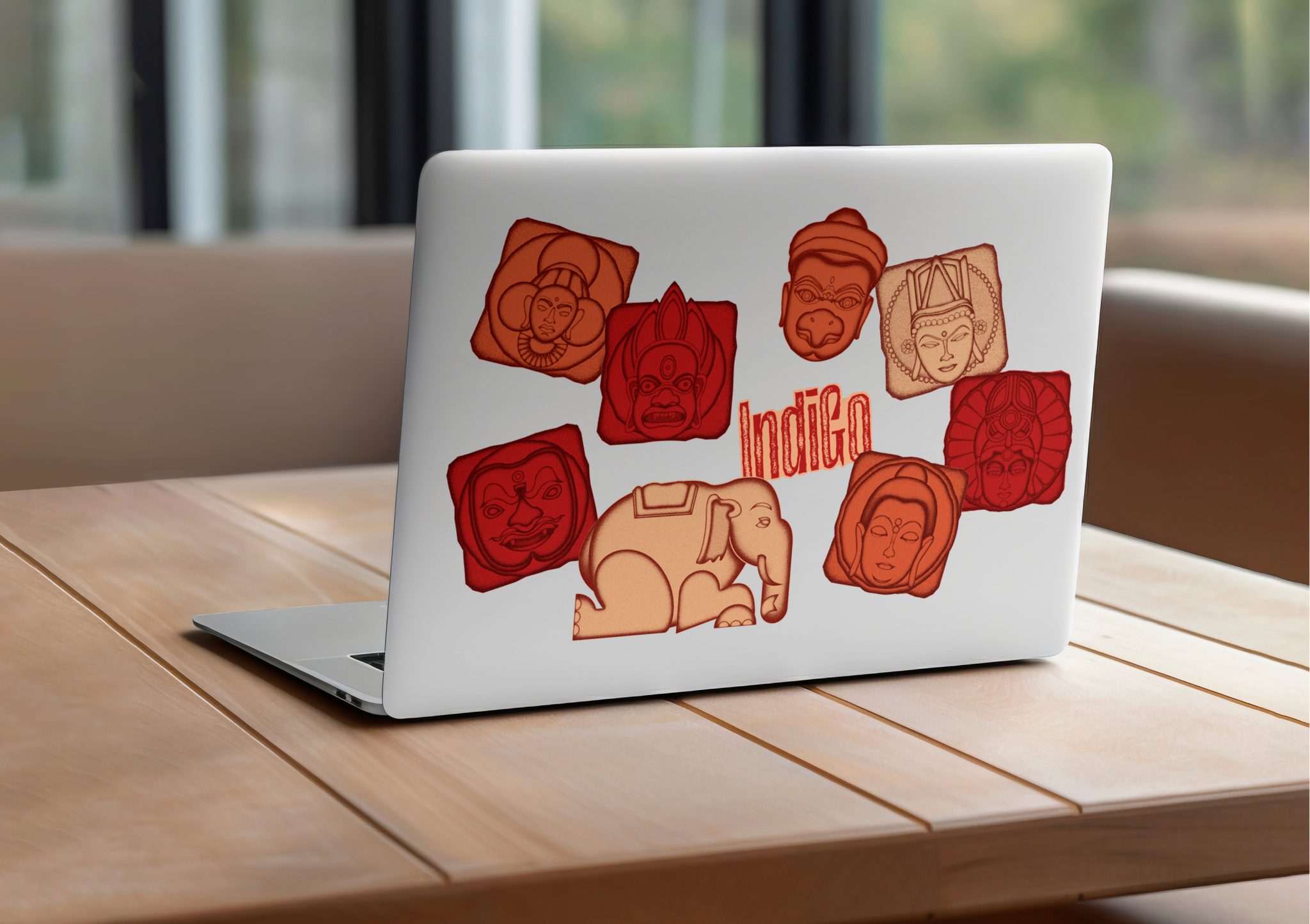
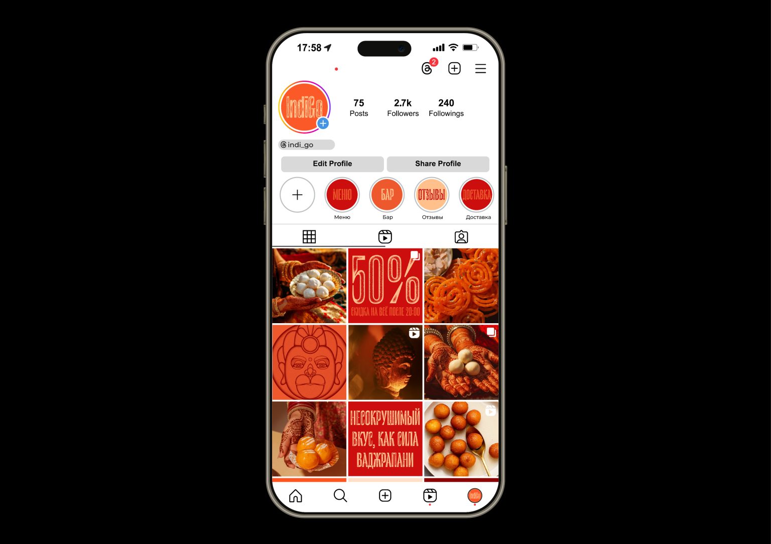
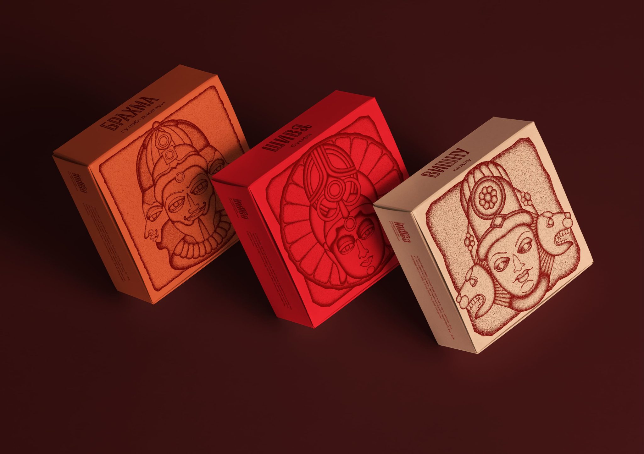
To create an atmosphere of authenticity, we developed a brand identity for IndiGo that reflects the spirit of India and its traditions. The design is based on images from Indian mythology – Hindu and Buddhist deities embodied in stylized characters.
The brand identity’s metaphor is the stone sculptures and reliefs decorating the temples of India. The texture of the stone used in the design evokes associations with majestic Buddhist temples, and also imitates the texture of shortcrust pastry, from which many Indian desserts are prepared. The main colors of the corporate style – bright red, warm orange and soft beige – reflect the hot and sunny atmosphere of India, giving the style liveliness and warmth. The typography echoes the techniques used in the character design. The letters, like the images of the characters, acquire a crumbly, rocky texture.

