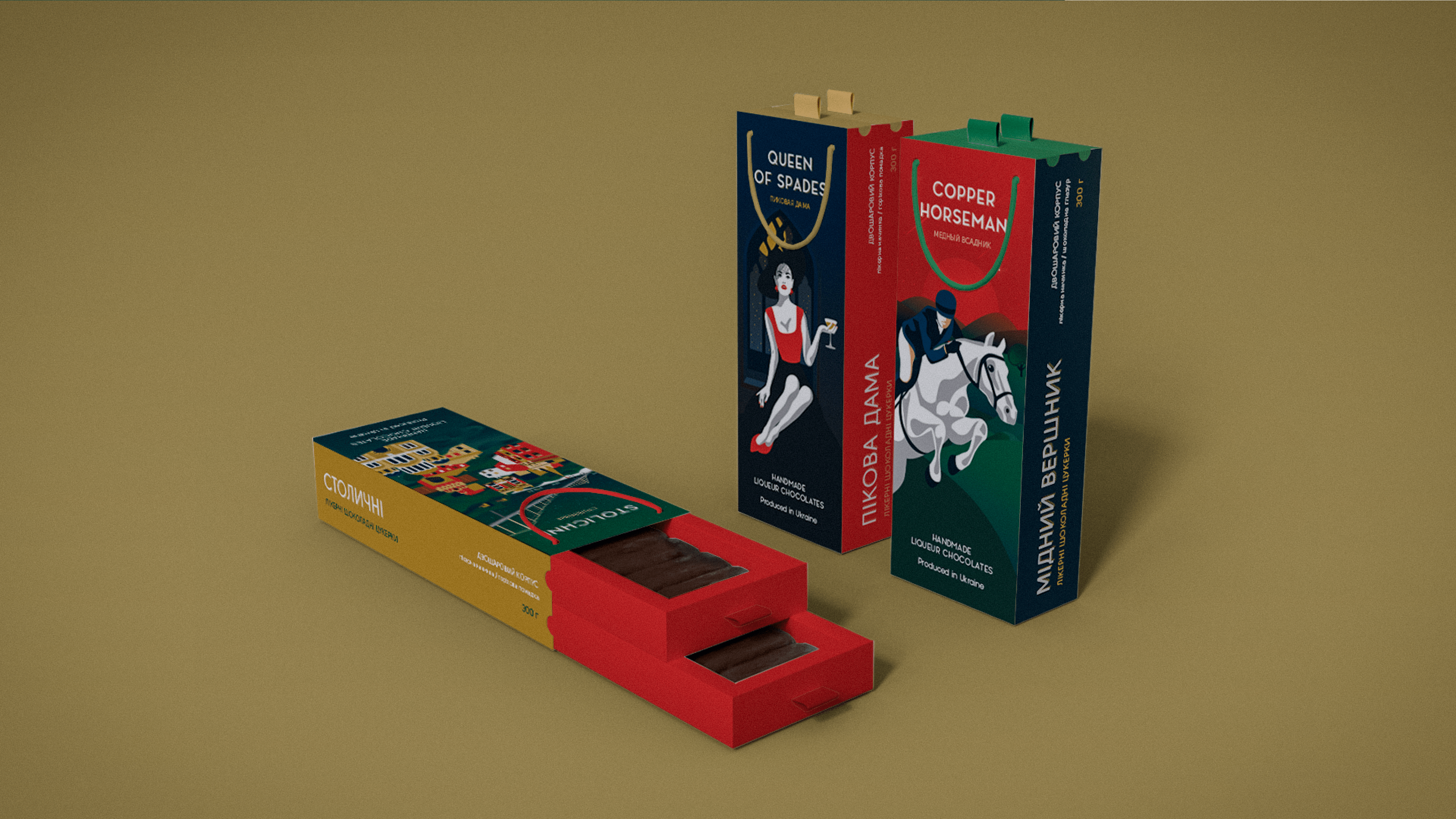
Packaging rebranding of candies with a rich history and taste
Problem
The key challenge: to create a packaging design that combines the vivid history of candies of the 1960s and modern elements.
Solution
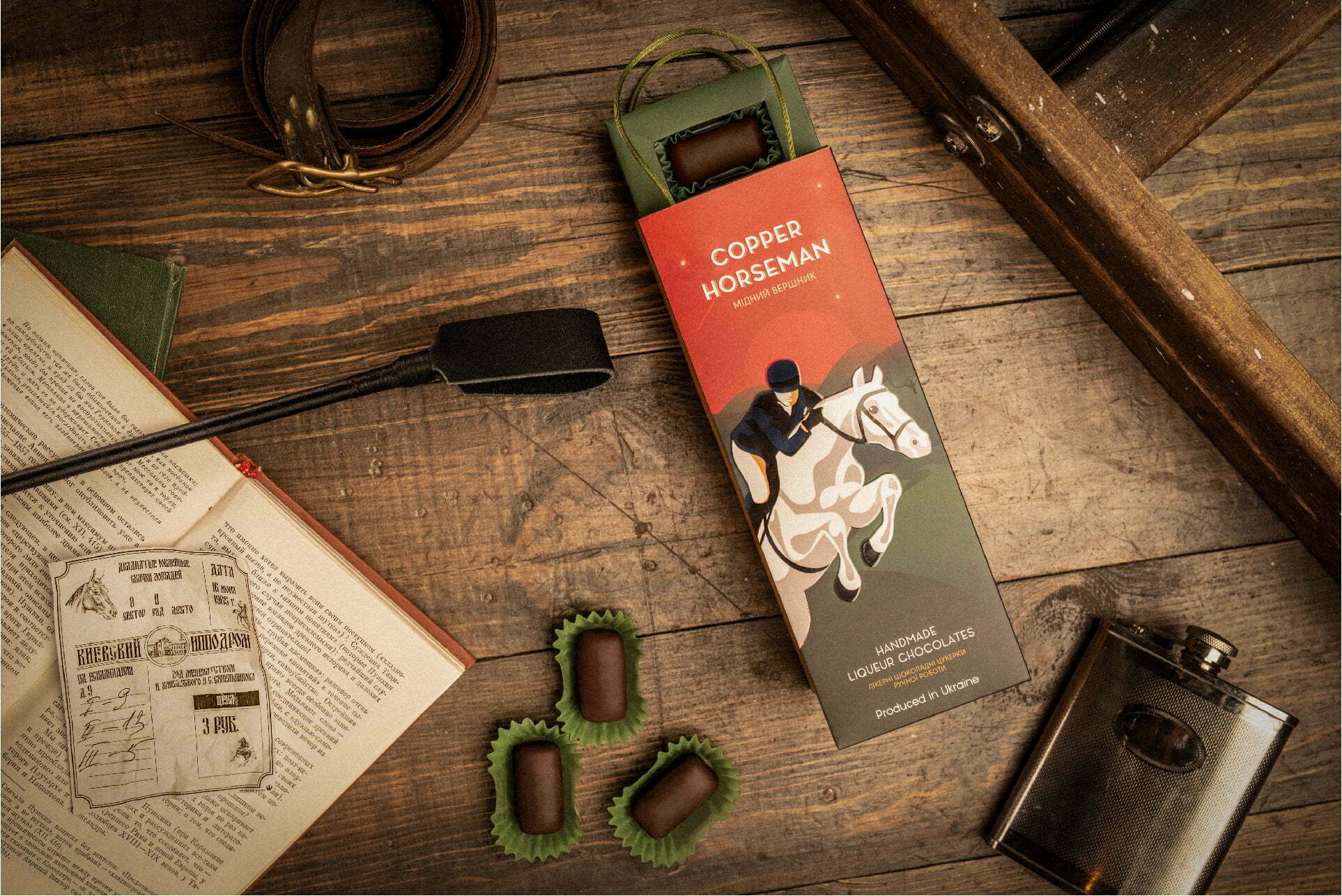
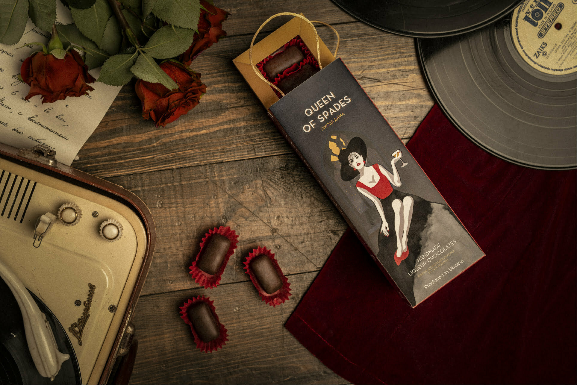
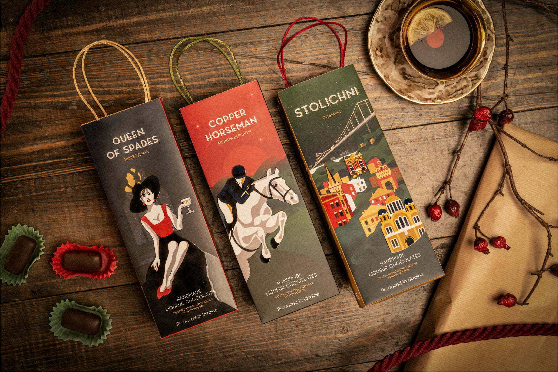
Having studied the history of liqueur candies in detail, we took a trip through archival photos and videos related to the Ukraine of the last century. The history of the Rivne confectionery factory series of liqueur candies “Stolichnye”, “Pikovaia Dama” (“Queen of Spades”), and “Medniy Vsadnik” (“Copper Horseman”) began in the 60s. The fragile sugar body of the candies requires careful treatment. They are made according to an old recipe. Therefore, it was so important in rebranding to reflect the handicraft on each part of the brand.
The main association with these candies is alcohol. We focused on this and created a unique design that resembles the packaging of expensive alcohol. Thus, people will associate the candies on the shelf with the liquor.
When creating key visual packages, we found authentic things of the 60s, including the newspaper “Vecherniy Kiev” (“Evening Kiev”), a record player, the “Salyut” camera, tickets for horse races, and a tea set. As a result, the packaging design speaks for itself. Preserving the spirit of that time, it inspires new acquaintances and emotions.