

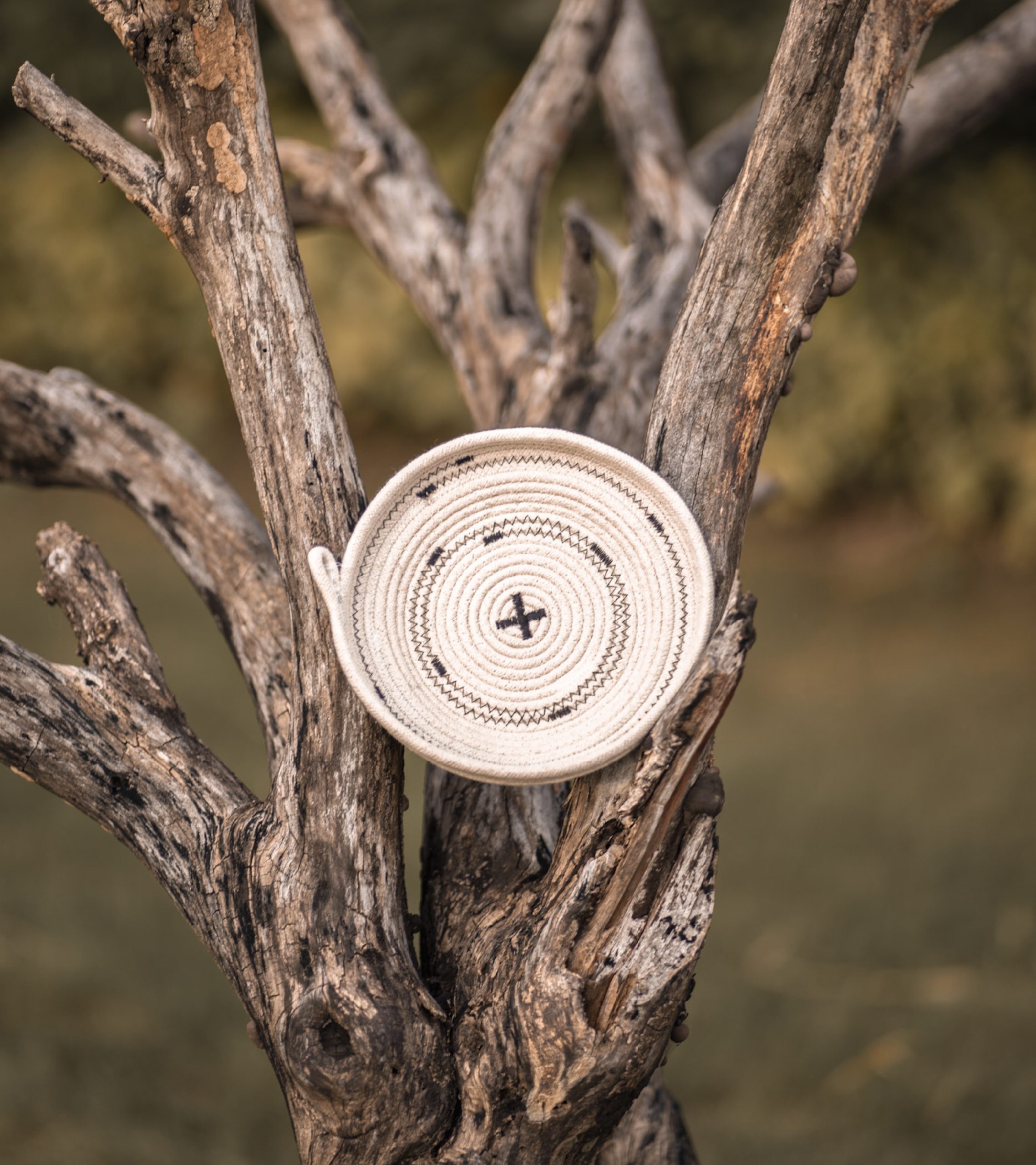
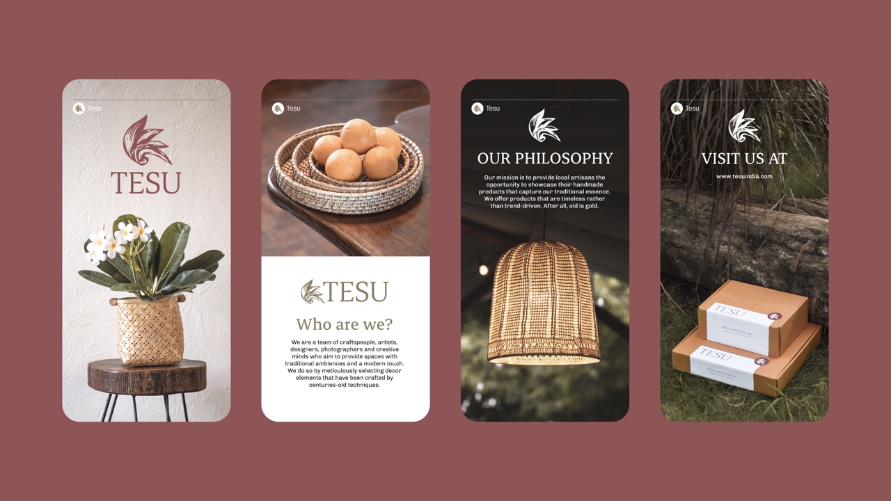
Tesu is a home decor and furniture brand based in Madhya Pradesh that works closely with local artisans and artists from across India to produce timeless collections of objects that are natural, sustainable, functional, and rich in aesthetic value.
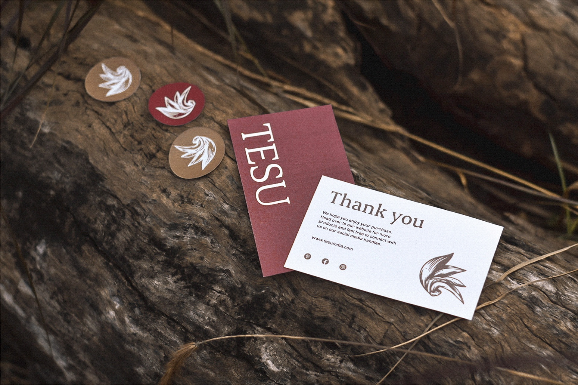
The brand is named after the Tesu flower, traditionally used to prepare natural colors for Holi. The brand identity draws directly from this flower, illustrated in a linocut style to evoke a handmade feel—mirroring the artisanal nature of Tesu’s products.
Since Madhya Pradesh is predominantly covered in deciduous forests, the brand palette uses earthy, muted tones to reflect the dry and rugged personality of the region that Tesu proudly calls home.
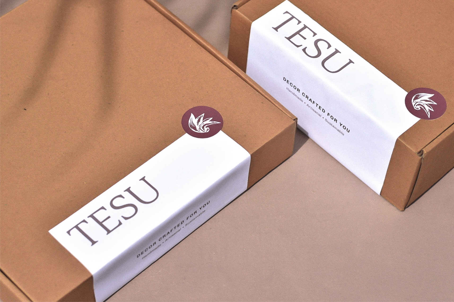
One of the key challenges in packaging was the limited availability of resources to create a visually appealing package for a premium product. The client provided simple cardboard boxes as the only available packaging material. Instead of seeing this as a limitation, I leveraged the brand’s earthy aesthetic by keeping the box natural and unaltered. A clean, minimalist label made from white ivory sheet seals the box. This label features a prominent logotype, complemented by a separate logo mark in the form of a sticker placed on one corner—adding a distinct and premium touch to the packaging.
Branding, Packaging and Art Direction: Sushruta Sarkar
Photography: Sushruta Sarkar, Squirk Media Co.




 NEV
NEV Stefano Bracci
 Alina
Alina monther al omari
 Lizakjx
 JOAOMARCOSDESIGN
 alchimistestudioParis
 Harriet Neild
 octavio rojo
 宏洛图品牌设计HONGLT
 DESIGN CONCEPTS
 Alexander Skurihin
 Studio K95
 ARMBRAND
 Richa Rai
 houseoferas by Miti
 Agence des Coteaux
 Kushi Eaknath
 Ann Treasa
 Xiao Ning
 krrrrrllii
 babyage
 Deep
Deep