

Péralya – Conception d’emballage pour pâte à tartiner aux noisettes | Agence Artistry Studio
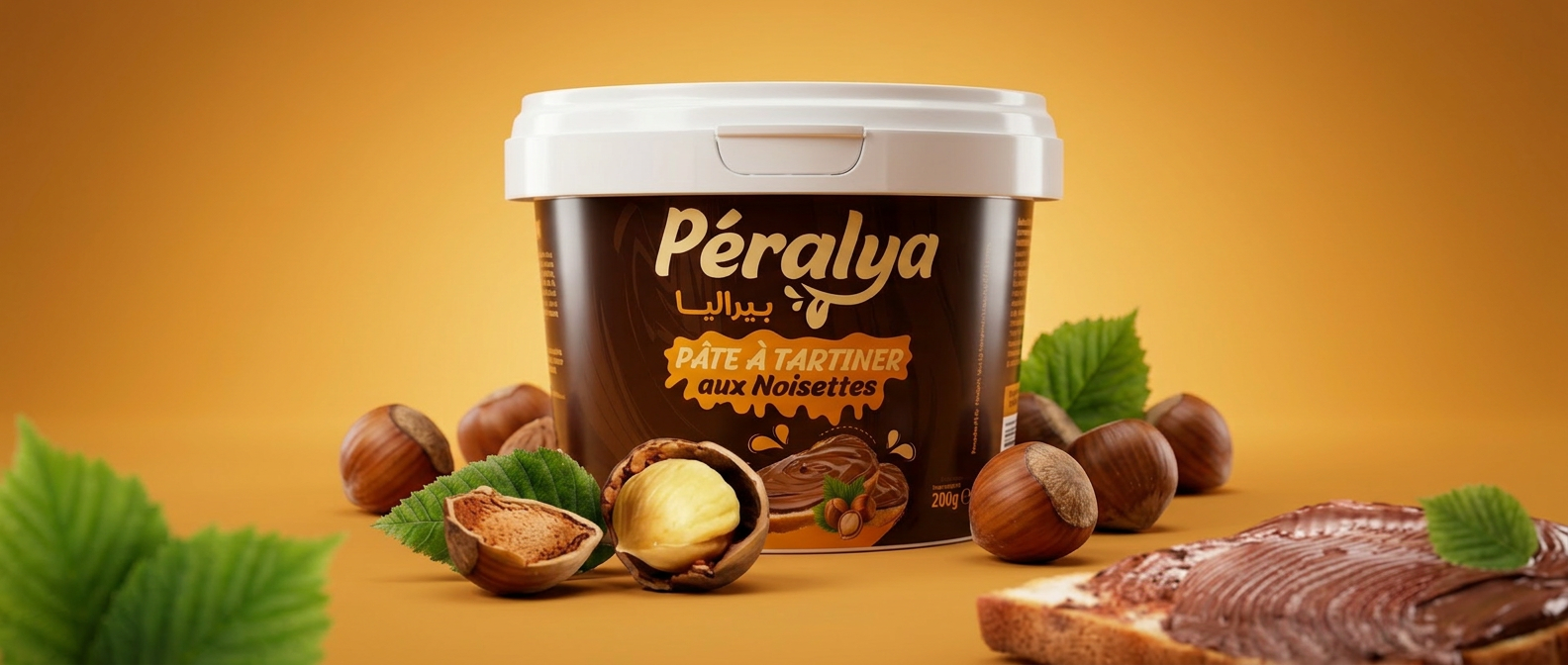
L’agence Artistry Studio a conçu l’identité visuelle complète des emballages de Péralya, une pâte à tartiner algérienne au chocolat et aux noisettes destinée au grand public. Le projet englobe le design intégral des emballages déclinés en trois formats : un pot large, un seau haut et un pot compact.
Identité visuelle et de marque : Le logo Péralya a été conçu selon un système bilingue associant le latin et l’arabe (بيراليا), garantissant une lisibilité optimale pour les consommateurs algériens dans les deux langues. Le nom de marque utilise une typographie fluide et conviviale qui allie accessibilité et confiance dans la marque.
Choix de conception de l’emballage : La stratégie couleur repose sur une base brun chocolat intense, contrastée par des accents dorés chauds et un orange vif pour le nom du produit « Pâte à Tartiner aux Noisettes », optimisant ainsi sa visibilité en rayon dans les supermarchés et épiceries algériennes. L’étiquette intègre des illustrations appétissantes de noisettes, de pâte à tartiner au chocolat et d’éléments végétaux naturels, communiquant directement sur l’emballage le goût et la qualité des ingrédients.
Cohérence du format : Les trois formats de contenants conservent une stricte cohérence visuelle — mêmes codes couleur, même emplacement du logo, même architecture d’étiquette — assurant une forte reconnaissance de la marque sur l’ensemble de la gamme de produits.
Secteur : Emballage alimentaire et de boissons Catégorie : Pâtes à tartiner / Confiseries Marché : Algérie Conception : Agence Artistry Studio
Péralya – Hazelnut Spread Packaging Design | Artistry Studio Agency
Artistry Studio Agency created the complete visual identity and packaging design for Péralya, an Algerian chocolate and hazelnut spread made for the mass market. The project includes the full packaging system developed across three different formats: a wide jar, a tall bucket, and a compact jar.
Visual and Brand Identity:
The Péralya logo was designed using a bilingual system that combines both Latin and Arabic (بيراليا), ensuring optimal readability for Algerian consumers in both languages. The brand name features a smooth and friendly typography that balances accessibility with a strong sense of trust.
Packaging Design Choices:
The color strategy is built around a rich chocolate-brown base, contrasted with warm golden accents and a vibrant orange tone used for the product name “Hazelnut Spread,” helping the packaging stand out on supermarket and grocery store shelves across Algeria. The label includes appetizing illustrations of hazelnuts, chocolate spread, and natural botanical elements, visually communicating the flavor and ingredient quality directly through the packaging.
Format Consistency:
All three container formats maintain strong visual consistency through the same color codes, logo placement, and label architecture, creating strong brand recognition across the entire product range.
Industry: Food & Beverage Packaging Category: Spreads / Confectionery Market: Algeria Design: Artistry Studio Agency


 Derrick Lin
 monther al omari
 43oz
43oz lilyz design23
 Modern Theory
 Eighteen Brand Studio
 Bhumika Singh
 MohamedMashaly
 Pixels Studio
 Gulya
Gulya UPRISE
 Lizaveta Kharitonyuk
 Bonsanco Creative Studio
 DesignRepublic
 GIRAFA STUDIO
 PiotrWisniewski
 Sophiagdotcom
 CreativeWise
 SoreThumbStudio®
 Modern World Studio
 Palashcc
 Valérie Colace