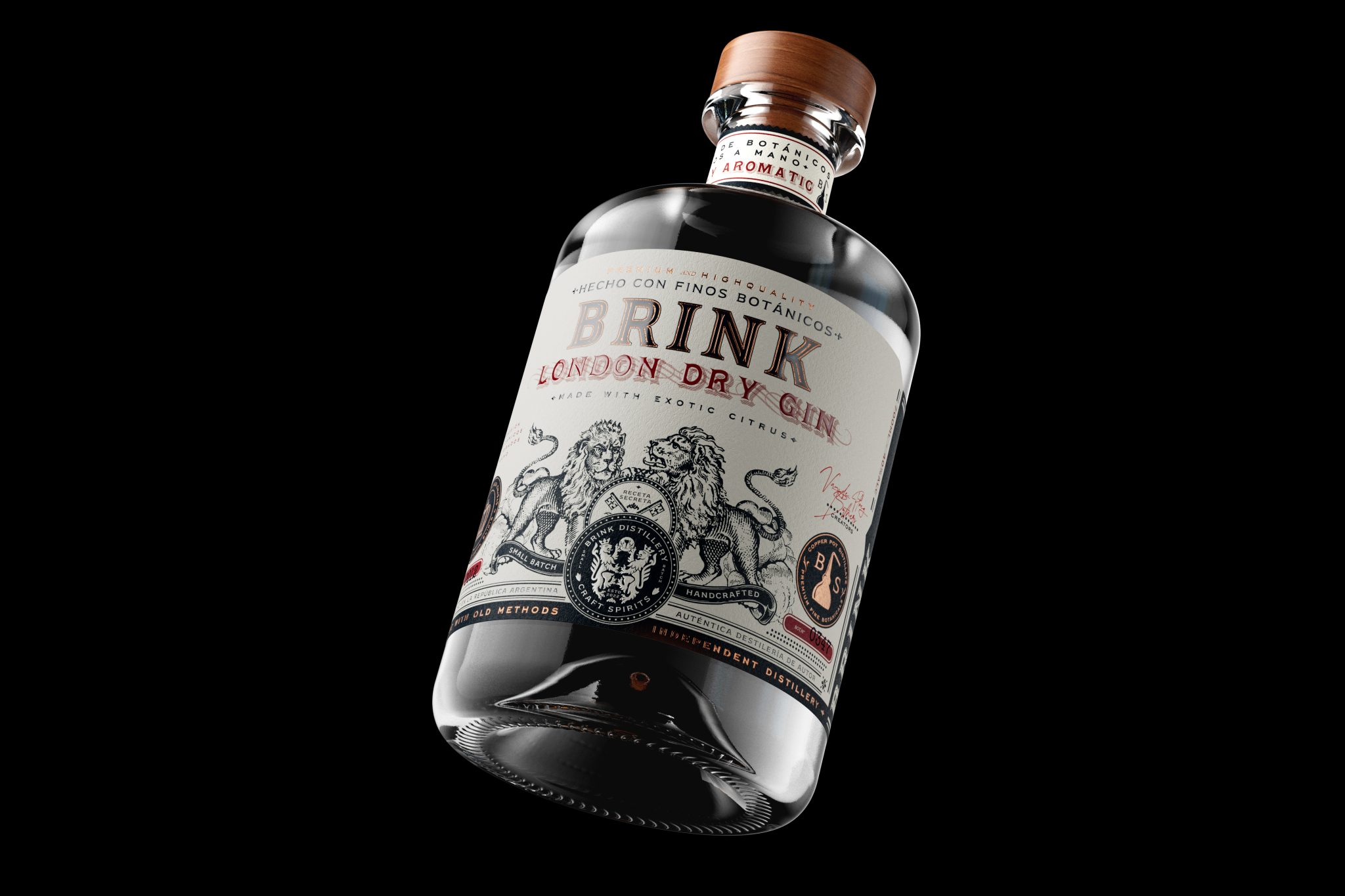

This label feels premium, classic, and really well put together. It takes inspiration from traditional British spirits, but still has its own personality, a bit more narrative, refined, and contemporary. The idea of “Dutch roots tailored by strict British design” comes through clearly, a brand with Dutch roots, shaped with the structure, elegance, and precision of British design.
The label sits on a clean, matte looking paper stock that contrasts beautifully with the dark glass bottle. At the center, Brink takes the lead with a strong serif typeface that feels elegant, confident, and high-end. Right below it, London Dry Gin brings in a more classic, ornamental touch, reinforcing the heritage and timeless character of the product.
The illustration of the two lions gives the label a sense of strength, authority, and tradition. It has that fine engraved style often found in premium spirits, and it works really well with the seals, microtext, and small production details throughout the label. Everything feels crafted, intentional, and full of story.
Beyond the visual design, the label carries a very human idea, a gin conceived by two brothers to celebrate the timeless art of conversation. Classic, perfectly balanced, and bottled as proof that there is always one more story to tell.


 Natasha Spitsyna
 babyage
 GruppoSaida
 ahmedraoudgfx
 Hi estudio
 Nadezhda Gorelikova
 Studio Garces
 Brandsbylufo
 Rewot
Rewot alchimistestudioParis
 Asprey Creative
 kat bres
 Valérie Colace
 Atiq Alam
 Sara Communications
 David Hakobyan
 monther al omari
 Innovāt - Empowering Creative Innovation
 mmdesign
 Amjad Battal
 Hollóka Grafikai Műhely / Graphic Design Studio
 Palashcc
 ABC Design Communication
 ChrisSkarlatos
 Hedayat Hadavi
 Tia Nguyen