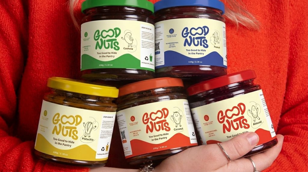

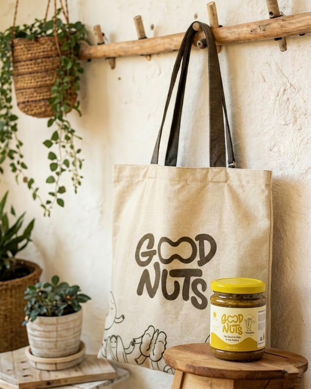
Nut butter is a category built to disappear — dull packaging, forgettable type, nothing worth leaving on the counter. The challenge wasn’t a new jar design; it was rethinking the relationship between the product and the space it lives in: how do you turn something inherently “healthy and boring” into an object people are proud to display?
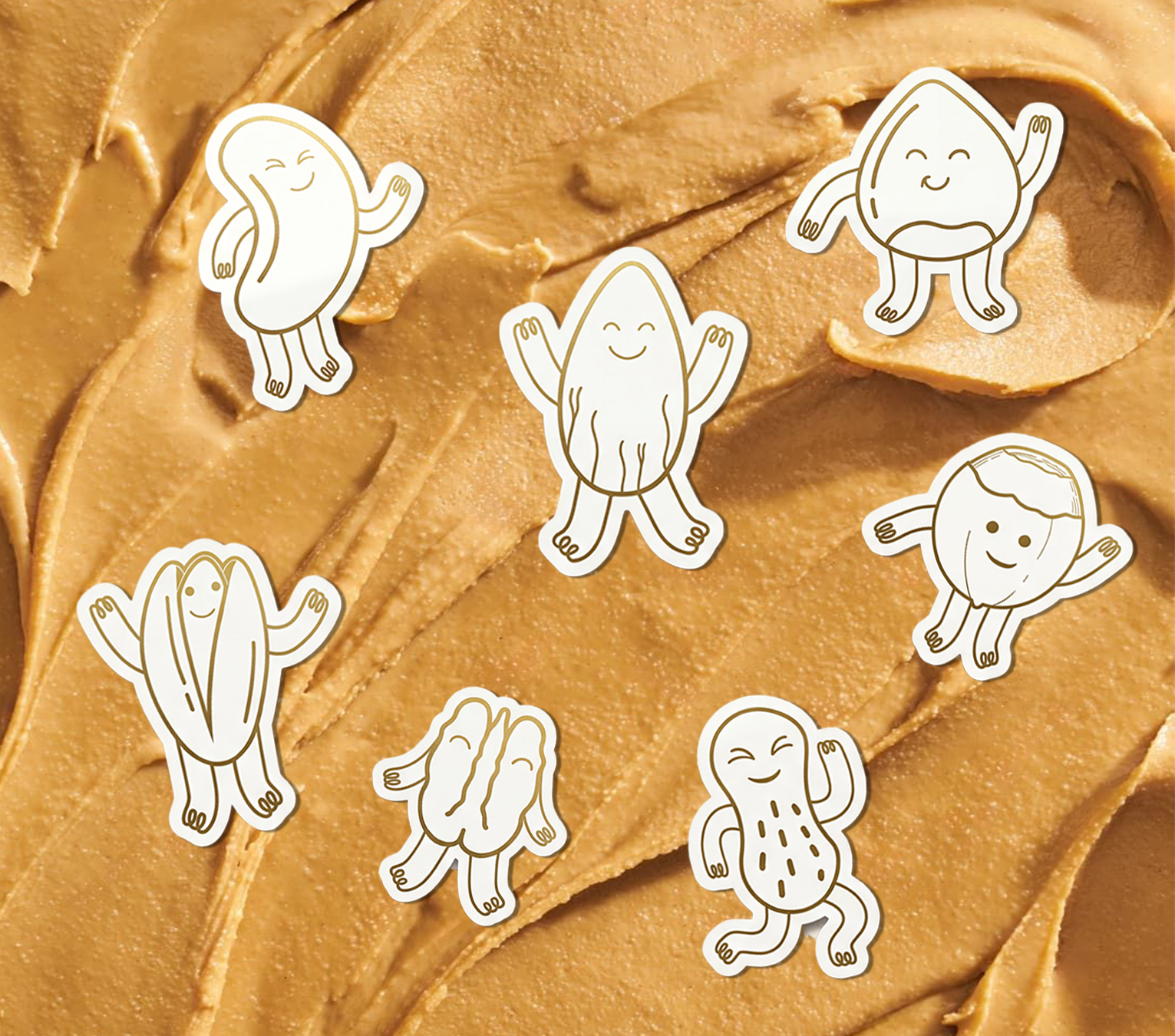
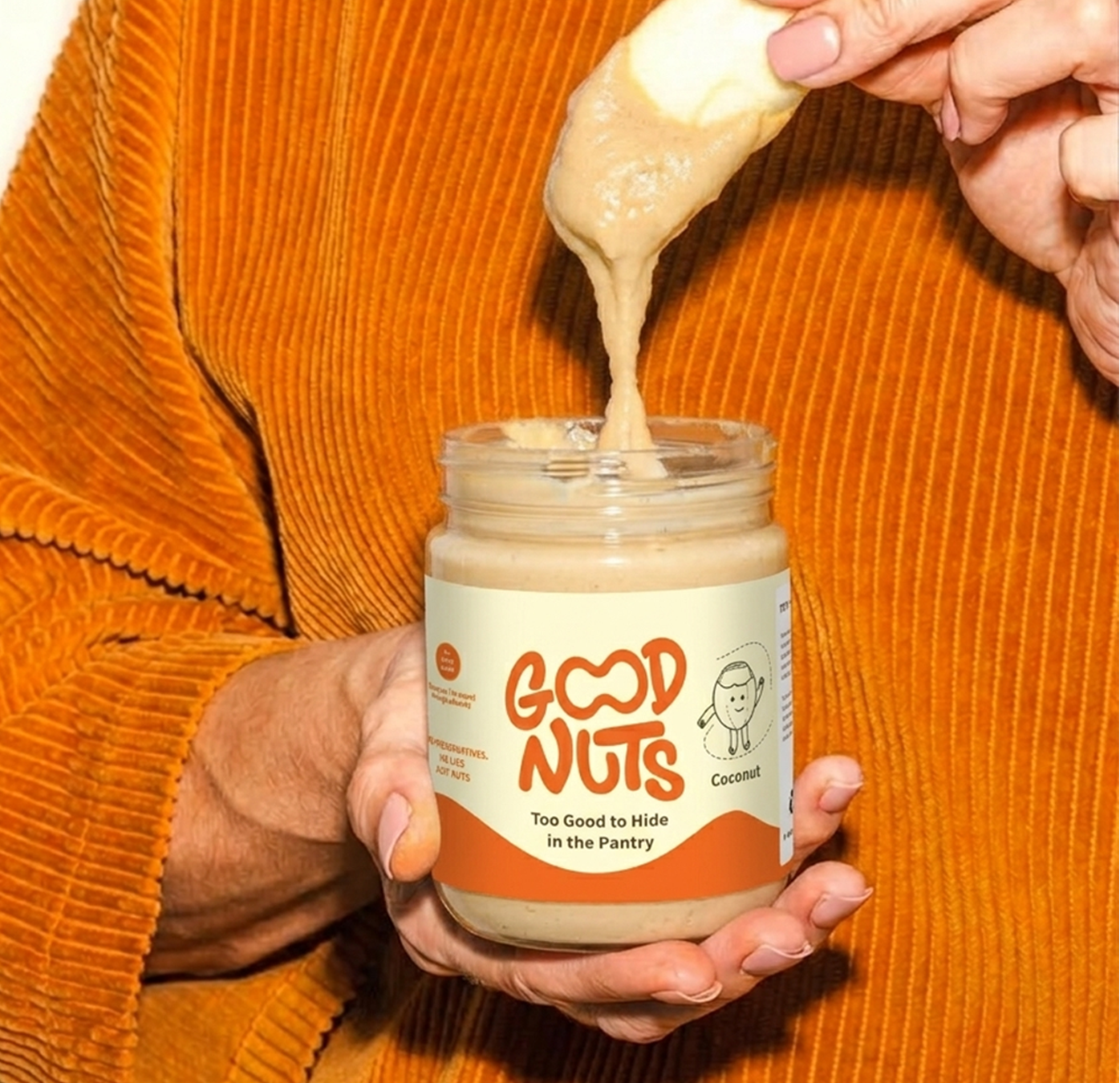
The answer: a full identity system built around one idea — every nut has a personality. Peanuts, cashews, almonds, and pistachios became simple line-drawn characters with playful expressions, letting shoppers recognize a flavor instantly instead of reading a label.
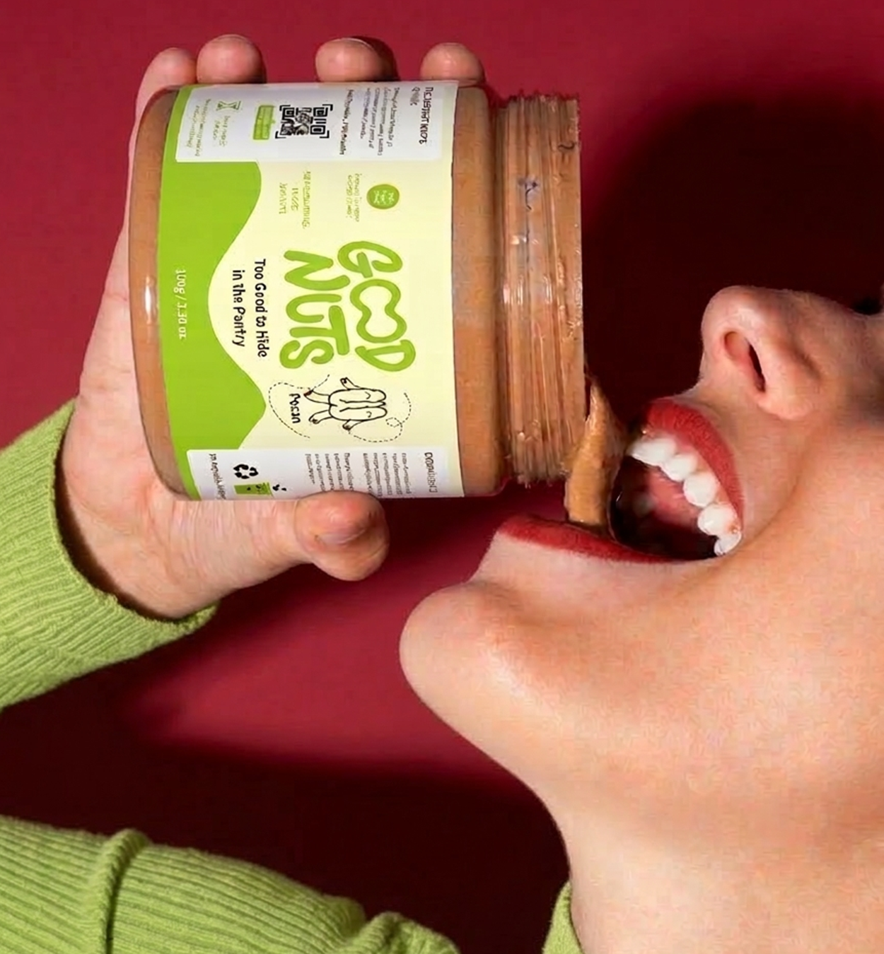
Bold bubble typography carries the brand name as the visual hero, readable from across a crowded shelf. A flavor-coded color system (green for cashew, yellow for pistachio, blue for peanut…) turns shopping into something fast and intuitive, giving each row of jars a cohesive rhythm instead of clutter.
The result: a brand that doesn’t need extra convincing to earn counter space — the identity itself is the invitation to stay out of the pantry.

 MID-AIR STUDIO
 Heramb Arora
 monther al omari
 Tríona O'Donoghue • Design
 Cocoon Prague
 alchimistestudioParis
 hugo zapata
 Bonsanco Creative Studio
 parawaradesign
 UPRISE
 Brand Society
 Que Cálido Studio®
 Richest Branding Pvt. Ltd.
 STRATEDGY
 Shapers Studio
 Platon Ivantsov
 WPA Pinfold
 giselepereiradesign
 ShalaSketches
 05Creation
 Voit Studio
 SSTO
SSTO