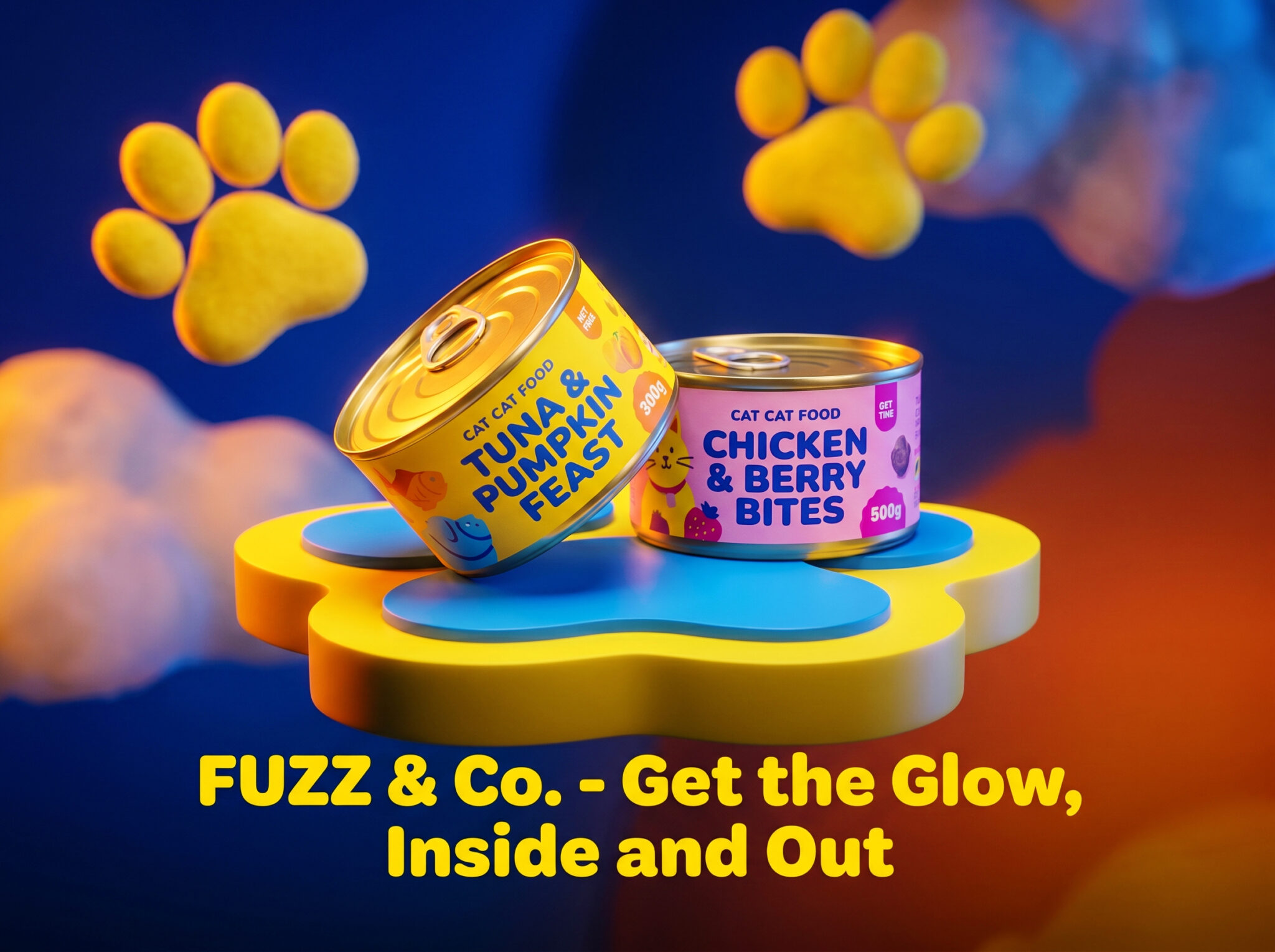

FUZZ & CO. is a pet lifestyle and feline nutrition brand built on a single observation: pet retail has never been treated as a spatial or material design problem. It’s either flat, mass-market packaging or cold, minimalist “premium” branding. Neither engages with the animal or the owner as someone with taste.
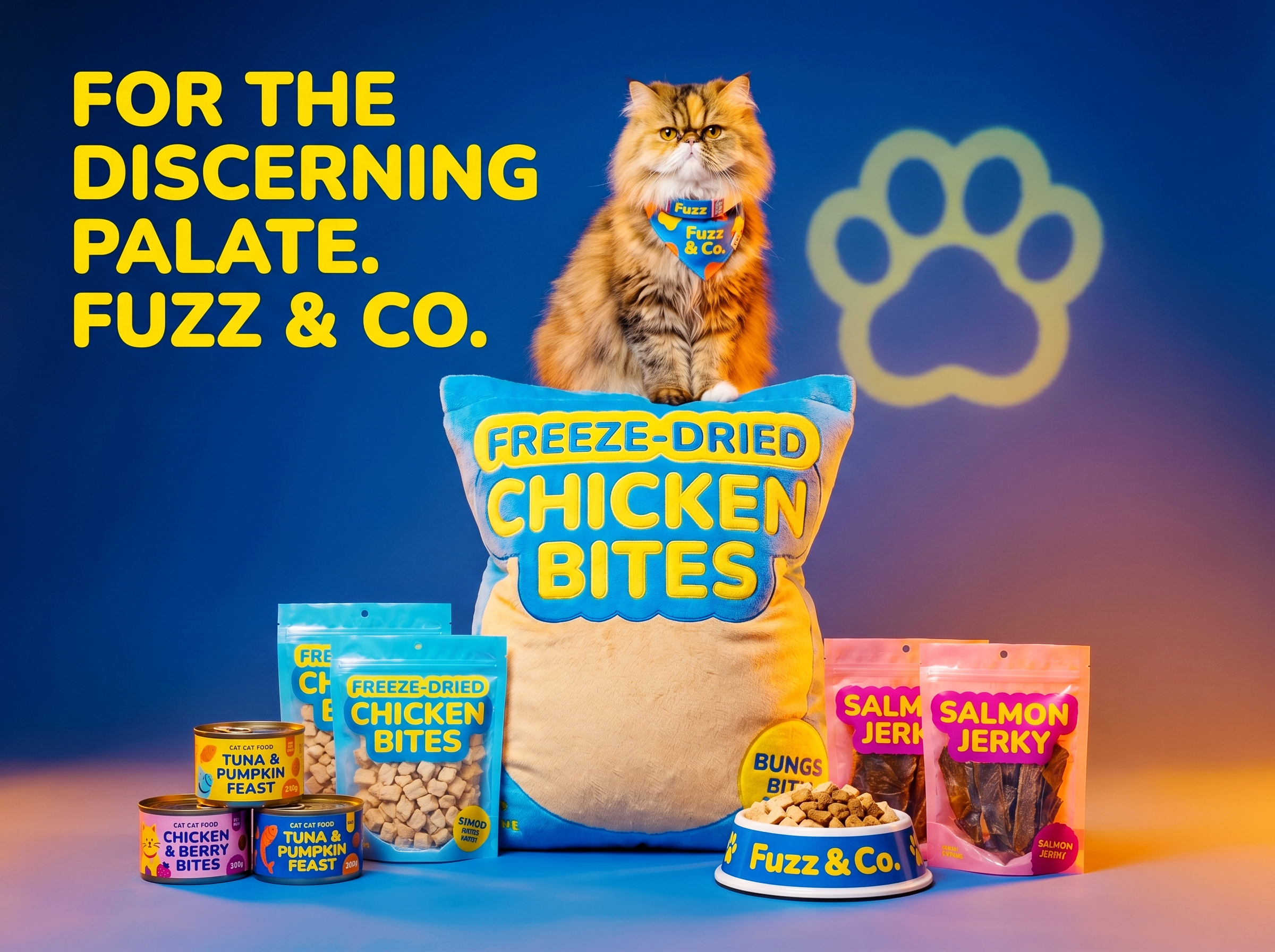
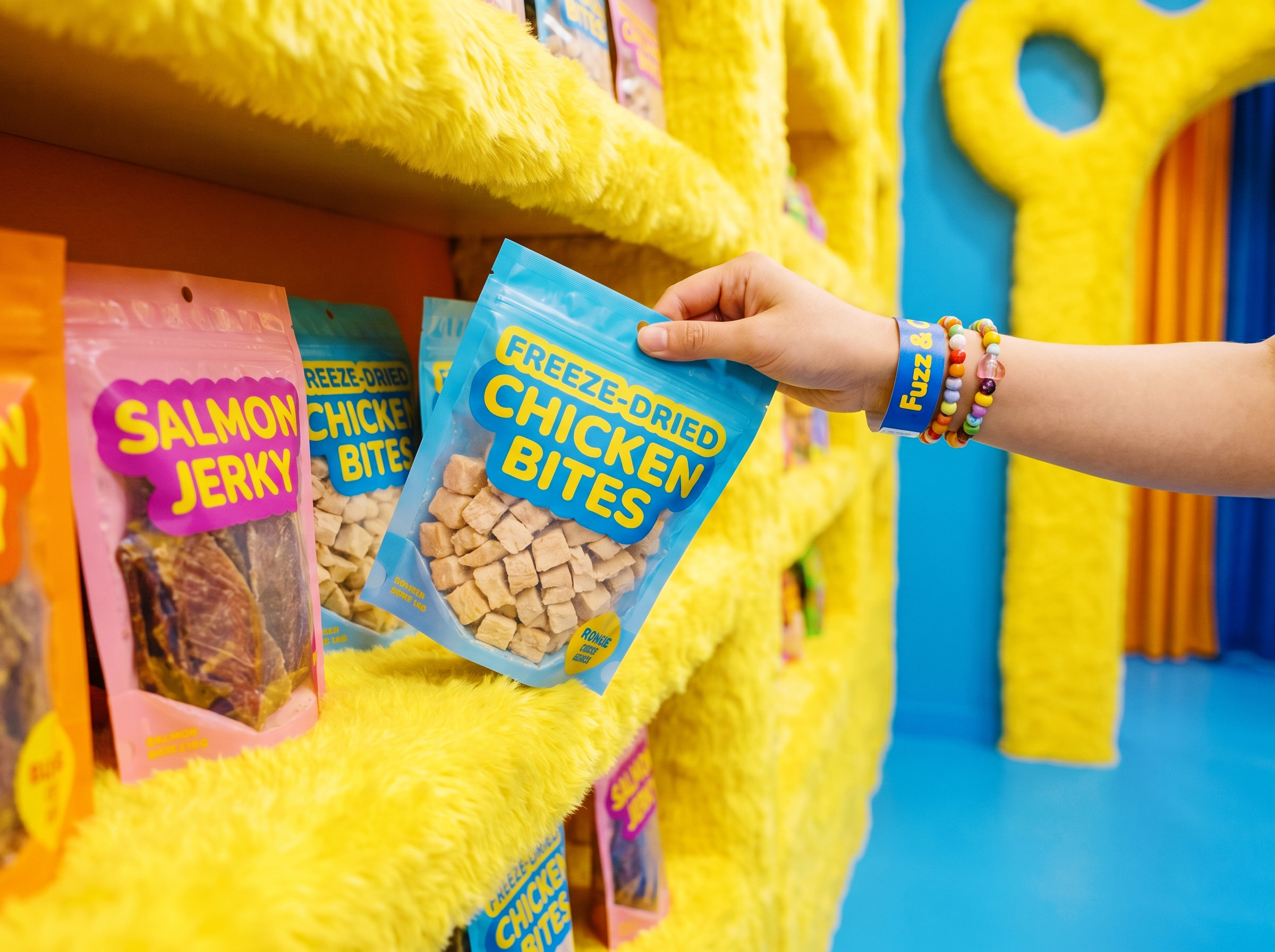
The design system starts with touch. The flagship store wraps every wall in heavy curly yellow fleece, carved with arched display alcoves, and the entrance is a multi-meter walkway cut into the shape of the brand’s fuzzy paw mark. The packaging follows the same logic: wet food canisters in bubblegum pink with hand-drawn strawberries and electric blue type, freeze-dried pouches with oversized die-cut windows that show exactly what’s inside. Both are built to sit on a counter, not hide in a cupboard.
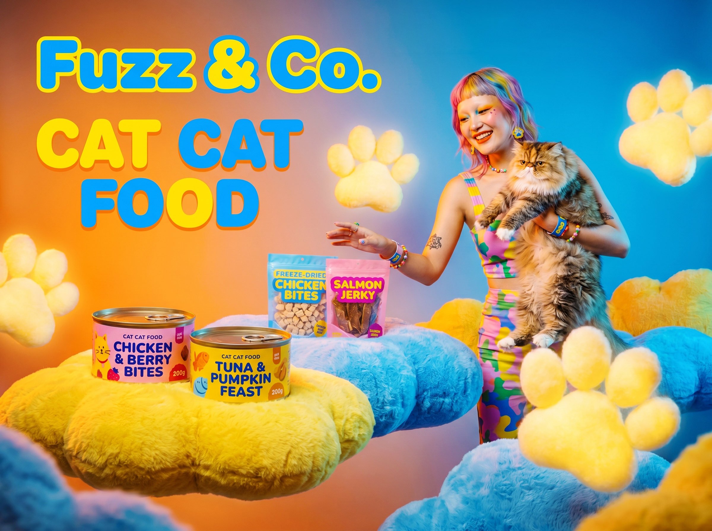
The campaign extends the brand into culture. A model with rainbow-dyed bangs holds a long-haired Exotic Shorthair, both wearing matching pink-and-blue plush collars. Not owner and pet. Two beings with the same aesthetic. The visual language borrows from kidcore, soft sculpture, and high-street fashion rather than from the pet industry’s existing vocabulary.
What makes FUZZ & CO. worth looking at is its category position. It doesn’t compete on “cute” or “premium” within the existing pet industry vocabulary. Texture isn’t decoration here. It’s the strategy.






 krrrrrllii
 babyage
 Deep
Deep monther al omari
 Atiq Alam
 TUERCA Studio
 neo creative studio
 Pinot Agency
 Pixels Studio
 Anastasia Cherepanova | xtramez
 awaiskhadim
 Studio Be Design
 Belova Oksana
 We Craft Studio
 ArtDesignByDIna
 Ananya Taran
 Nadezhda Gorelikova
 orhanirmaktasarim
 WillBe
 Hi estudio
 43oz
43oz Rosario Lo Iacono
 alchimistestudioParis