Alev
OVERVIEW
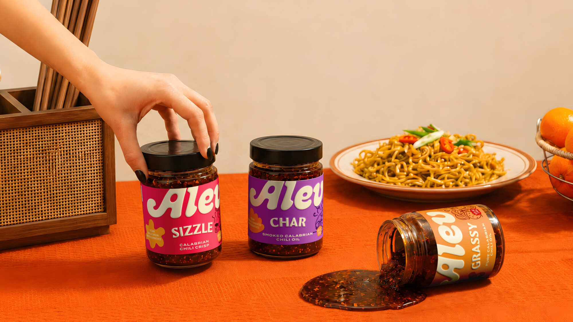
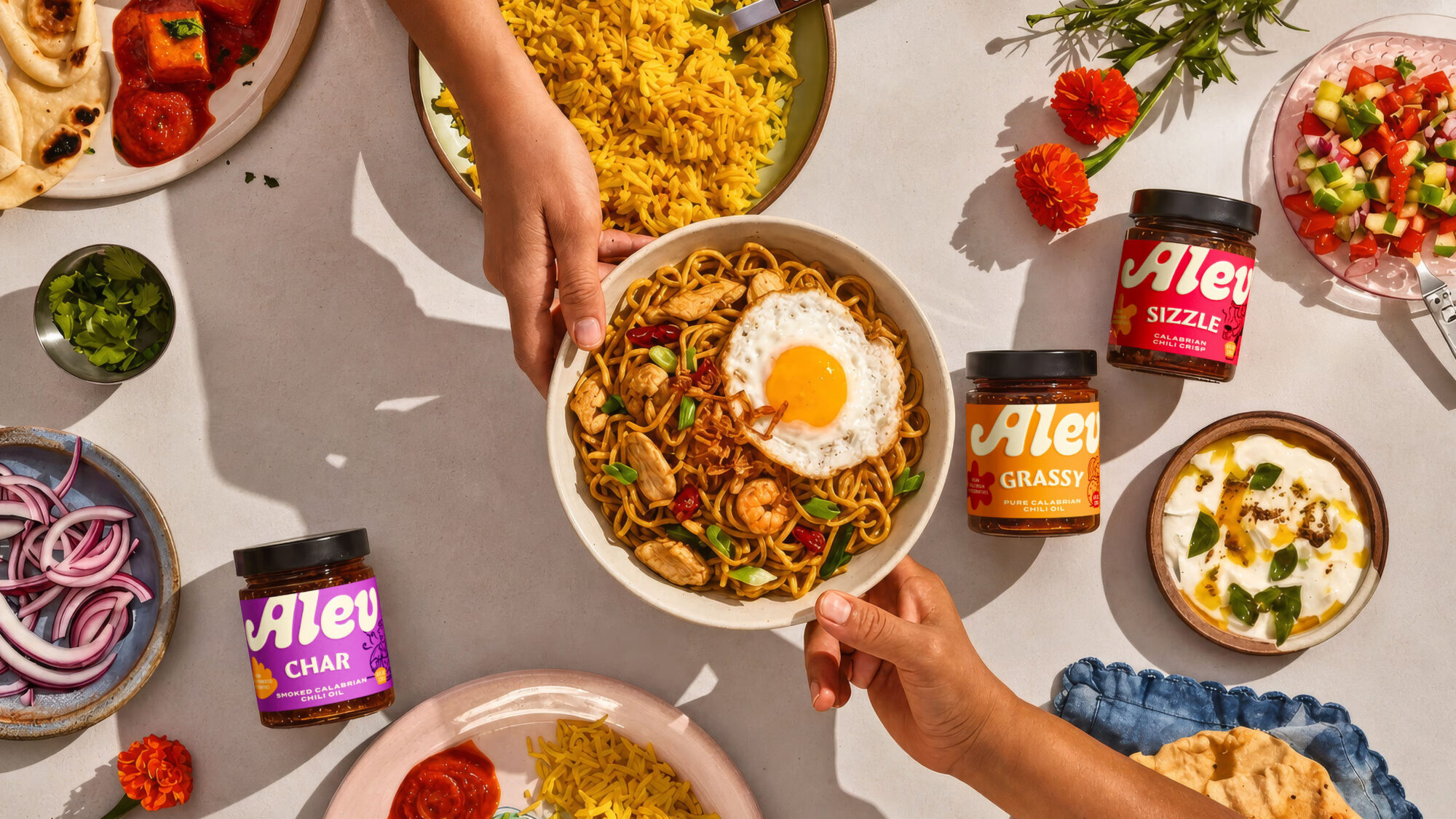
One person cooks; tastes differ around the table. ALEV begins with an idea: keep the meal shared, but let each person finish their own plate. A spoonful of chili oil or crisp gives familiar eggs, pasta or noodles a new finish, without asking the cook to make something else.
CHALLENGE
Home cooks rely on dependable recipes. They save time, but repetition can make a meal feel routine. That opened a different path: instead of asking people to try a new recipe, ALEV gives them a reason to reach for a jar at meals they already make.
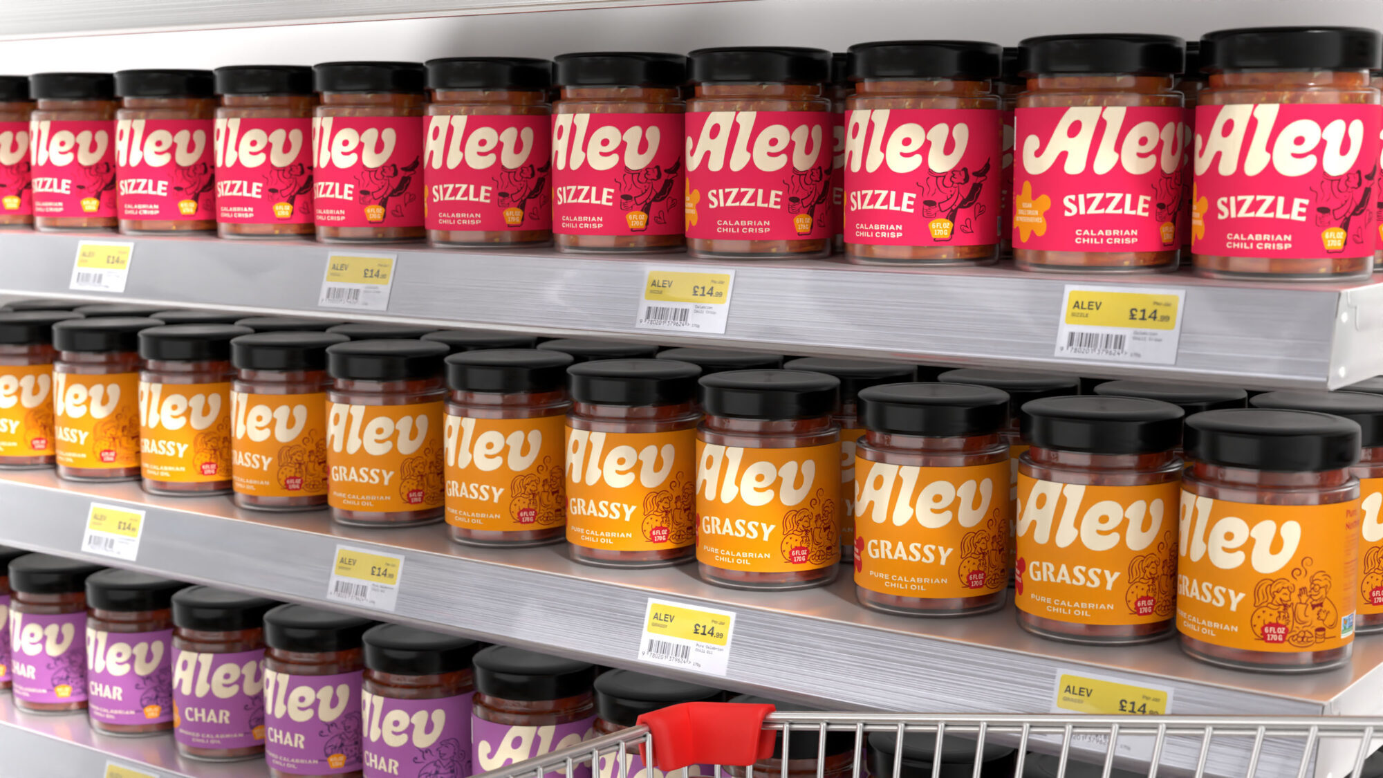
On shelf, the brand had to stand out among chili oils that lead with heat, texture or culinary heritage. Its packaging needed to catch the eye, distinguish three variants and help shoppers picture a jar on their table. Recognition at shelf distance mattered, but so did clarity once the jar was in someone’s hand.
SOLUTION
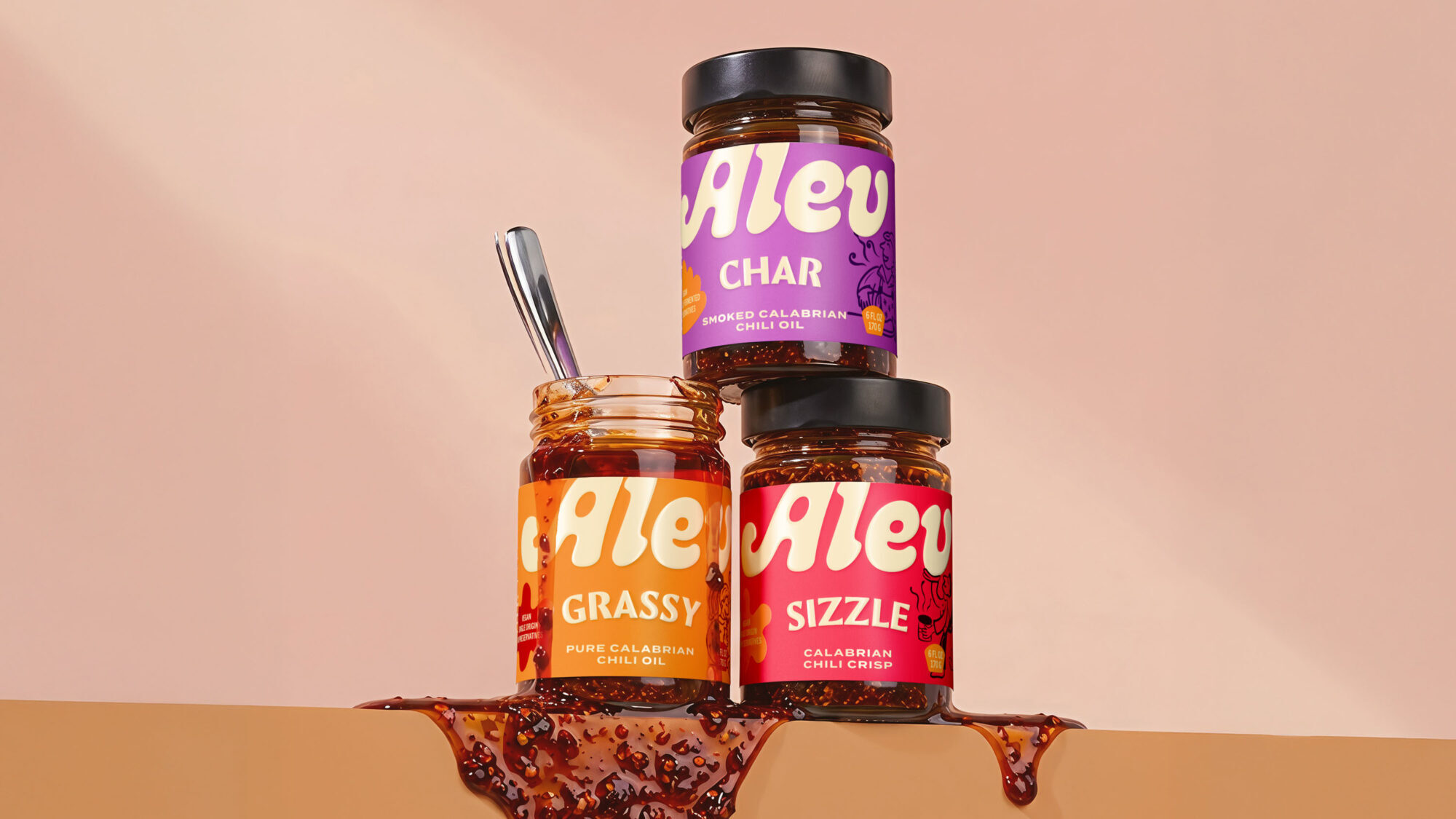
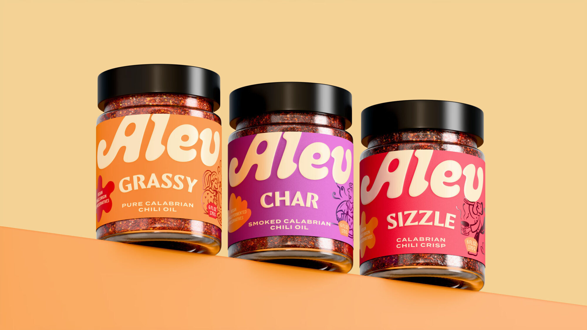
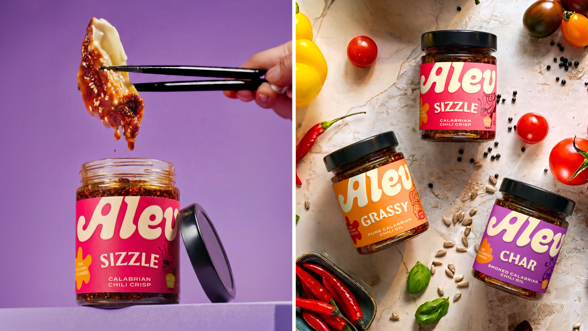
The design takes its cue from the moment ALEV would be used: one shared meal, finished to individual taste. We created three ways to finish a plate. GRASSY is a bright pure Calabrian chili oil, SIZZLE a crunchy Calabrian chili crisp, and CHAR a deeper smoked Calabrian chili oil. Their names suggest an experience; their descriptions tell shoppers what they are buying.
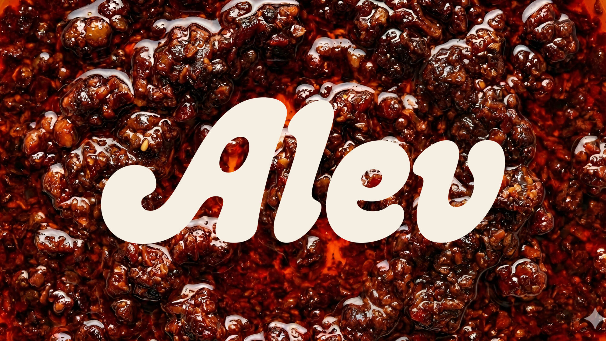
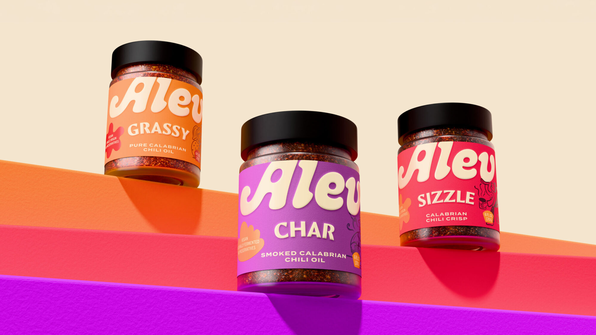
We built the identity around a simple name. ALEV means “flame” in Turkish. We chose it for its sound and sensation, not to suggest where the product comes from. The fluid logotype moves across the label like poured oil, giving the three jars a shared signature.
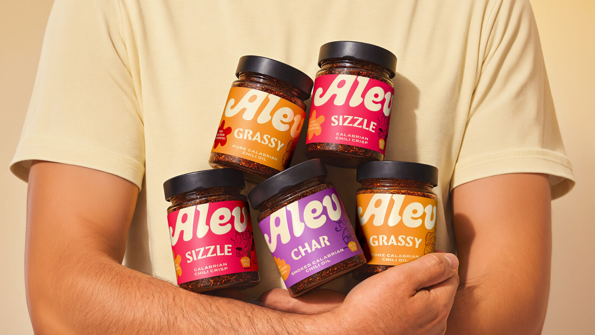
The packaging follows the shopper’s next decisions. Comma Base Black gives the variant names weight and personality, while Termina Bold keeps the product descriptions clear and steady. Orange, pink-red and violet make the variants easy to distinguish. Their energy speaks to young families and gives ALEV a vivid presence on shelf and in digital thumbnails.
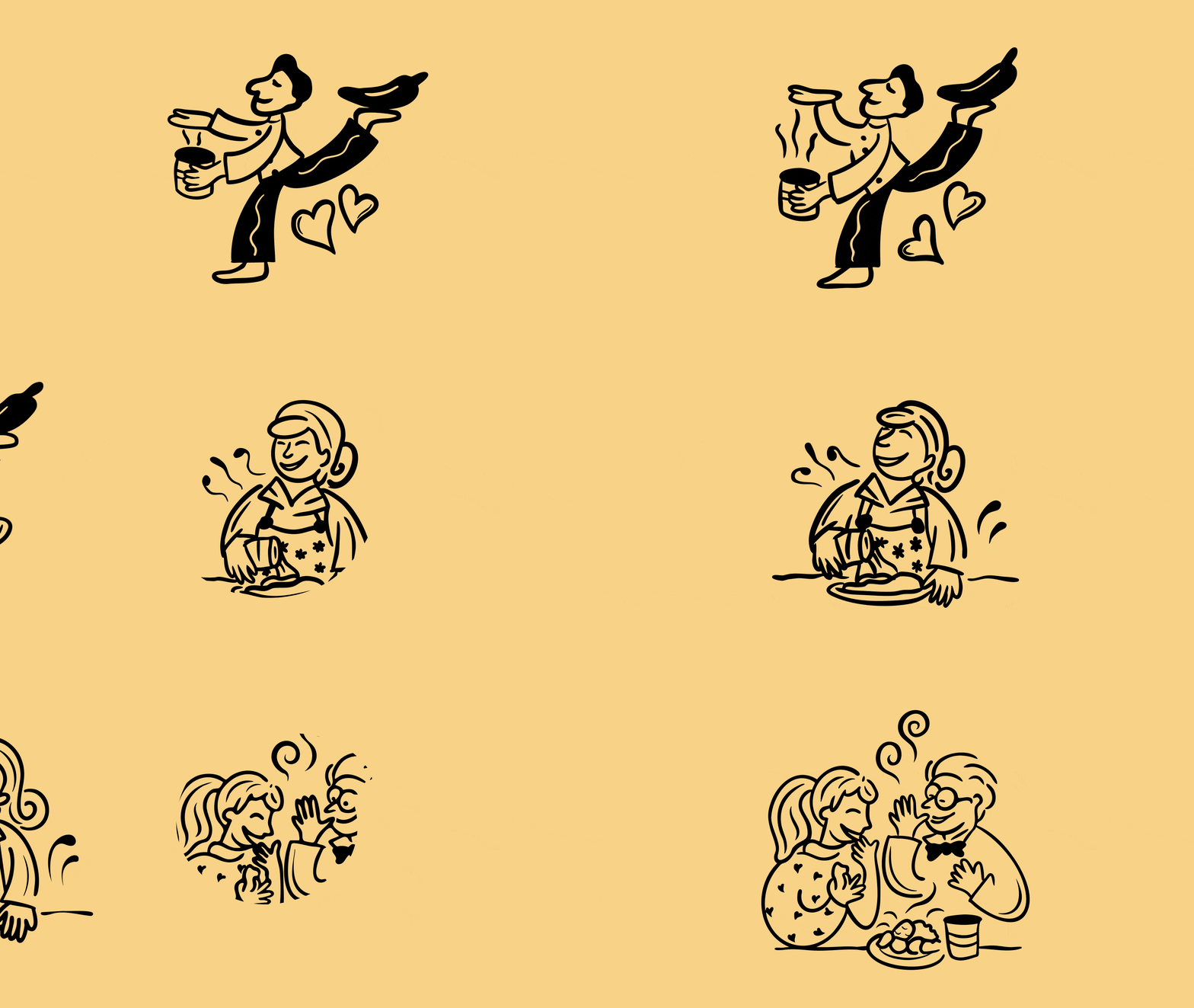
Rather than depicting ingredients alone, the illustrations show people enjoying food. They bring the shared meal at the heart of ALEV into the identity and add a human voice to each jar. Animated labels, moving characters and familiar dishes carry that idea beyond the packaging.
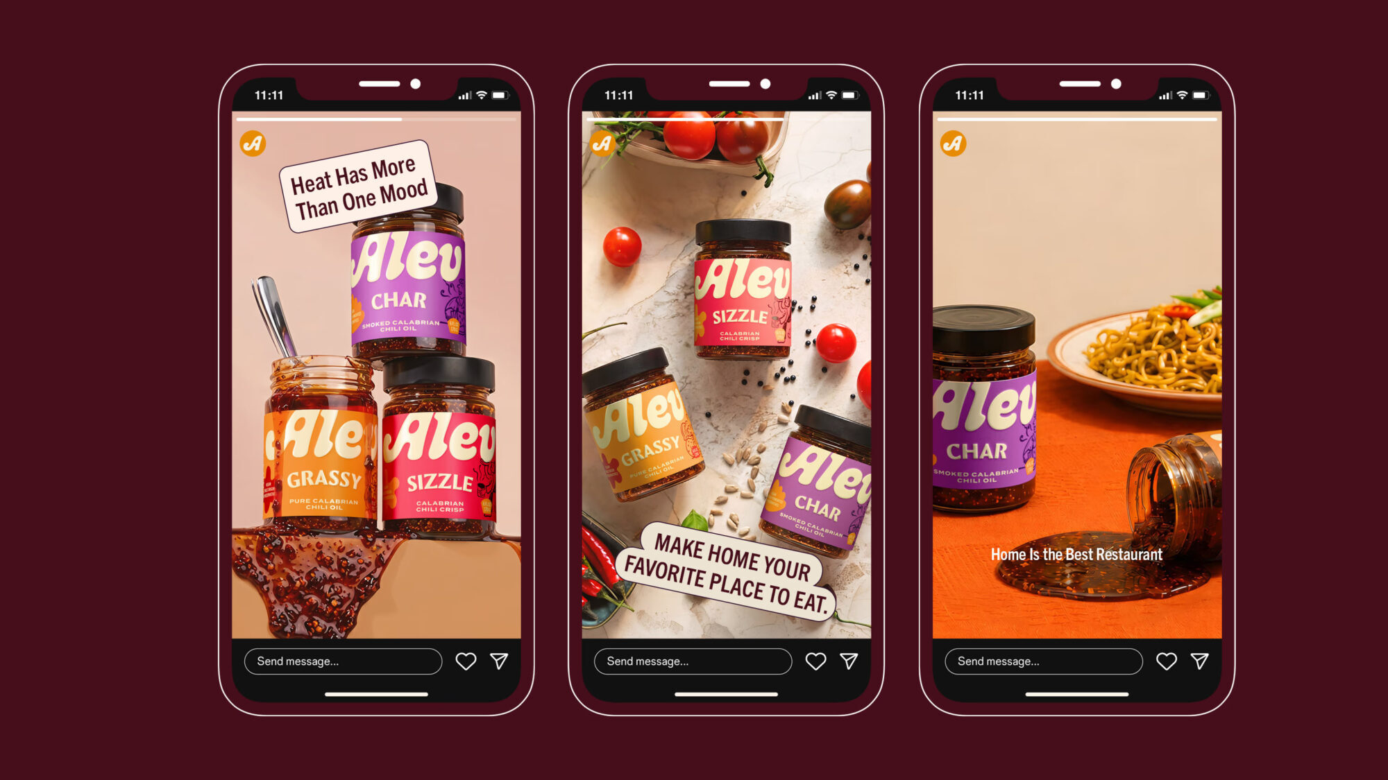
The campaign line, Home Is the Best Restaurant, carries the same idea into advertising. It invites people to pass the jar, finish their plate and find something new in a meal they already know.
Outcome
The result is a brand system built for three moments. On shelf, the colour fields and repeated logotype bring the variants together as one family. In hand, the names and descriptions help shoppers understand the choice between them. At the table, the idea becomes tangible: one shared meal, finished to individual taste. As a concept, ALEV shows how a chili oil brand can find its place in everyday life through a moment of use, rather than relying on heat or heritage alone.
ALEV is a self-initiated brand concept by Widarto Impact. Product formulations, sourcing, production methods and on-pack claims are conceptual and have not been commercially verified.


Comments
0 commentsLog in to comment or submit projects