Curator's PicksSubmit a projectShare your work

Explore by Country

AfghanistanAfricaAlbaniaAlgeriaAmerican SamoaAndorraAngolaAnguillaAntarcticaArgentinaArmeniaAsiaAustraliaAustriaAzerbaijanBahamasBahrainBangladeshBarbadosBelarusBelgiumBeninBoliviaBosnia and HerzegovinaBotswanaBrazilBritish Indian Ocean TerritoryBrunei DarussalamBulgariaCambodiaCameroonCanadaChileChinaChristmas IslandColombiaCosta RicaCote D'ivoireCroatiaCubaCyprusCzech RepublicDemocratic People's Republic of KoreaDenmarkDominican RepublicEcuadorEgyptEl SalvadorEstoniaEthiopiaEuropeFijiFinlandFranceFrench GuianaFrench Southern TerritoriesGeorgiaGermanyGhanaGlobalGreeceGuadeloupeGuatemalaGuyanaHaitiHondurasHong KongHungaryIcelandIndiaIndonesiaIranIraqIrelandIsraelItalyJamaicaJapanJordanKazakhstanKenyaKuwaitKyrgyzstanLatviaLebanonLibyaLithuaniaLuxembourgMacedoniaMadagascarMalaysiaMaldivesMaliMaltaMarshall IslandsMauritiusMexicoMoldovaMonacoMongoliaMontenegroMoroccoMyanmarNepalNetherlandsNew CaledoniaNew ZealandNicaraguaNigeriaNorth AmericaNorwayOceaniaOmanPakistanPalestiniaPanamaPapua New GuineaParaguayPeruPhilippinesPolandPortugalPuerto RicoQatarRepublic of KoreaRepublic of KosovoRomaniaRussian FederationSan MarinoSao Tome and PrincipeSaudi ArabiaSenegalSerbiaSeychellesSingaporeSlovakiaSloveniaSomaliaSouth AfricaSouth AmericaSpainSri LankaSudanSwazilandSwedenSwitzerlandSyrian Arab RepublicTaiwanTajikistanThailandTrinidad and TobagoTunisiaTurkeyTurkmenistanUgandaUkraineUnited Arab EmiratesUnited KingdomUnited StatesUnited States Minor Outlying IslandsUruguayUzbekistanVanuatuVenezuelaViet NamVirgin Islands, U.S.YemenZambiaZimbabwe

Materials

Browse all

Zzzeny

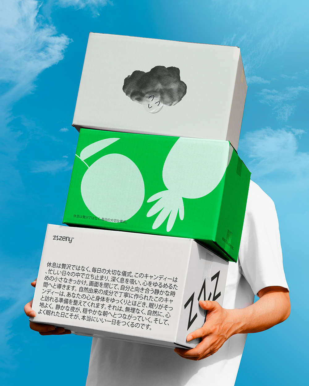
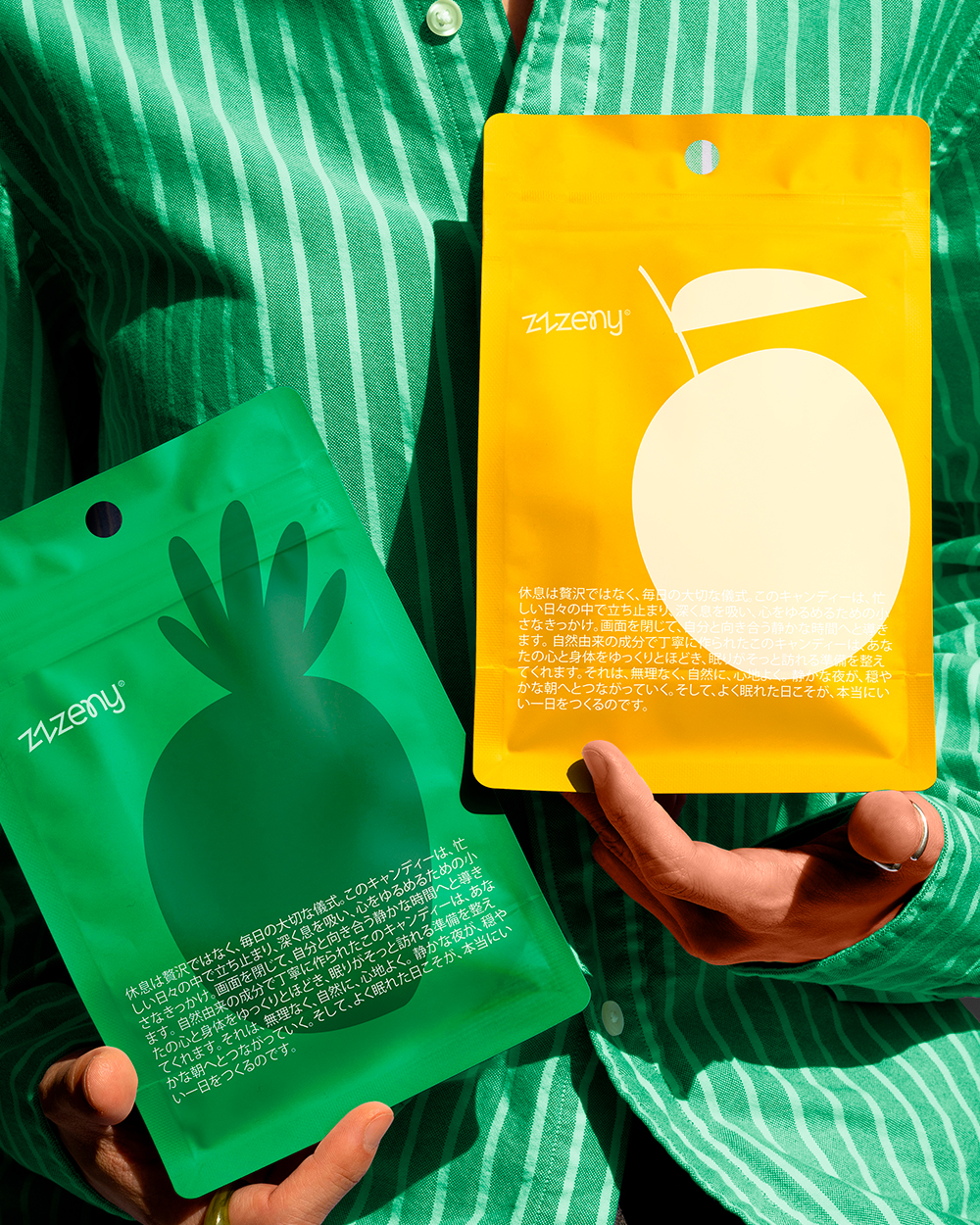
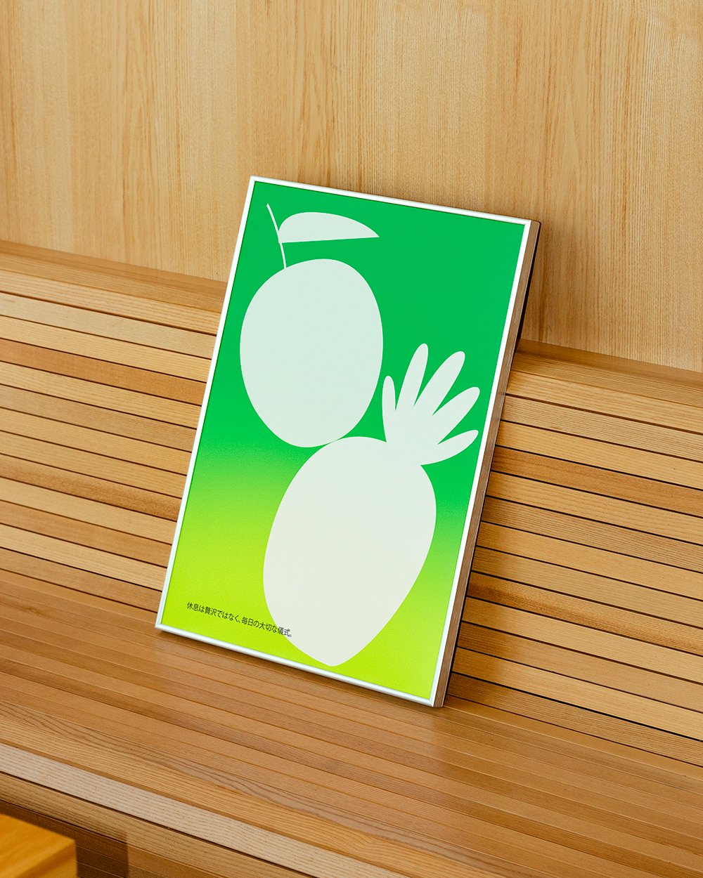
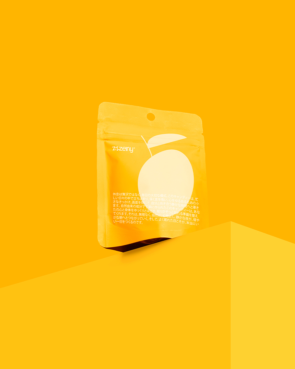
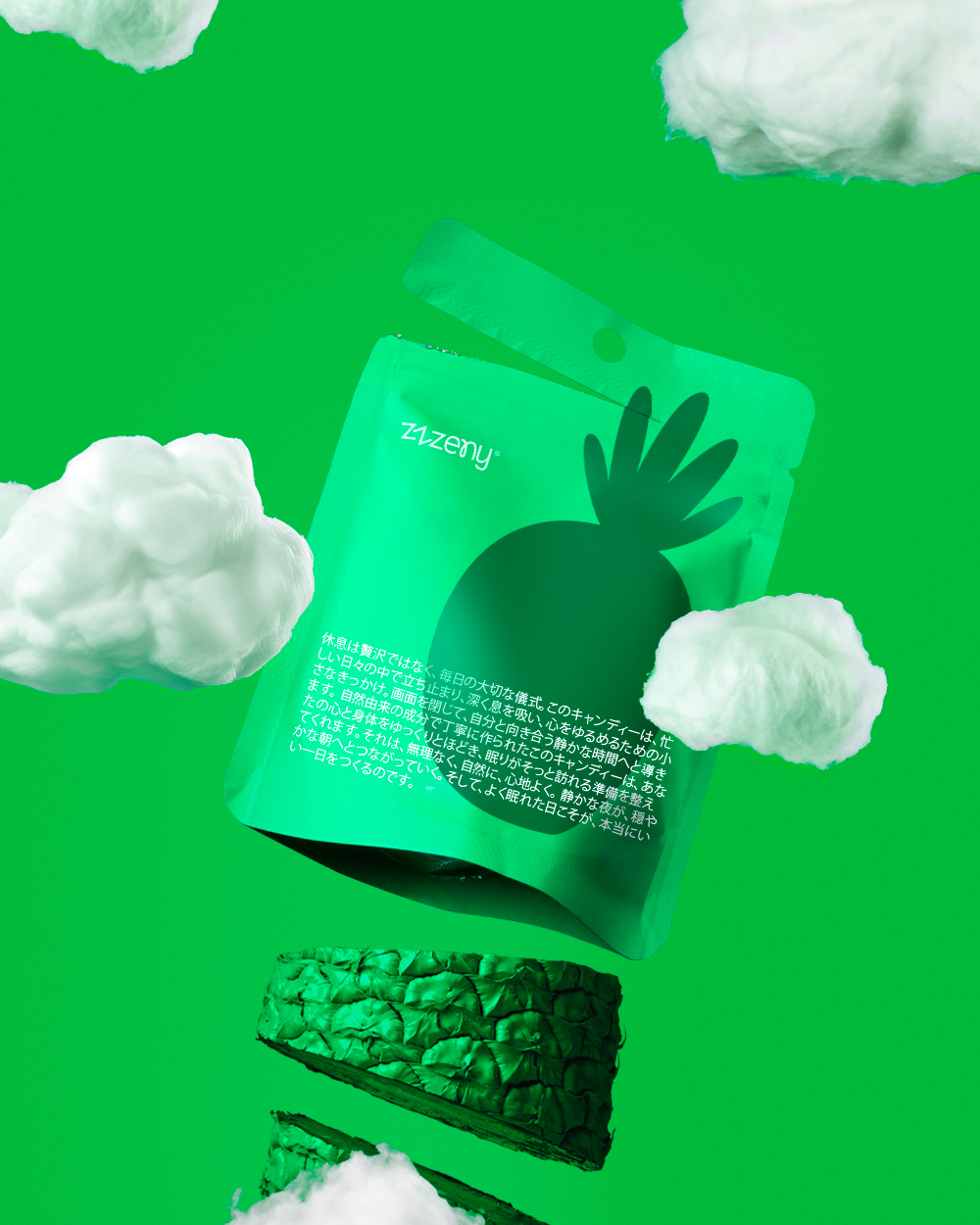
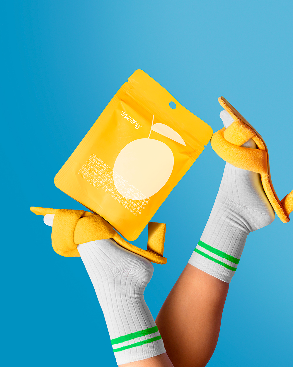
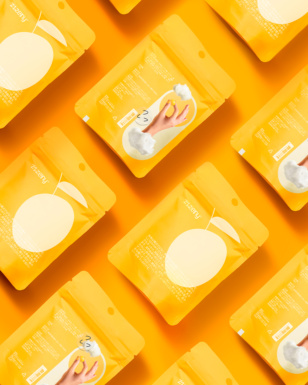
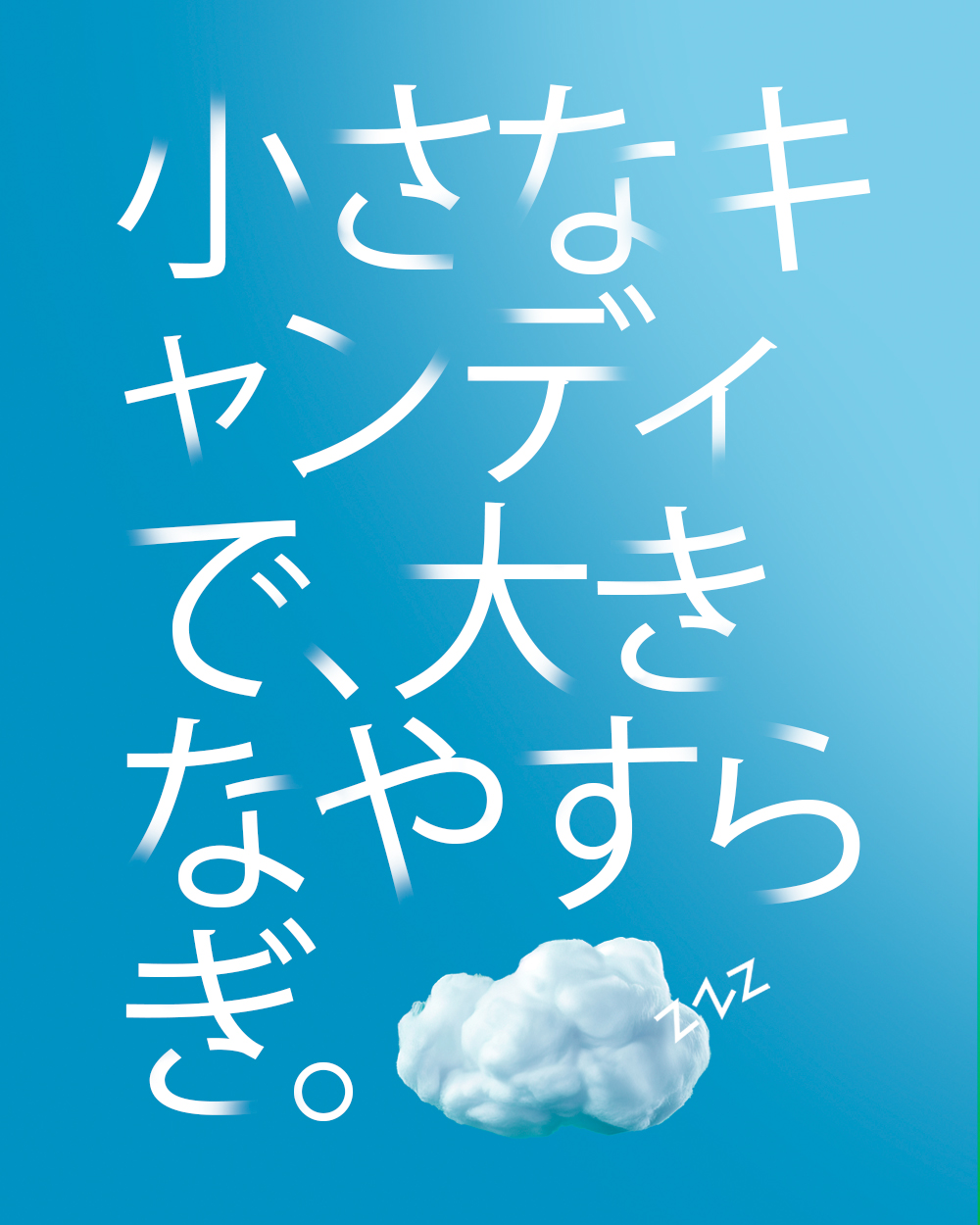
For this brand, Zzzeny 😴, we set out to create an identity that transforms a simple candy into a ritual of calm and relaxation. The concept is rooted in the idea of “being in the clouds,” inviting consumers to unwind before sleep with fruit-flavored candies designed for rest. The packaging draws from softness and serenity, using a color palette of yellow and green, and subtle fruity accents to evoke the freshness of the flavors. Clean typography and generous white space reflect clarity and calm, while rounded forms echo the lightness of clouds. This brand identity captures the dual essence of the product: a sweet indulgence that also guides the consumer toward peace, rest, and lightness. The result is a minimal yet playful visual system where color, type, and form work together to communicate tranquility and flavor.

 

Zzzeny, snacks packaging design by empatia, Japan. Image 1 of 14.Zzzeny, snacks packaging design by empatia, Japan. Image 2 of 14.Zzzeny, snacks packaging design by empatia, Japan. Image 3 of 14.Zzzeny, snacks packaging design by empatia, Japan. Image 4 of 14.Zzzeny, snacks packaging design by empatia, Japan. Image 5 of 14.Zzzeny, snacks packaging design by empatia, Japan. Image 6 of 14.Zzzeny, snacks packaging design by empatia, Japan. Image 7 of 14.Zzzeny, snacks packaging design by empatia, Japan. Image 8 of 14.Zzzeny, snacks packaging design by empatia, Japan. Image 9 of 14.Zzzeny, snacks packaging design by empatia, Japan. Image 10 of 14.Zzzeny, snacks packaging design by empatia, Japan. Image 11 of 14.Zzzeny, snacks packaging design by empatia, Japan. Image 12 of 14.Zzzeny, snacks packaging design by empatia, Japan. Image 13 of 14.Zzzeny, snacks packaging design by empatia, Japan. Image 14 of 14.